Benjamin Moore Mint (436) is a soft, refreshing green that exudes a sense of calm, vitality, and timeless charm. This versatile hue is an ideal choice for creating serene and airy interiors, effortlessly infusing spaces with a natural, uplifting ambiance. Whether you're looking to design a tranquil bedroom retreat, an invigorating kitchen, or an inviting living room, Mint (436) offers a delicate yet sophisticated touch that enhances any environment.
Benjamin Moore Mint (436) is rooted in its gentle green base but carries soft undertones that give it depth and adaptability. Its primary undertones are cool, with a whisper of blue that lends it a crisp, clean feel. However, there's also a faint warmth, almost like a breath of cream, that prevents it from feeling too stark or icy. This balanced undertone allows Mint to feel equally at home in modern, minimalist spaces as well as traditional or vintage-inspired interiors.
Mint (436) pairs beautifully with a wide array of colors, making it a versatile choice for various design styles. Here are some of the best coordinating colors to consider:
Neutral Partners: To create a soft and cohesive look, pair Mint with warm neutrals like Benjamin Moore White Dove (OC-17) or Classic Gray (OC-23). These shades bring out the subtle warmth in Mint while maintaining a light and airy feel.
Cool Complements: For a modern and refreshing palette, combine Mint with cool whites like Chantilly Lace (OC-65) or pale gray tones such as Stonington Gray (HC-170). These shades emphasize Mint's crisp, cool undertones.
Accent Colors: Add vibrancy with bold, complementary accents. Coral, blush pink, or warm peach tones can provide a playful contrast, while navy blues like Hale Navy (HC-154) or deep teals like Aegean Teal (2136-40) create a striking yet harmonious pairing.
Earthy Tones: Incorporate warm wood finishes or earthy shades like taupe and camel for a natural, grounded feel.
The versatility of Mint (436) makes it a fantastic choice for a variety of spaces and design applications. Here are some popular ways to use this soft green hue:
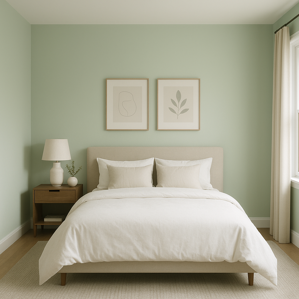
Mint's calming and restorative qualities make it perfect for bedrooms and nurseries. Its light, airy presence encourages relaxation while still feeling fresh and invigorating. Pair it with soft linens, natural textures, and muted accents for a dreamy, restful retreat.
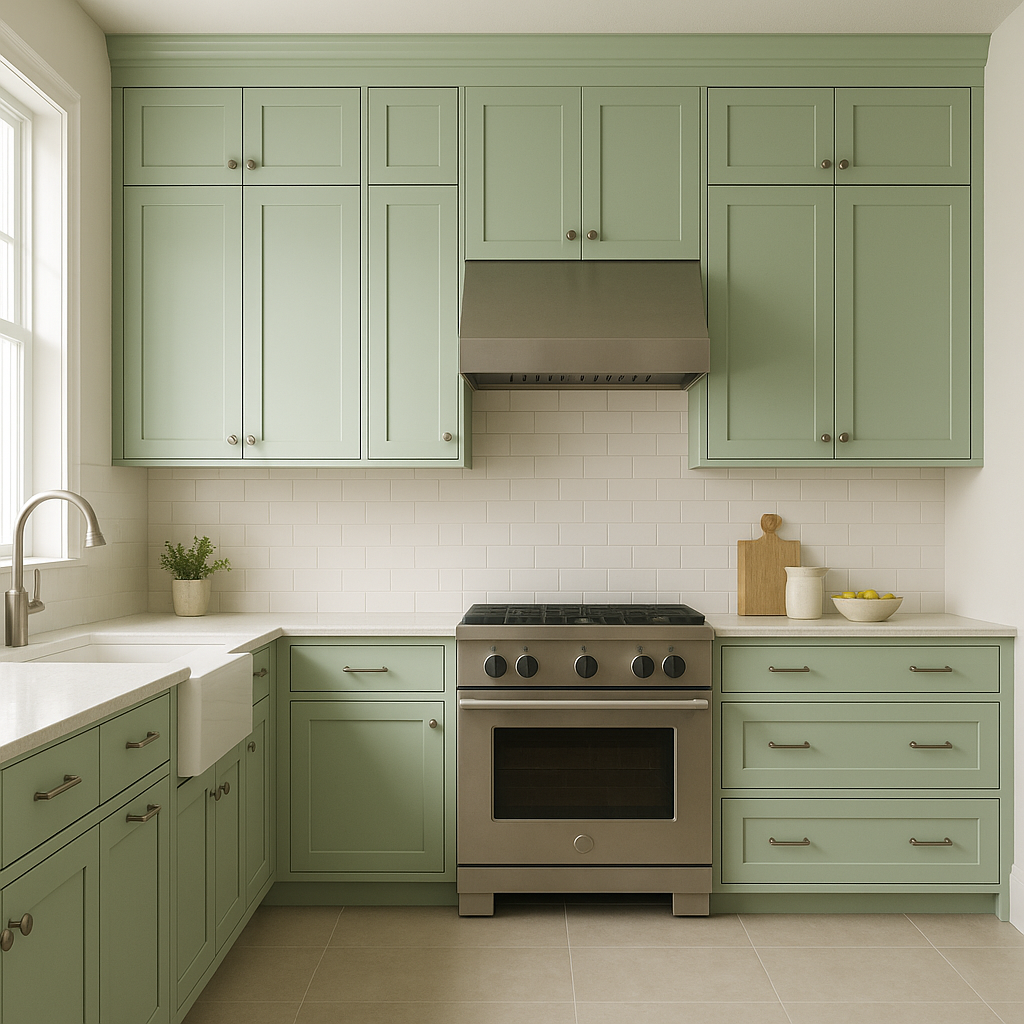
In kitchens and dining spaces, Mint (436) offers a crisp, clean aesthetic. Whether used on cabinets, walls, or as an accent color, it brings a refreshing energy to these functional spaces. Pair it with white subway tiles, brass hardware, and butcher block countertops for a chic, farmhouse-inspired look.
Create a welcoming and serene living room by using Mint (436) on walls or furniture. Its subtle vibrancy adds character without overwhelming the space. Complement it with soft beige or cream upholstery and touches of greenery for a cohesive and inviting atmosphere.
Mint's cool undertones make it an excellent choice for bathrooms, where it evokes a spa-like sense of calm and cleanliness. Use it with white tiles, chrome or brushed nickel fixtures, and fluffy white towels for a timeless and refreshing look.
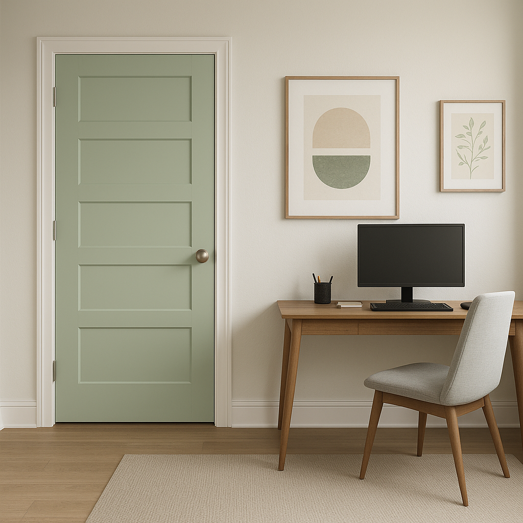
For a pop of color, consider Mint (436) on accent walls, furniture, or even front doors. Its gentle vibrancy works well on small-scale applications, adding a playful yet sophisticated touch to your home.
Benjamin Moore Mint (436) is more than just a soft green—it’s a color that embodies balance, freshness, and versatility. Its subtle undertones and adaptable nature make it a perfect choice for homeowners seeking a color that feels both timeless and modern. Whether used as a main wall color or as an accent, Mint (436) is sure to breathe life and tranquility into any space.
View Colors Only by Brand (No Imagery):
Sherwin-Williams
|
Benjamin-Moore
|
Behr
|
Valspar
Live on the Eastern Slope of Colorado and looking for a local painting professional, check out all our painting services and reach out for a free estimate.
Copyright © 2026 : Wild Fox Painting Inc. : 12435 Mead Way, Littleton, CO 80125


