Benjamin Moore Spring (438) is a soft and refreshing green that evokes the first signs of budding leaves and warmer days. With its delicate balance of cool and warm undertones, this hue is a versatile option for creating tranquil, nature-inspired spaces. Whether you're designing a cozy bedroom retreat or a welcoming living area, Spring (438) offers a nurturing backdrop that seamlessly blends with a variety of design styles, from classic to contemporary.
Spring (438) is a muted green with subtle yellow undertones, giving it a warm and sunny disposition while maintaining an air of sophistication. These undertones make it more approachable than stark greens, allowing for greater adaptability in both brightly lit spaces and rooms with limited natural light. The yellow undertones lend a cheerful quality, while the overall muted green base gives it a grounding presence, perfect for creating spaces that feel both airy and grounded.
When working with Benjamin Moore Spring (438), selecting complementary and coordinating colors can enhance its natural beauty while ensuring a harmonious design palette.
Neutral Pairings:
Accent Colors:
Earthy Complements:
Benjamin Moore Spring (438) is a highly versatile shade that can be used in virtually any room to evoke a sense of calm and rejuvenation. Its muted tone ensures it won’t overwhelm, making it a smart choice for spaces where balance is key.
Living Rooms:
Spring (438) is perfect for creating a serene living room atmosphere. Pair it with neutral furniture, natural wood finishes, and soft textiles to highlight its organic charm. Incorporate potted plants or botanical artwork to emphasize the green’s connection to nature.
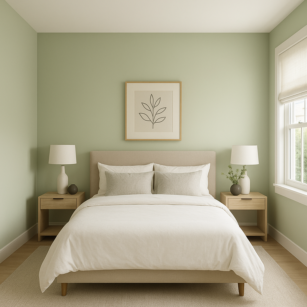
Bedrooms:
For a restful retreat, use Spring (438) on walls and pair it with crisp white linens and soft gray accents. This combination fosters an environment of peace and relaxation. Add touches of warm metallics, such as brushed gold or copper, for an elevated look.
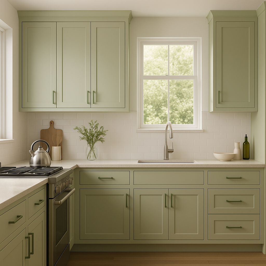
Kitchens:
Bring a breath of fresh air to your kitchen by using Spring (438) on cabinetry or walls. Pair it with white quartz countertops and subway tiles for a clean, modern feel. Incorporate pops of navy or mustard yellow in accessories for added interest.
Bathrooms:
Spring (438) can transform a bathroom into a spa-like oasis. Use it on walls alongside white fixtures and polished chrome accents. Add woven baskets, natural stone, or greenery for a cohesive, calming design.
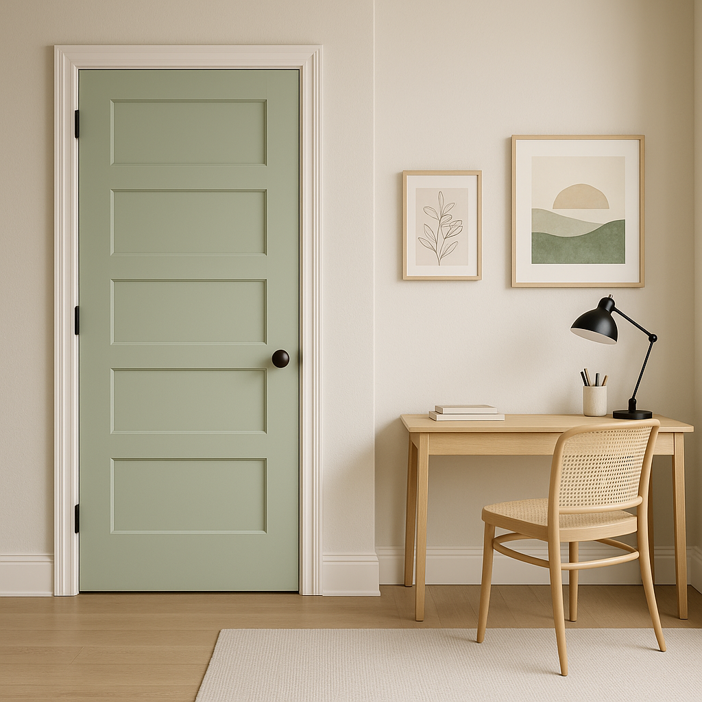
Offices:
In home offices, Spring (438) fosters focus and tranquility. Pair it with dark wood furniture and navy accents for a sophisticated yet serene workspace.
Benjamin Moore Spring (438) is more than just a paint color—it’s a mood enhancer that brings the essence of nature indoors. Its subtle undertones and versatility make it a reliable choice for those seeking to create timeless, harmonious interiors. Whether paired with soft neutrals, bold accents, or earthy tones, Spring (438) adapts beautifully to your vision, making it an indispensable tool in any interior designer’s palette.
View Colors Only by Brand (No Imagery):
Sherwin-Williams
|
Benjamin-Moore
|
Behr
|
Valspar
Live on the Eastern Slope of Colorado and looking for a local painting professional, check out all our painting services and reach out for a free estimate.
Copyright © 2026 : Wild Fox Painting Inc. : 12435 Mead Way, Littleton, CO 80125


