Benjamin Moore Palisades (439) is an elegant and understated neutral that effortlessly brings sophistication and balance to any space. Its soft beige tone is versatile, making it suitable for both traditional and contemporary interiors. With subtle warmth and a refined presence, Palisades is a go-to choice for creating calm, inviting atmospheres.
Palisades features delicate warm undertones that give it a slightly creamy depth without leaning too yellow or overly cool. This well-balanced hue has just enough warmth to feel cozy while remaining neutral enough to pair seamlessly with a wide range of colors and styles. Its undertones make it ideal for spaces where you want to avoid stark white but still maintain a light, airy aesthetic.
Palisades is incredibly versatile, making it easy to coordinate with other Benjamin Moore shades to achieve a cohesive look. Below are some thoughtfully curated pairings:
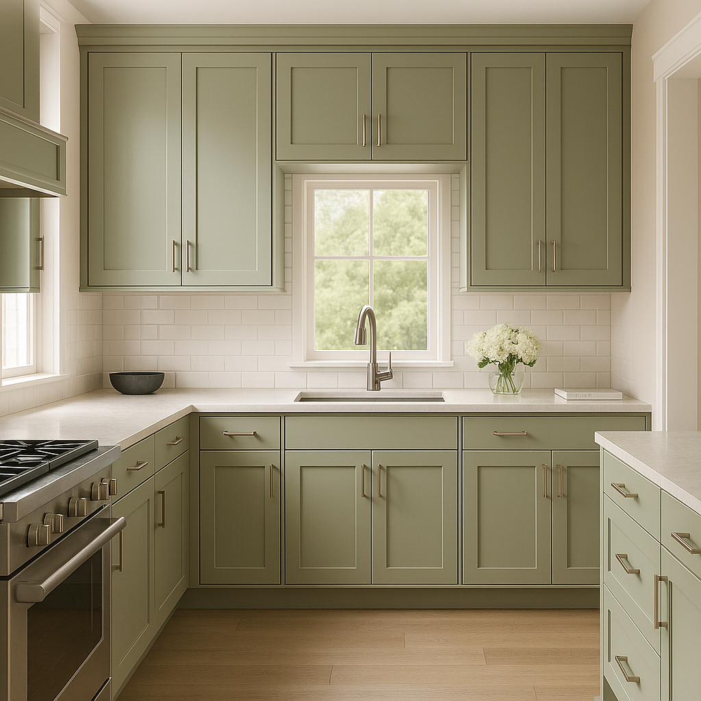
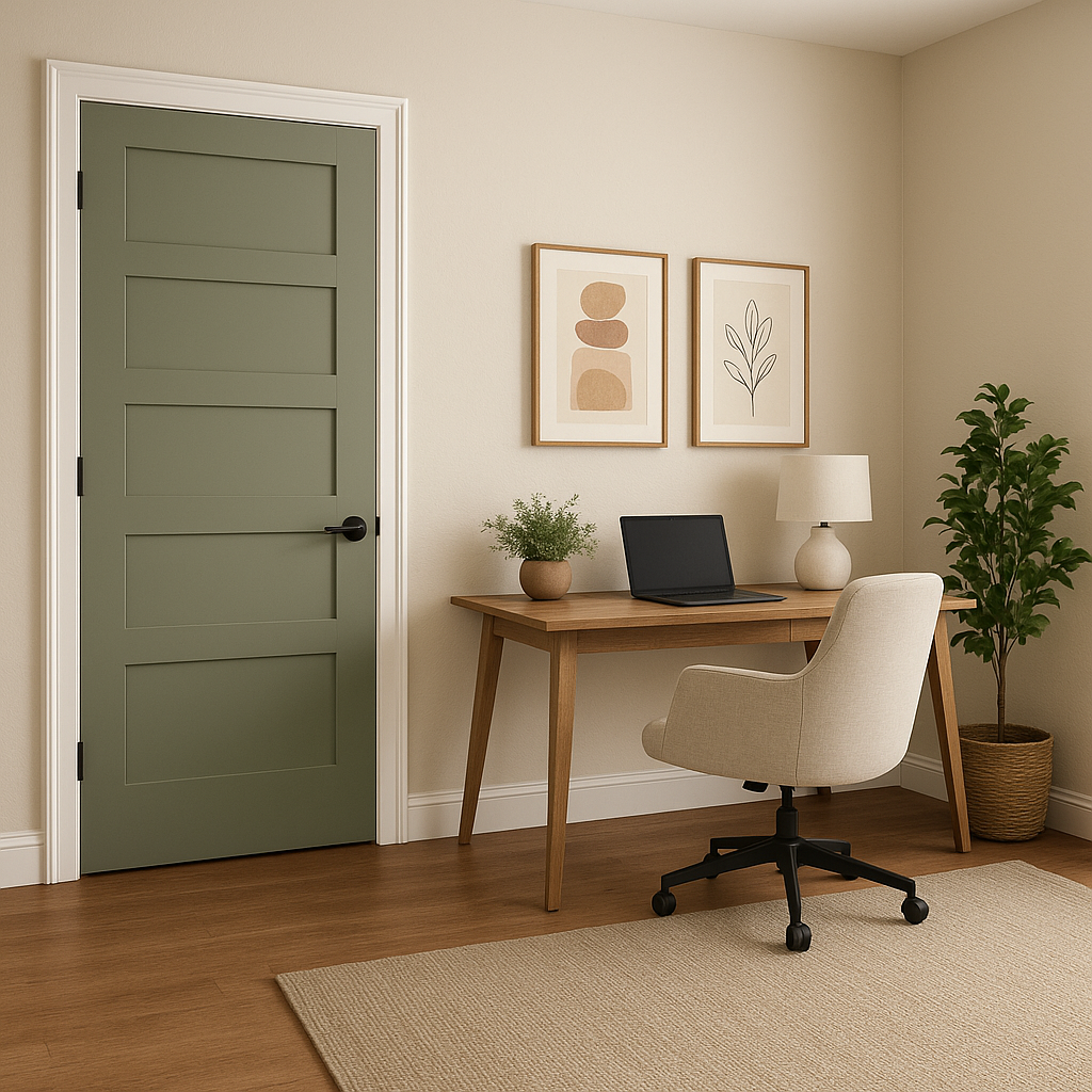
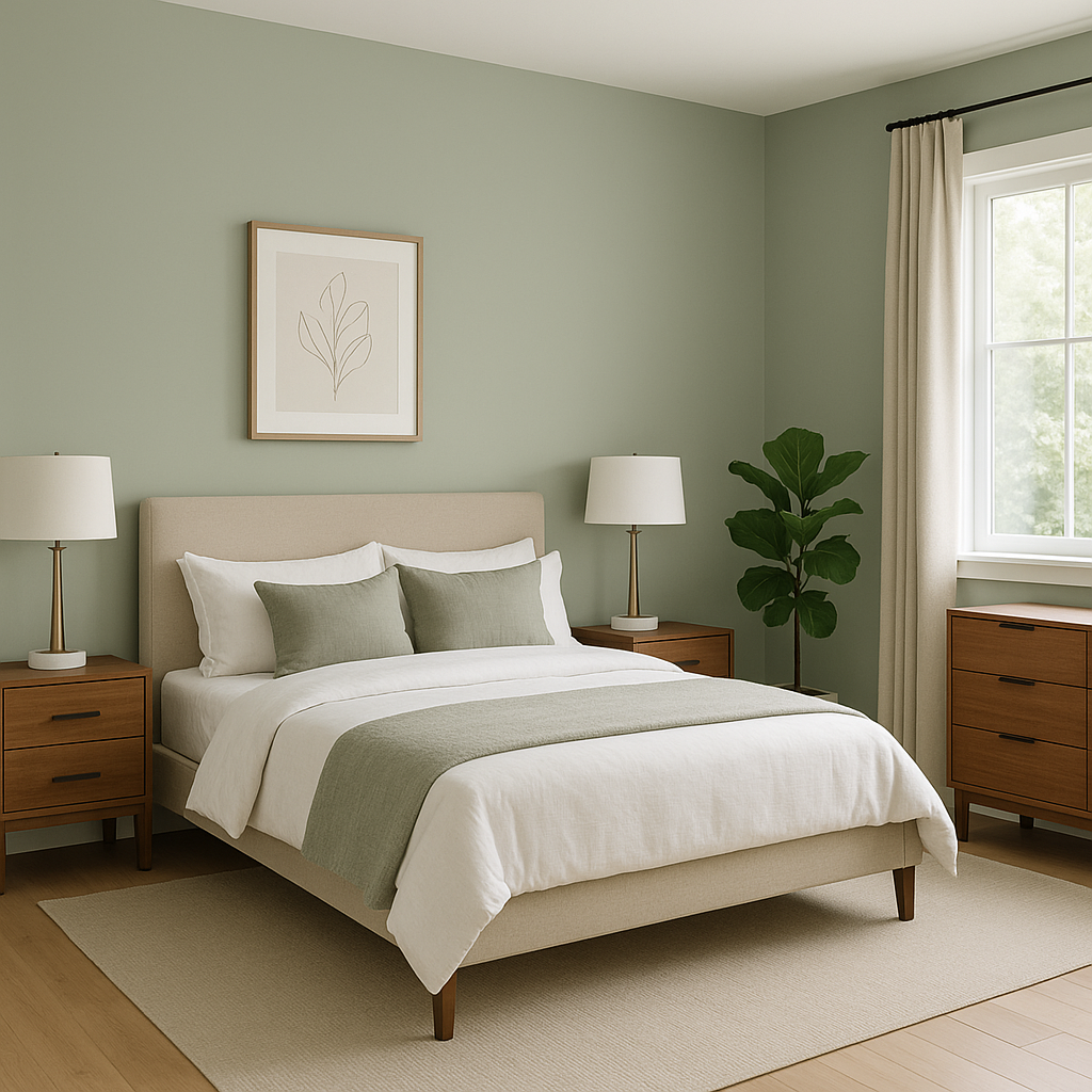
Palisades is a versatile neutral that lends itself to a variety of applications across different interior styles. Here are some of its best uses:
Palisades is more than just a paint color—it's an ambiance creator. Its timeless neutrality allows it to remain relevant through changing trends, making it a smart investment for homeowners and designers alike. Whether you're refreshing an entire home or adding a touch of elegance to a single room, its flexibility and versatility make it a standout choice.
With its warm undertones, coordinating color options, and wide range of applications, Benjamin Moore Palisades (439) is the perfect shade for those seeking a balanced, sophisticated hue that enhances the beauty of any space.
View Colors Only by Brand (No Imagery):
Sherwin-Williams
|
Benjamin-Moore
|
Behr
|
Valspar
Live on the Eastern Slope of Colorado and looking for a local painting professional, check out all our painting services and reach out for a free estimate.
Copyright © 2026 : Wild Fox Painting Inc. : 12435 Mead Way, Littleton, CO 80125


