Benjamin Moore Greenwich (445) is a deeply refined, mid-tone green that brings a sense of timeless sophistication and natural tranquility to any interior. Inspired by the lush greenery and stately charm of its namesake, Greenwich is a versatile color that bridges classic elegance and modern design. Its understated richness makes it an excellent choice for creating spaces that exude warmth, depth, and subtle drama.
Greenwich features soft gray undertones that temper its green base, giving it a muted and balanced appearance. These undertones lend the color a sense of versatility, allowing it to feel both earthy and elegant depending on the surrounding decor and lighting. In brighter spaces, Greenwich takes on a fresh and inviting character, while in dimmer rooms, its depth and richness create a cozy, enveloping atmosphere.
This shade leans neutral, making it an excellent option for designers seeking a green that doesn’t feel overly bold or overpowering. It pairs beautifully with natural textures like wood, stone, and woven materials, further enhancing its organic appeal.
Benjamin Moore Greenwich (445) harmonizes effortlessly with a variety of complementary hues, allowing it to adapt to both traditional and contemporary palettes. Consider pairing Greenwich with the following shades to create cohesive and visually stunning designs:
Greenwich’s versatility makes it suitable for a wide range of applications in interior design. Its ability to adapt to both traditional and modern aesthetics ensures it can elevate the look of any room. Here are some ideas for incorporating Greenwich into your space:
Greenwich adds depth and warmth to living rooms, creating an inviting atmosphere that feels grounded yet elegant. Pair it with plush furniture, natural wood accents, and metallic finishes to achieve a balanced, cohesive look.
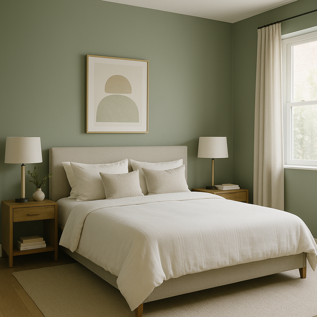
Use Greenwich on bedroom walls to foster a sense of calm and relaxation. Its muted green tones are perfect for creating a restful retreat, especially when paired with soft linens in whites or creams and wooden furniture.
For a sense of understated grandeur, Greenwich works wonderfully in dining rooms. Combine it with dark wood dining tables, brass or gold accents, and moody lighting to enhance its sophisticated vibe.
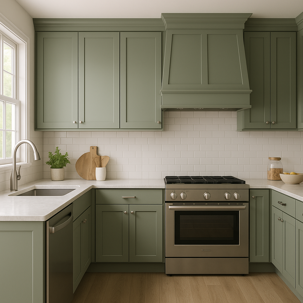
Greenwich is a stunning choice for kitchen cabinetry, especially when paired with marble countertops or subway tile backsplashes. Its soft green hue offers a fresh yet classic feel that works beautifully in both farmhouse and modern kitchens.
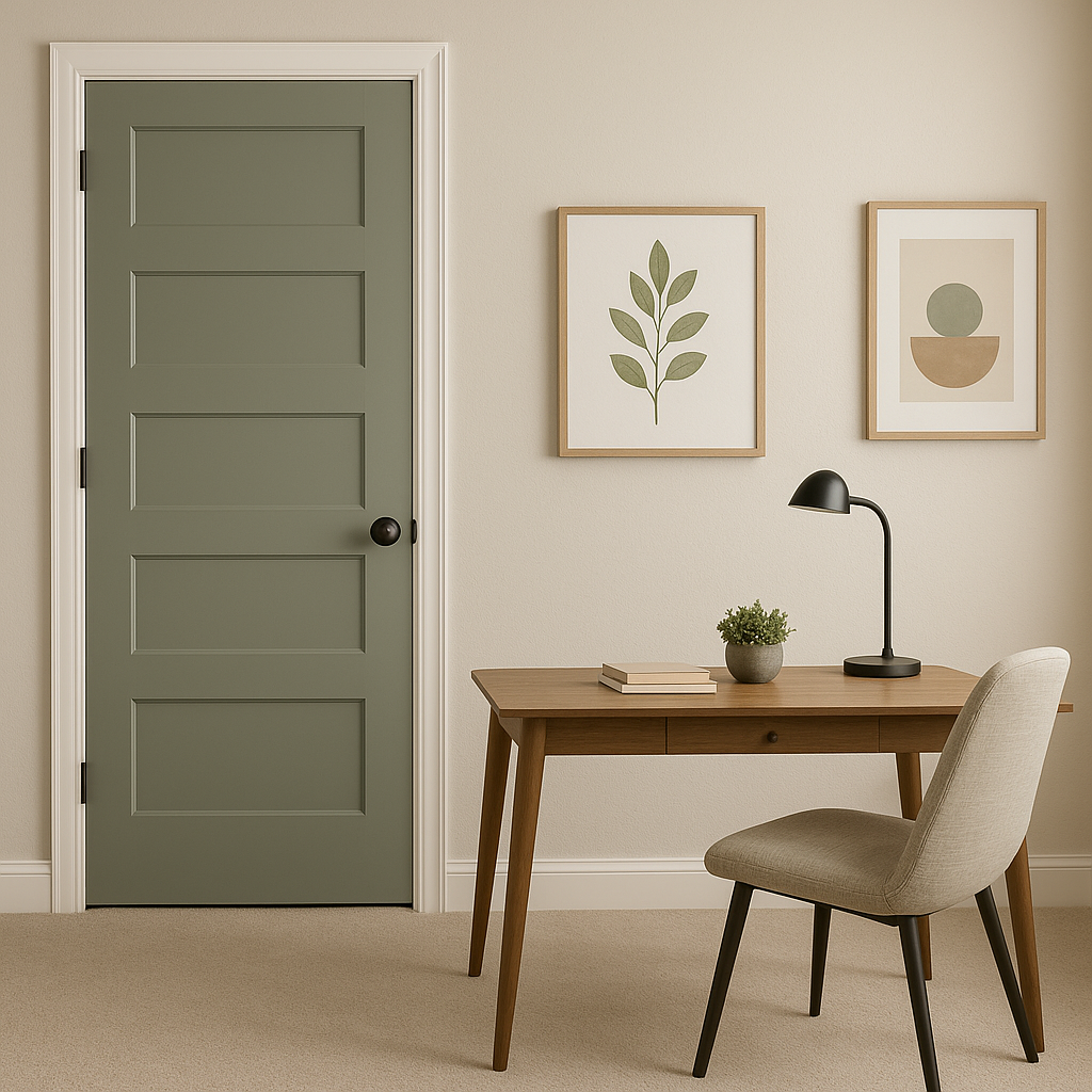
Create a focal point in any room with Greenwich as an accent wall. Whether used in an office, hallway, or reading nook, its richness draws the eye and adds personality to the space.
The appearance of Greenwich (445) can vary based on lighting conditions. In rooms with abundant natural light, the green feels brighter and more energized, while in dimmer spaces, its gray undertones emerge, lending it a moodier and more sophisticated air. To ensure the perfect result, test Greenwich in your intended space under different lighting conditions before committing to the color.
Benjamin Moore Greenwich (445) is a timeless shade that elevates interiors with its understated elegance and versatility. Whether used as a primary wall color, accent, or cabinetry shade, Greenwich’s balanced blend of green and gray undertones ensures it will remain a favorite for designers and homeowners seeking sophistication, serenity, and style.
View Colors Only by Brand (No Imagery):
Sherwin-Williams
|
Benjamin-Moore
|
Behr
|
Valspar
Live on the Eastern Slope of Colorado and looking for a local painting professional, check out all our painting services and reach out for a free estimate.
Copyright © 2026 : Wild Fox Painting Inc. : 12435 Mead Way, Littleton, CO 80125


