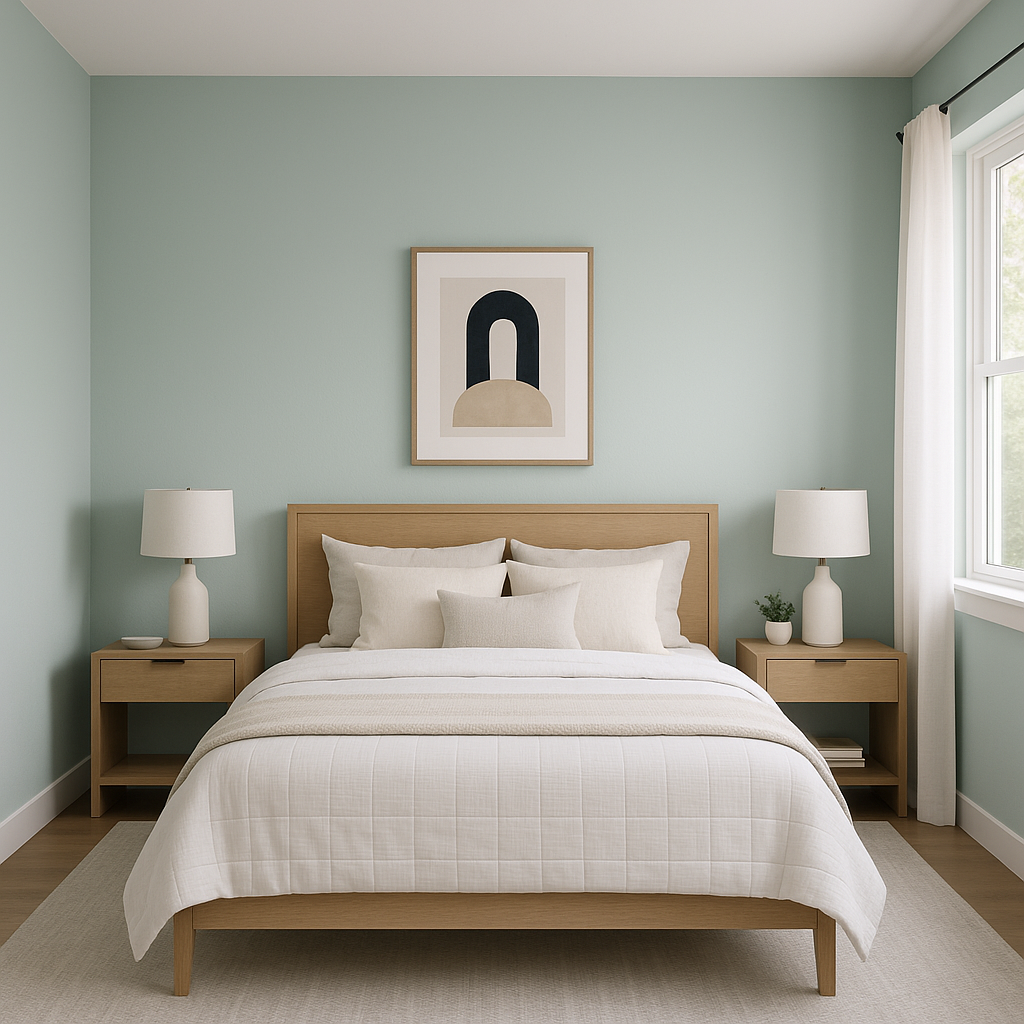
Benjamin Moore Serene 449 is a beautifully soft and understated shade that lives up to its name, evoking feelings of calm and relaxation. This tranquil hue is a pale, muted blue with subtle gray undertones, making it a versatile option for a wide range of interior design styles. Whether you're looking to create a spa-like bathroom retreat, a peaceful bedroom sanctuary, or an inviting living room, Serene 449 offers the perfect balance of color and neutrality.
At its core, Serene 449 is a light blue, but it’s the soft gray undertones that give it a sophisticated, modern edge. The gray infusion tempers the blue, preventing it from feeling overly vibrant or childish. Instead, the hue reads as airy and elegant, creating a soothing atmosphere in any room. Depending on the lighting, Serene 449 can lean slightly cooler, making it especially well-suited for rooms with ample natural light or spaces where you want to establish a sense of calm and openness.
One of the standout features of Benjamin Moore Serene 449 is its ability to coordinate seamlessly with a variety of colors, allowing for both monochromatic and contrasting schemes. Here are some complementary options to consider:
Whites and Off-Whites: Pair Serene 449 with crisp whites like Benjamin Moore Chantilly Lace (OC-65) or softer whites like White Dove (OC-17) for a clean, classic look. These whites provide a subtle contrast, enhancing the freshness of the pale blue.
Neutral Grays: To emphasize the gray undertones in Serene, consider pairing it with warm grays such as Revere Pewter (HC-172) or cooler grays like Stonington Gray (HC-170). These combinations create depth and dimension without overwhelming the space.
Soft Greens: For a nature-inspired palette, pair Serene 449 with muted green tones like Saybrook Sage (HC-114) or October Mist (1495). These shades bring a sense of organic balance and harmony.
Deeper Blues: To add contrast while staying within a cohesive color family, consider navy tones like Hale Navy (HC-154). This pairing works well in bedrooms or offices for a more dramatic yet serene effect.
Warm Accents: Add warmth to your space with earthy tones like Monroe Bisque (HC-26) or Kendall Charcoal (HC-166). These hues provide a grounded contrast while complementing the coolness of Serene 449.
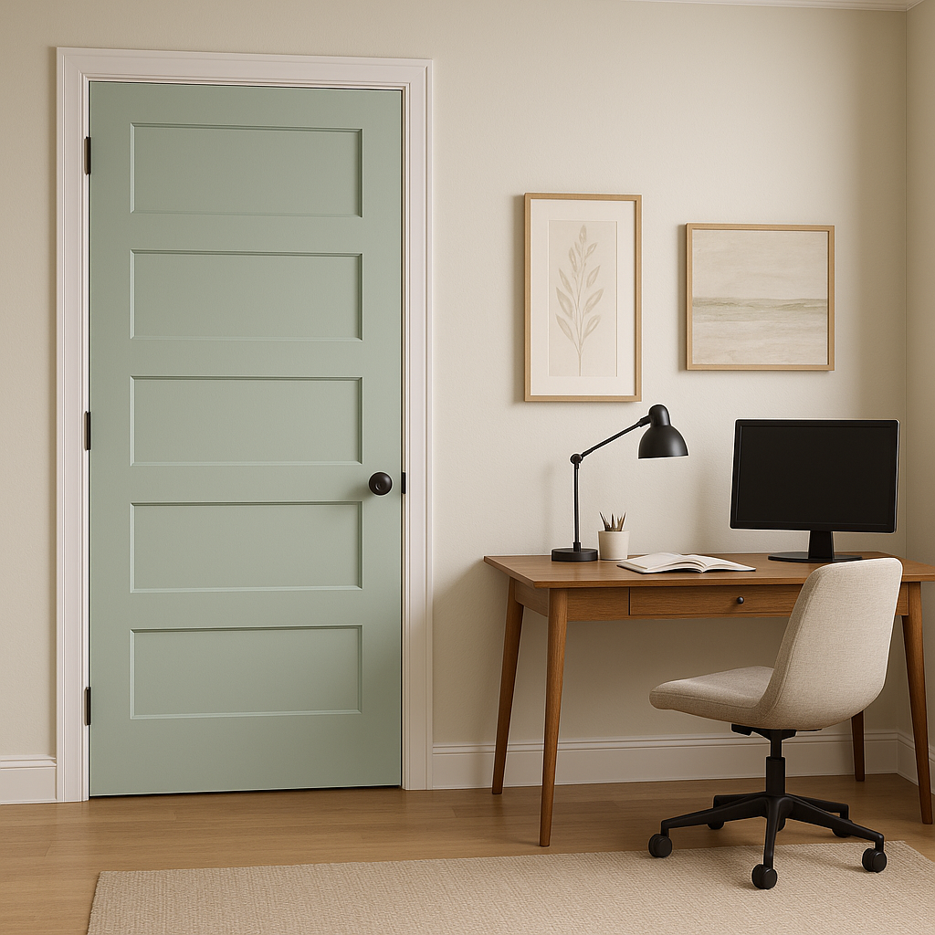
Benjamin Moore Serene 449 has a timeless and versatile quality that makes it suitable for a variety of applications throughout the home. Here are some ideas to inspire you:
Serene 449 is an excellent choice for bedrooms, where its calming presence can help create a restful retreat. Pair it with soft, plush textiles in whites or grays to amplify the soothing vibes. Add metallic accents like brushed nickel or matte gold for a touch of modern elegance.
Transform your bathroom into a spa-like haven with Serene 449. Its light and airy tone works beautifully on walls, especially when paired with white or marble finishes for vanities, tiles, and countertops. Complete the look with natural wood accents for added warmth.
In living spaces, Serene 449 offers a refreshing alternative to traditional neutrals like beige or gray. Use it as a wall color to create a serene backdrop for furniture and artwork. Pair it with soft neutrals and pops of color in throw pillows or rugs to bring balance and character to the space.
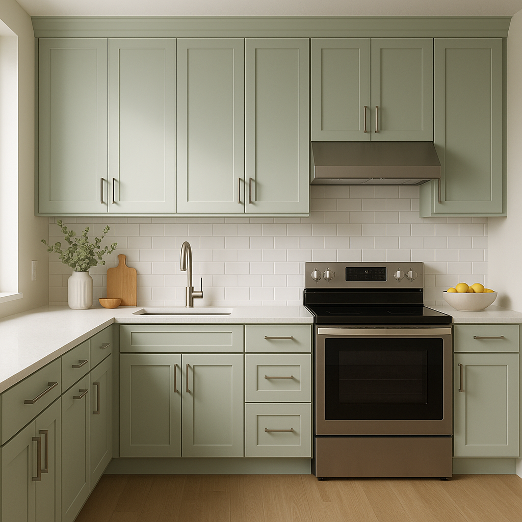
For a fresh and modern kitchen, consider using Serene 449 on cabinetry or as a wall color.
View Colors Only by Brand (No Imagery):
Sherwin-Williams
|
Benjamin-Moore
|
Behr
|
Valspar
Live on the Eastern Slope of Colorado and looking for a local painting professional, check out all our painting services and reach out for a free estimate.
Copyright © 2026 : Wild Fox Painting Inc. : 12435 Mead Way, Littleton, CO 80125


