Benjamin Moore Pine (451) is a soft, muted green that exudes a sense of calm and sophistication. This versatile shade is a beautiful blend of natural serenity and understated elegance, making it an excellent choice for a wide range of interior and exterior design applications. Its soothing quality and timeless appeal make it a go-to for anyone looking to create a harmonious and inviting space.
Pine (451) features subtle gray undertones, which soften the green and lend it a slightly earthy, grounded character. These gray undertones prevent the color from feeling overly bright or overpowering, making it an ideal choice for spaces that require a gentle, nature-inspired aesthetic. The balance between the green and gray gives the color depth and versatility, allowing it to work seamlessly in both modern and traditional settings.
Benjamin Moore Pine (451) pairs beautifully with a range of complementary and contrasting colors, giving you the flexibility to design spaces with personality and flair. Here are some excellent coordinating options:
Neutrals: Pair Pine (451) with soft neutrals like White Dove (OC-17) or Classic Gray (OC-23) for a clean, balanced look. These shades create a crisp contrast that highlights the natural beauty of Pine.
Deeper Greens: Consider pairing it with darker greens like Essex Green (HC-188) or Hunter Green (2041-10) for a monochromatic palette that feels lush and inviting.
Warm Accents: Warm beige tones, such as Edgecomb Gray (HC-173) or Revere Pewter (HC-172), complement the earthy undertones of Pine (451) and bring a touch of coziness to your space.
Soft Blues: For a serene and harmonious feel, pair Pine with soft blues like Wedgewood Gray (HC-146) or Palladian Blue (HC-144). This combination evokes a fresh, nature-inspired palette reminiscent of forests and skies.
Warm Metallics: Accents in brass, gold, or copper provide a stunning contrast to the cool undertones of Pine, adding warmth and sophistication to the overall look.
Pine (451) is a versatile color that works well in a variety of settings and applications. Here are some ideas for incorporating it into your home:
The soothing qualities of Pine (451) make it an excellent choice for living rooms and family areas. It creates a welcoming and relaxed atmosphere, whether used as a primary wall color or as an accent on built-ins, cabinets, or furniture. Pair it with natural wood tones and soft textiles for a cozy, organic look.
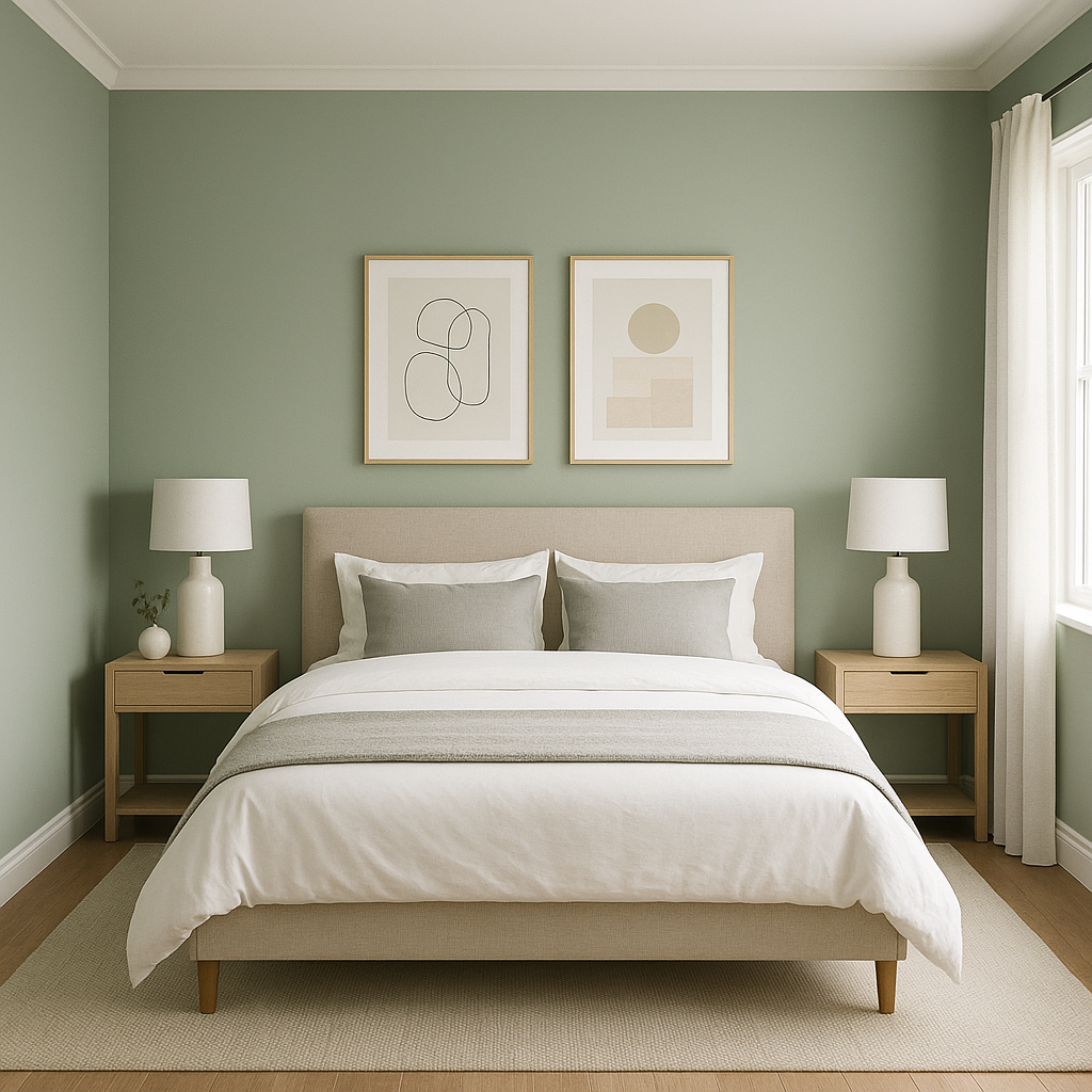
Pine (451) is perfect for bedrooms, where its calming presence promotes relaxation and restfulness. Use it on all walls for a cocooning effect, or incorporate it as an accent wall behind the bed for a subtle yet impactful statement.
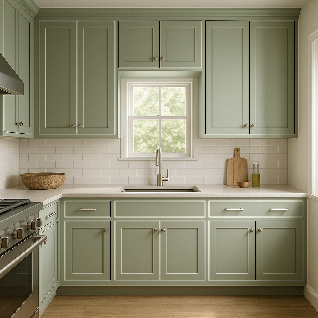
In kitchens and dining spaces, Pine (451) strikes a balance between traditional charm and modern freshness. Use it on cabinetry for a subtle pop of color, or pair it with white subway tiles and warm wood accents for a classic farmhouse vibe.
For home offices, Pine (451) provides a serene backdrop that fosters focus and creativity. Its muted tone is easy on the eyes, making it ideal for long hours spent working or studying.
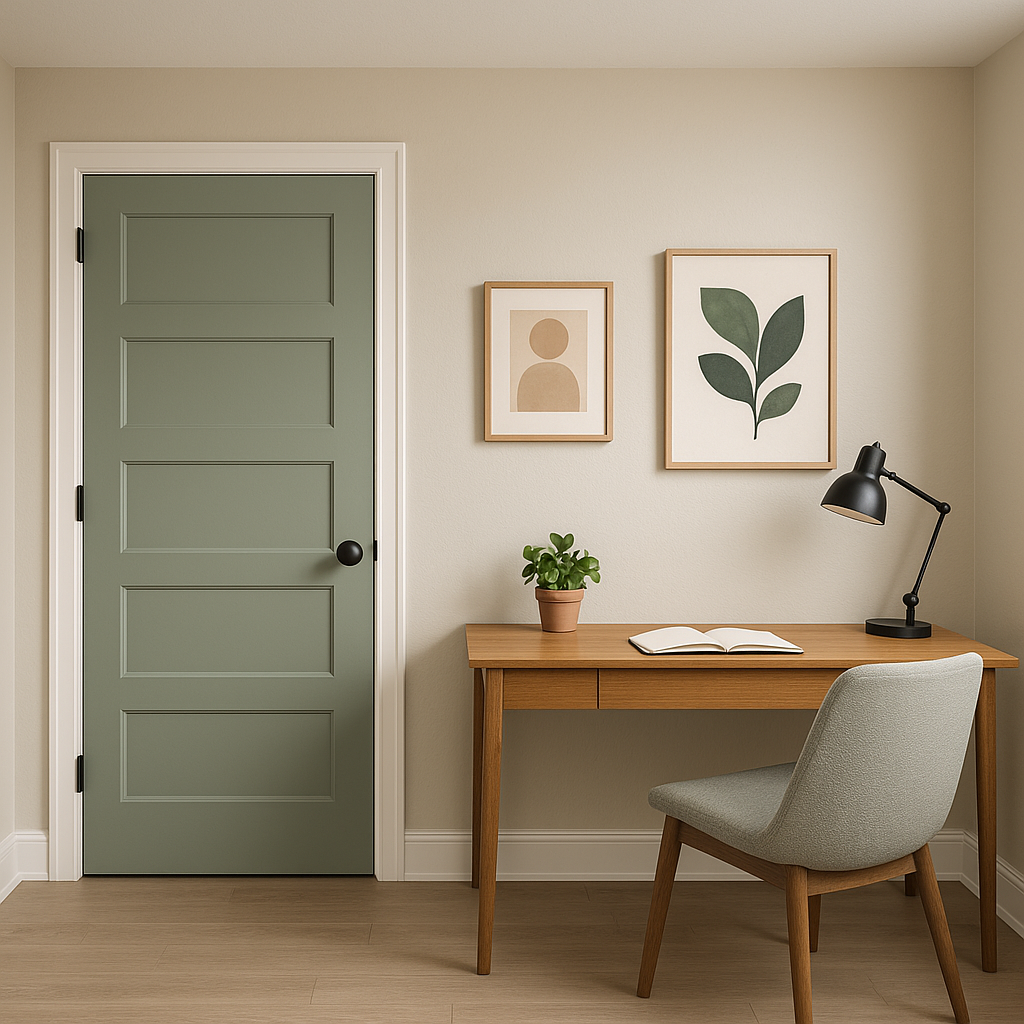
On the exterior of a home, Pine (451) blends beautifully with natural surroundings, making it a great choice for siding, shutters, or front doors. Its soft, earthy undertones ensure it looks timeless and elegant in any outdoor setting.
Benjamin Moore Pine (451) is a versatile green that embodies the tranquility of nature. Its subtle gray undertones make it adaptable to a variety of styles, from coastal and farmhouse to modern and transitional. Whether you’re looking for a serene backdrop or a color that harmonizes with other elements in your space, Pine (451) delivers effortless elegance and timeless appeal.
By pairing it with the right coordinating colors and incorporating it into thoughtful design schemes, you can create spaces that feel both fresh and inviting, making Pine (451) an enduring favorite for any home.
View Colors Only by Brand (No Imagery):
Sherwin-Williams
|
Benjamin-Moore
|
Behr
|
Valspar
Live on the Eastern Slope of Colorado and looking for a local painting professional, check out all our painting services and reach out for a free estimate.
Copyright © 2026 : Wild Fox Painting Inc. : 12435 Mead Way, Littleton, CO 80125


