Benjamin Moore Thornton (464) is an inviting and versatile neutral that lends an air of sophistication to any space. This paint color is a soft beige with subtle golden undertones that exude warmth and charm. Its timeless appeal makes it an ideal choice for both traditional and contemporary interiors, offering a harmonious balance between cool and warm tones. Thornton (464) creates a cozy ambiance and serves as a dependable backdrop to showcase other design elements.
Thornton is notable for its gentle warm undertones, primarily golden beige, which soften its appearance and allow it to adapt seamlessly to various lighting conditions. In spaces with ample natural light, Thornton’s warmth becomes more pronounced, creating an inviting and sunlit glow. In rooms with cooler artificial lighting, the golden undertones are slightly subdued, resulting in a more neutral effect.
This adaptability makes Thornton (464) an excellent choice for spaces that transition between day and evening lighting. Its ability to complement a wide variety of textures and finishes ensures that it remains a favorite among interior designers looking for a versatile paint color.
Thornton (464) pairs beautifully with a curated selection of coordinating colors, allowing you to create cohesive and visually stunning palettes. Here are some suggestions:
By combining Thornton with these hues, you can create a balanced aesthetic that feels both inviting and refined.
Thornton (464) is a highly adaptable paint color that works beautifully in a variety of settings. Here are some popular applications:
Thornton is a perfect choice for living rooms, where its warm undertones create a welcoming environment. Pair it with natural wood furniture and soft textiles like linen to enhance its cozy appeal.
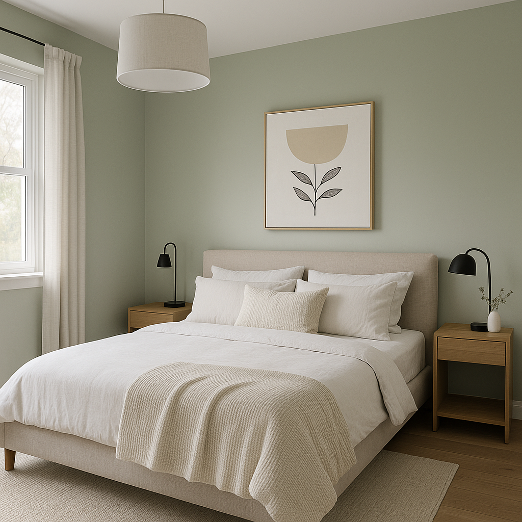
In bedrooms, Thornton serves as a soothing neutral that promotes relaxation. Complement it with soft pastels or darker accent colors for a serene yet stylish retreat.
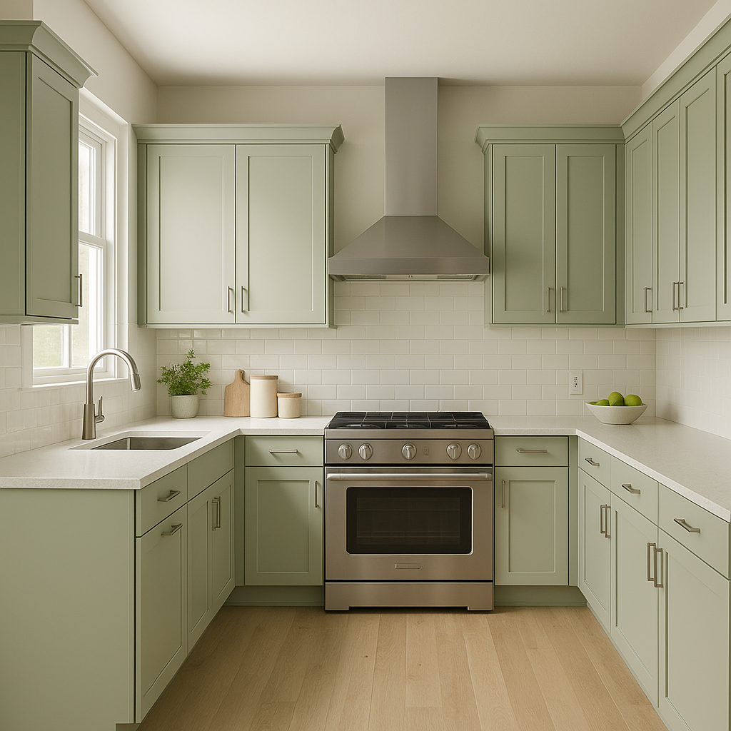
For kitchens, Thornton provides a neutral backdrop that allows cabinetry, countertops, and backsplash materials to shine. Pair it with crisp white trim or bold accent colors for a polished look.
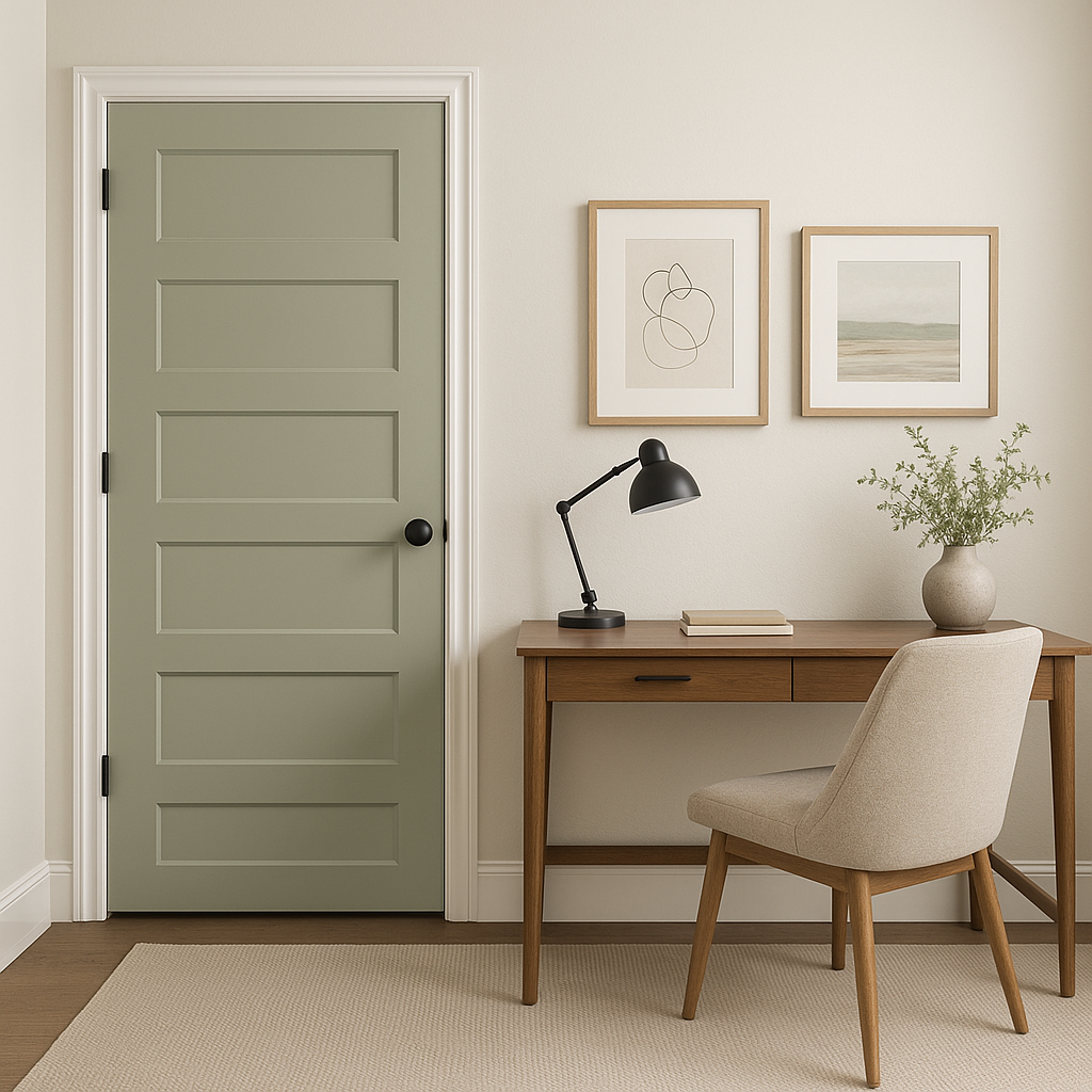
Thornton is an excellent option for transitional spaces like hallways and entryways. Its understated elegance makes it ideal for connecting different rooms while maintaining a cohesive flow.
In home offices, Thornton fosters focus and productivity. Its warm yet neutral tone pairs effortlessly with wood accents, metallic finishes, or greenery for a balanced workspace.
Benjamin Moore Thornton (464) is a warm beige paint color with subtle golden undertones, perfect for creating cozy and elegant interiors. Its versatility makes it ideal for living rooms, bedrooms, kitchens, hallways, and home offices. Coordinating colors such as White Dove (OC-17), Hale Navy (HC-154), and Saybrook Sage (HC-114) enhance Thornton’s charm, allowing for a variety of design possibilities. Whether you’re aiming for a traditional aesthetic or a modern vibe, Thornton (464) adapts beautifully to different lighting and décor styles.
View Colors Only by Brand (No Imagery):
Sherwin-Williams
|
Benjamin-Moore
|
Behr
|
Valspar
Live on the Eastern Slope of Colorado and looking for a local painting professional, check out all our painting services and reach out for a free estimate.
Copyright © 2026 : Wild Fox Painting Inc. : 12435 Mead Way, Littleton, CO 80125


