Benjamin Moore Liberty (487) is a captivating green paint color that embodies a sense of refinement and timeless charm. With its balanced blend of cool and warm undertones, Liberty is a versatile shade that can be used to create serene environments or dramatic accents. Whether you're designing a cozy living room, a sophisticated office, or a tranquil bedroom, Liberty (487) offers the perfect balance of richness and subtlety to elevate your interiors.
Liberty (487) is a medium green with distinctive gray undertones, which lend it a muted, sophisticated quality. The gray component softens the vibrancy of the green, making it feel grounded and elegant rather than overly bright or overpowering. It also has subtle hints of blue, which add to its cool and calming nature, making it an excellent choice for spaces where relaxation is key.
These undertones give Liberty the ability to adapt beautifully to different lighting conditions. In natural daylight, the green feels fresh and earthy, while under artificial lighting, the gray undertones emerge, providing a more subdued and formal look.
Benjamin Moore Liberty (487) pairs effortlessly with a range of complementary colors, making it a versatile option for various design styles. Here are some excellent coordinating colors to consider:
Neutral Pairings:
Combine Liberty with warm neutrals like Benjamin Moore White Dove (OC-17) or Benjamin Moore Revere Pewter (HC-172) for a harmonious, timeless palette. These soft tones provide a gentle contrast that allows the green to shine without overwhelming the space.
Rich Contrasts:
For a more dramatic effect, pair Liberty with deep charcoal shades like Benjamin Moore Kendall Charcoal (HC-166) or Benjamin Moore Black Satin (2131-10). This creates a bold, modern look that feels both luxurious and grounded.
Earthy Complements:
Enhance the organic feel of Liberty by coordinating it with warm browns and terracottas such as Benjamin Moore Rustic Taupe (2166-50) or Benjamin Moore Texas Leather (AC-3). This combination evokes the beauty of nature and works wonderfully in rustic or farmhouse-inspired interiors.
Pop of Brightness:
Add a touch of vibrancy by pairing Liberty with crisp whites like Benjamin Moore Chantilly Lace (OC-65) or soft yellows like Benjamin Moore Hawthorne Yellow (HC-4). These accents can create a cheerful and airy atmosphere without detracting from Liberty’s elegance.
Liberty (487) is a versatile choice that can be used in a variety of settings and applications, from walls and cabinetry to accent furniture. Here are some creative ways to incorporate this timeless green into your home or office:
Living Room:
Use Liberty on the walls of your living room to create a cozy and sophisticated retreat. Pair it with neutral furnishings and natural textures like linen, wood, or jute to emphasize its earthy undertones.
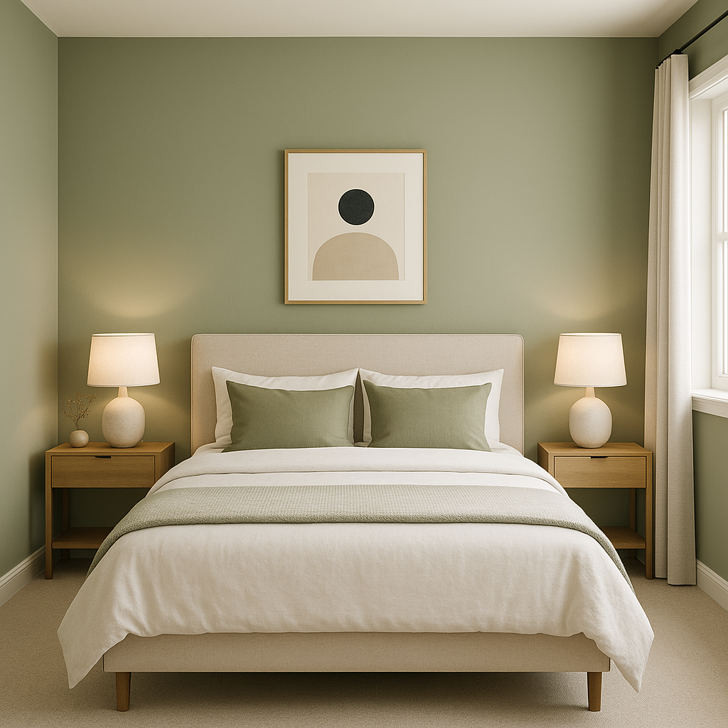
Bedroom:
As a calming color, Liberty is ideal for bedrooms. Painting an accent wall in Liberty can provide depth and tranquility, while pairing it with soft bedding in whites or grays completes the serene look.
Home Office:
Encourage focus and productivity by using Liberty in your workspace. Its muted green tones promote concentration while adding an air of sophistication, especially when paired with sleek black or metallic finishes.
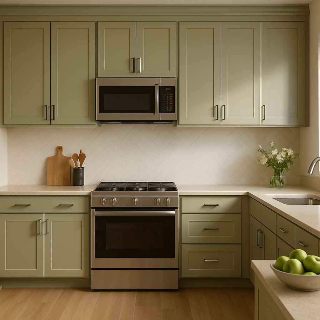
Kitchen Cabinetry:
For a modern yet timeless kitchen, consider Liberty for your cabinetry. Its understated elegance works beautifully with white marble countertops, brushed brass hardware, and wood flooring for a high-end look.
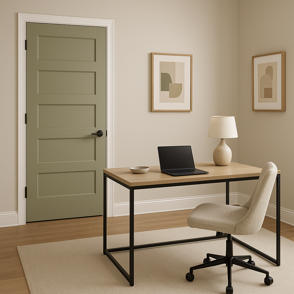
Accent Color:
If you’re not ready to commit to Liberty as a primary wall color, consider using it as an accent. Paint a piece of furniture, a bookshelf, or even your front door in Liberty to introduce its refined charm in smaller doses.
Benjamin Moore Liberty (487) is more than just a paint color—it’s an invitation to bring a sense of calm sophistication into your space. With its unique blend of gray and green undertones, it adapts to various design styles and lighting conditions, making it a favorite among interior designers. Whether you’re looking to create a soothing retreat or a bold statement, Liberty is a timeless choice that will elevate your interiors for years to come.
View Colors Only by Brand (No Imagery):
Sherwin-Williams
|
Benjamin-Moore
|
Behr
|
Valspar
Live on the Eastern Slope of Colorado and looking for a local painting professional, check out all our painting services and reach out for a free estimate.
Copyright © 2026 : Wild Fox Painting Inc. : 12435 Mead Way, Littleton, CO 80125


