Benjamin Moore Oak (489) is a versatile earthy neutral that evokes a sense of warmth and understated sophistication. This soft, muted shade sits comfortably between beige and taupe, making it an excellent choice for creating a cozy, grounded atmosphere in any space. Its timeless appeal and ability to adapt to a wide range of design styles make Oak (489) a go-to color for both traditional and modern interiors.
One of the standout features of Benjamin Moore Oak (489) is its subtle undertones. This color leans toward warm tones, with delicate hints of brown and a whisper of gray. These undertones help Oak (489) strike the perfect balance—neither too warm nor too cool—which makes it a delightfully versatile option. The gray undertones prevent it from feeling overly yellow or golden, ensuring it maintains a sophisticated and neutral appearance in various lighting conditions.
Benjamin Moore Oak (489) pairs beautifully with a range of coordinating colors, allowing you to create a cohesive and harmonious look throughout your home. Here are some suggestions for complementary colors:
Crisp Whites: Pair Oak (489) with clean whites like Benjamin Moore Chantilly Lace (OC-65) or Simply White (OC-117) for a fresh and airy aesthetic. These whites provide a bright contrast that enhances the warmth of Oak (489).
Earthy Greens: If you're drawn to nature-inspired palettes, consider pairing Oak (489) with muted greens like Saybrook Sage (HC-114) or Soft Fern (2144-40). These tones highlight the organic, earthy qualities of Oak (489) and create a serene, calming environment.
Deep Charcoals and Browns: For a more dramatic look, try darker shades like Kendall Charcoal (HC-166) or Mink (2112-10). These rich tones add depth and sophistication, making Oak (489) a beautiful backdrop for bold accents.
Soft Blues: Light blues like Palladian Blue (HC-144) or Silver Mist (1619) can create a subtle contrast that feels refreshing and tranquil, perfect for bedrooms or bathrooms.
Benjamin Moore Oak (489) is an incredibly adaptable shade that works well in various settings, from walls to cabinetry. Here are some ideas for incorporating this color into your home:
Oak (489) is ideal for living rooms and family spaces, where its warm and inviting nature can make gatherings feel even cozier. It pairs beautifully with both light and dark furnishings, making it easy to create a layered, textured look. Add plush textiles and natural wood accents to elevate the warmth and comfort of the space.
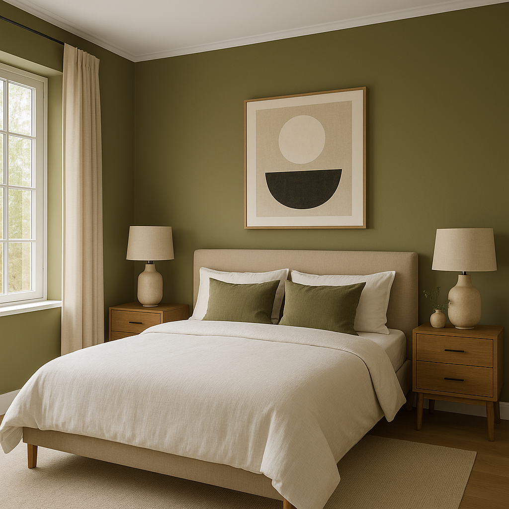
This calming neutral is perfect for bedrooms, where it promotes relaxation and tranquility. Pair it with soft, neutral bedding and light curtains for a serene retreat, or add pops of color with throw pillows and artwork to personalize the space.
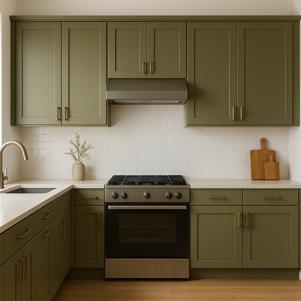
Oak (489) is an excellent choice for kitchens and dining areas, especially when paired with white cabinetry or natural wood finishes. It’s a classic yet contemporary color that provides a clean, polished look. Consider using it on walls or even as an accent on an island or pantry door.
The subtle gray undertones in Oak (489) make it a great choice for bathrooms, where it can create a spa-like ambiance. Pair it with crisp white tiles, brushed nickel hardware, and soft blue or green accents for a fresh, elegant feel.
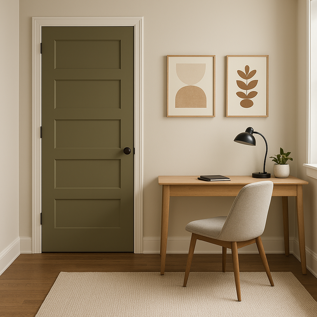
Oak (489) works wonderfully in transitional spaces like hallways and entryways, where its neutral nature provides a seamless flow between rooms. Its warm undertones help these areas feel welcoming and cohesive.
As with any paint color, lighting plays a significant role in how Benjamin Moore Oak (489) appears in a space. In rooms with ample natural light, Oak (489) tends to look softer and slightly warmer. In spaces with limited lighting, its gray undertones may become more pronounced, lending a cooler, more subdued vibe. Always test the color in your space before committing to see how it interacts with your specific lighting conditions.
Benjamin Moore Oak (489) is a timeless, versatile neutral that offers endless design possibilities. Whether you’re creating a warm and inviting living room or a serene and tranquil bedroom, this shade is sure to provide the perfect backdrop for your interior design vision. With its balanced undertones, coordination with a wide range of colors, and ability to complement various styles, Oak (489) is a foolproof choice for any home.
View Colors Only by Brand (No Imagery):
Sherwin-Williams
|
Benjamin-Moore
|
Behr
|
Valspar
Live on the Eastern Slope of Colorado and looking for a local painting professional, check out all our painting services and reach out for a free estimate.
Copyright © 2026 : Wild Fox Painting Inc. : 12435 Mead Way, Littleton, CO 80125


