Benjamin Moore Harbor (493) is a strikingly elegant color that captures the essence of tranquility and sophistication. This rich green-blue hue evokes images of serene coastal waters, making it the perfect choice for spaces seeking a calming yet refined ambiance. Harbor (493) is a versatile shade that effortlessly transitions from contemporary to traditional design, allowing it to fit seamlessly into a wide variety of aesthetics.
Harbor (493) is a complex color that beautifully balances the interplay between green and blue. Its subtle gray undertones lend it a muted, almost smoky depth, ensuring it never feels too bold or overpowering. The gray infusion softens the vibrancy of the green-blue blend, creating a sophisticated and understated look. These undertones make Harbor (493) an excellent choice for spaces that need a calming, natural vibe without sacrificing elegance.
Pairing Harbor (493) with complementary colors can enhance its beauty and versatility in any space. Here are some suggestions:
Harbor (493) is a versatile shade that works beautifully in various applications throughout your home. Its calming yet confident presence makes it suitable for both large-scale projects and accent details.
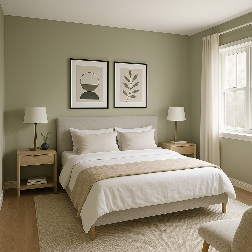
Use Harbor as the main wall color in living rooms or bedrooms to create a serene retreat. This shade pairs beautifully with natural wood tones and soft textiles, making it ideal for spaces designed for relaxation.
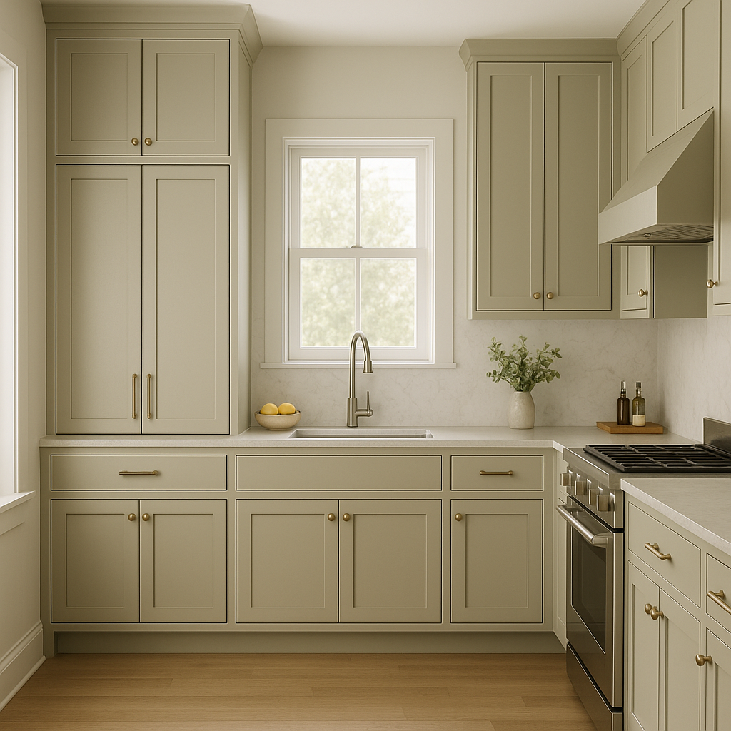
Harbor can bring character and charm to kitchens and dining rooms. Consider using it on cabinetry or a feature wall to add depth and visual interest. Pair it with marble countertops and brass hardware for a luxurious yet inviting feel.
Harbor’s coastal-inspired vibe is perfect for bathrooms. Use it on walls or vanity cabinets to evoke a spa-like atmosphere. Combine it with crisp white tiles and chrome finishes for a fresh, clean look.
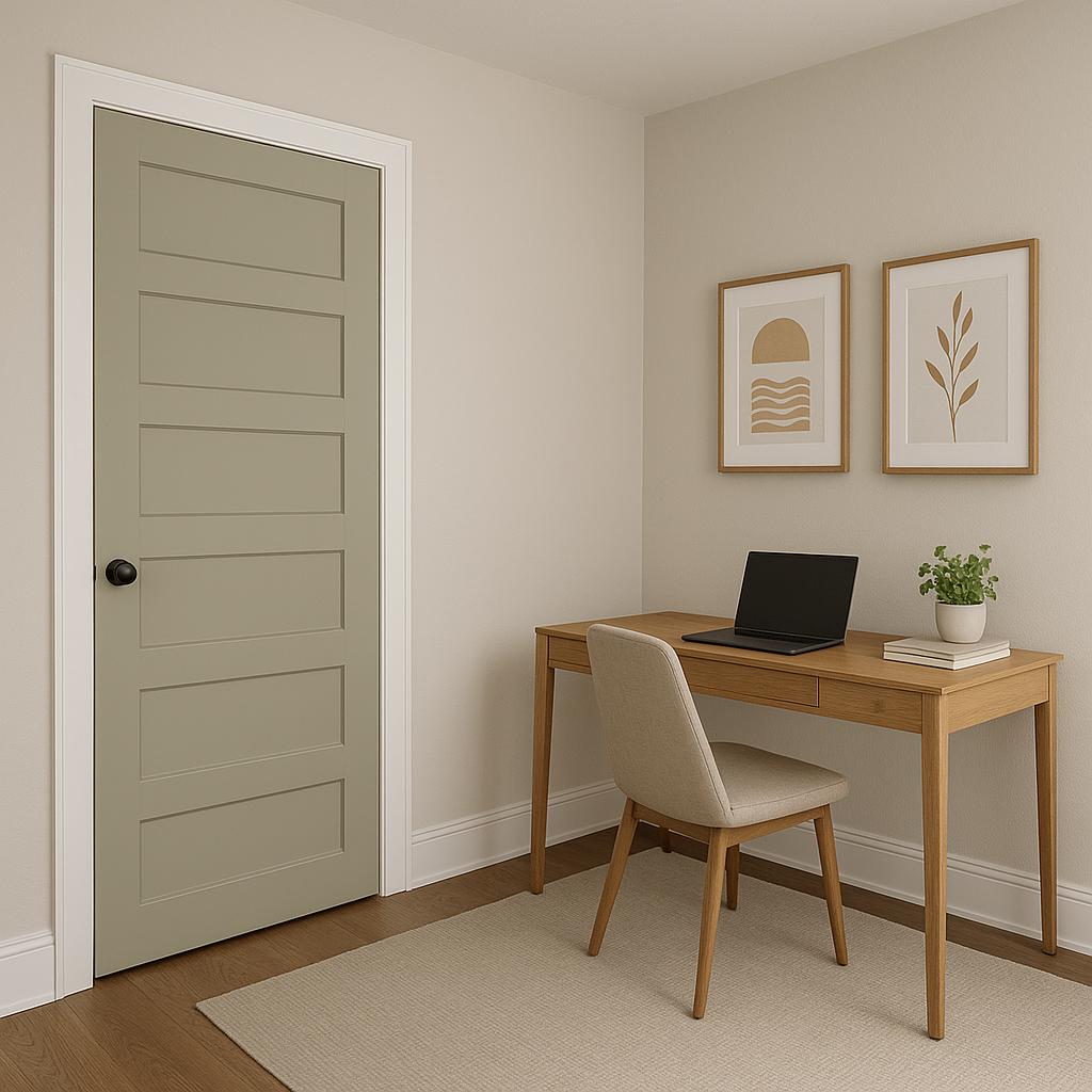
Harbor (493) is also a wonderful choice for exteriors, whether on shutters, doors, or siding. Its muted tone harmonizes with natural landscapes, making it a timeless option for curb appeal.
If you’re hesitant about bold color commitments, use Harbor (493) on smaller accents like furniture, trim, or decorative pieces. A painted bookshelf or console table in Harbor can add just the right touch of sophistication to any room.
Benjamin Moore Harbor (493) is more than just a color—it's an experience. Its refined blend of green, blue, and gray creates a versatile hue that feels both grounded and uplifting. Whether you’re designing a coastal-inspired retreat or a chic urban oasis, Harbor (493) provides the perfect balance of depth and softness, ensuring your space feels timeless and inviting.
View Colors Only by Brand (No Imagery):
Sherwin-Williams
|
Benjamin-Moore
|
Behr
|
Valspar
Live on the Eastern Slope of Colorado and looking for a local painting professional, check out all our painting services and reach out for a free estimate.
Copyright © 2026 : Wild Fox Painting Inc. : 12435 Mead Way, Littleton, CO 80125


