Benjamin Moore Nantucket (521) is a timeless and versatile neutral that exudes understated sophistication. This soft, muted gray-brown strikes the perfect balance between warmth and coolness, making it an ideal choice for creating serene, inviting spaces. Whether you're designing a modern retreat or a classic interior, Nantucket delivers a refined look that complements a wide range of styles.
Nantucket features subtle undertones of taupe and gray, which provide its unique character. These undertones lend the color a chameleon-like quality, allowing it to shift slightly depending on lighting conditions and surrounding decor. In rooms with natural light, Nantucket may appear warmer, showcasing its brownish taupe notes. In spaces with cooler artificial lighting, the gray undertones become more prominent, giving it a clean and contemporary feel. This adaptability makes Nantucket a favorite among interior designers seeking a neutral with depth and personality.
Pairing Benjamin Moore Nantucket (521) with complementary colors can elevate your design and create a cohesive look throughout your space. Here are some coordinating colors to consider:
These coordinating colors allow for flexibility in your design, whether you’re aiming for a neutral palette or incorporating bold accents.
Nantucket’s versatility makes it suitable for a variety of applications, from walls to furniture pieces. Here are some ideas for using this elegant neutral in your home:
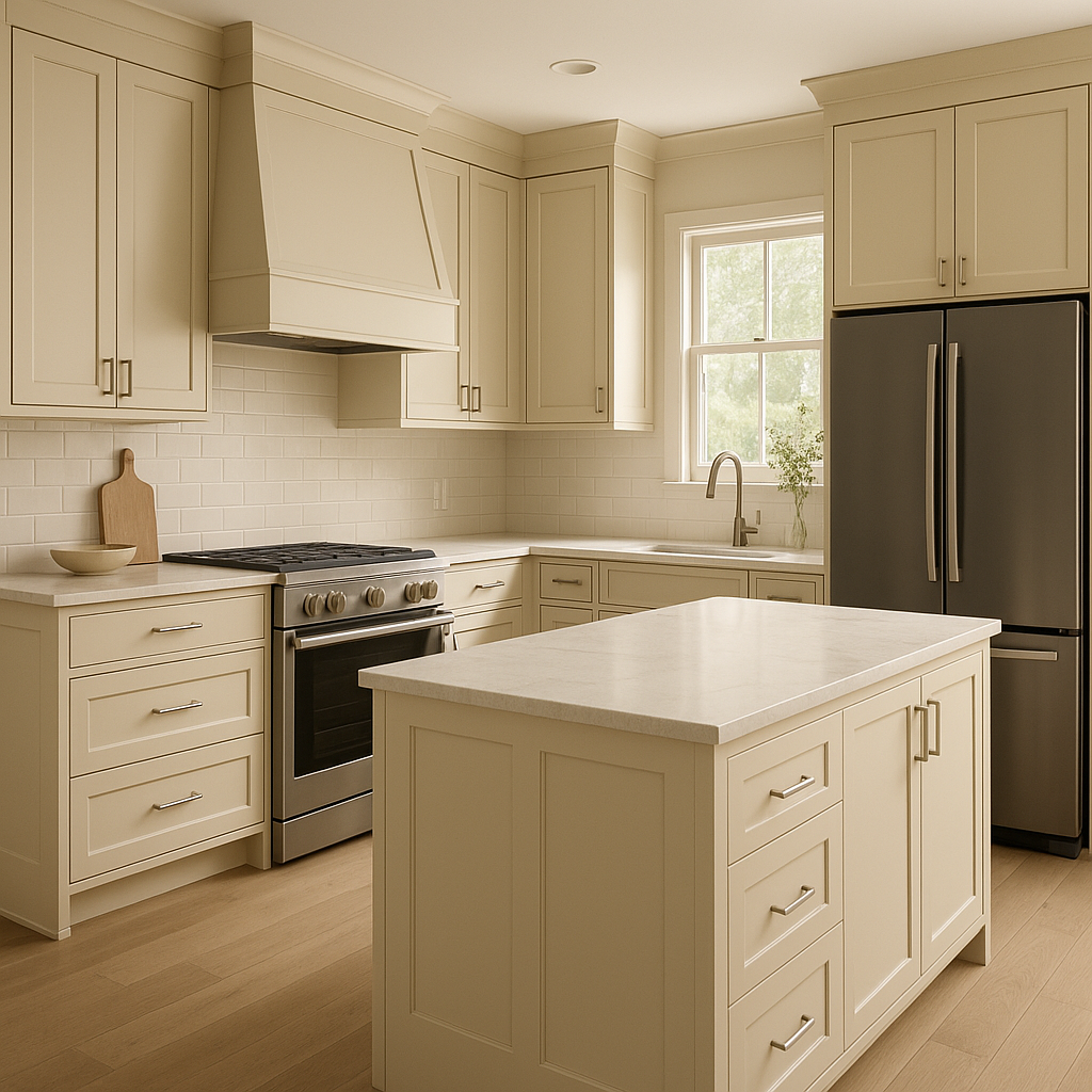
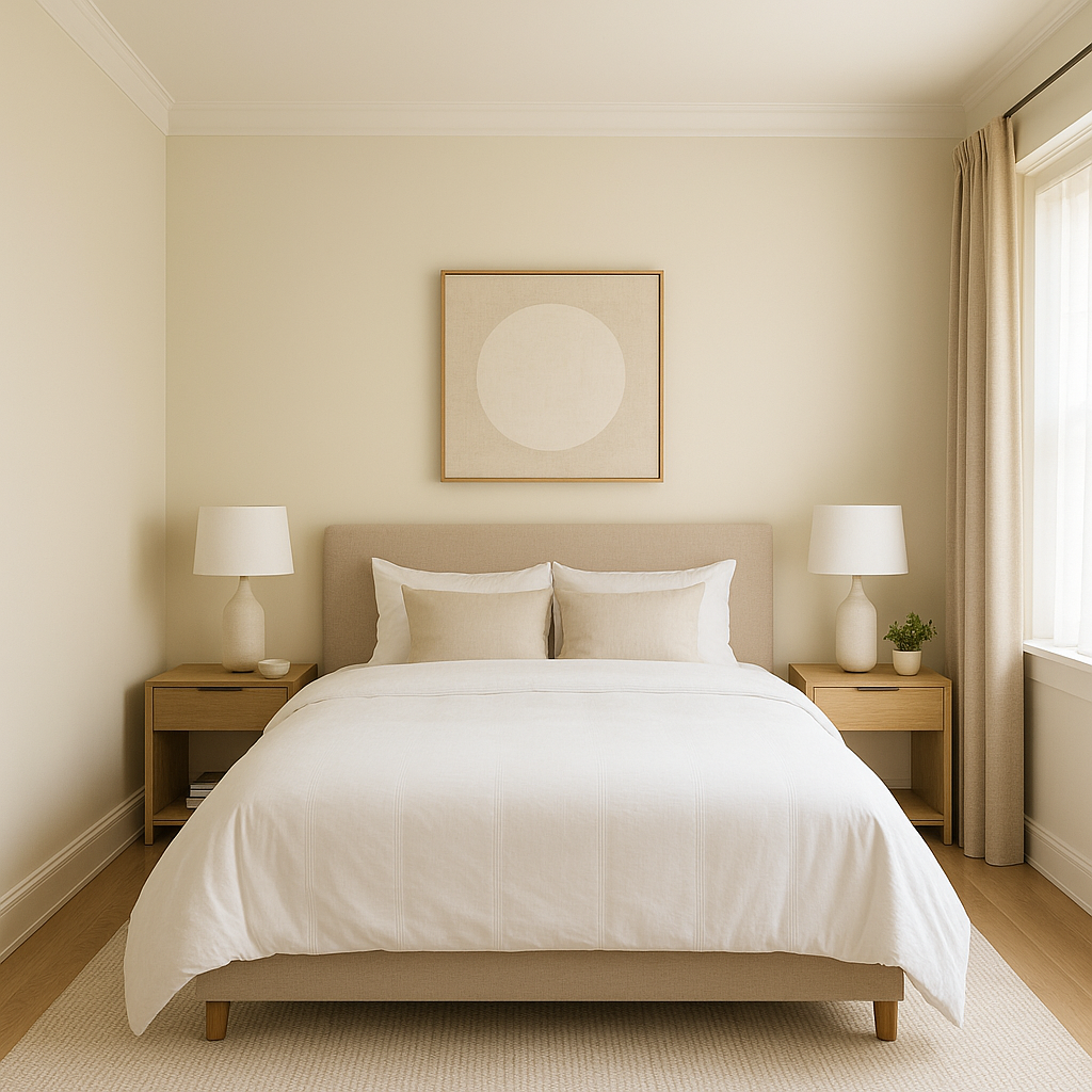
Nantucket is a stunning choice for walls in living rooms, bedrooms, dining areas, and offices. Its warm undertones create a cozy atmosphere, while its gray base keeps spaces feeling modern and fresh. Use it as the main wall color to establish a serene and sophisticated foundation for your room.
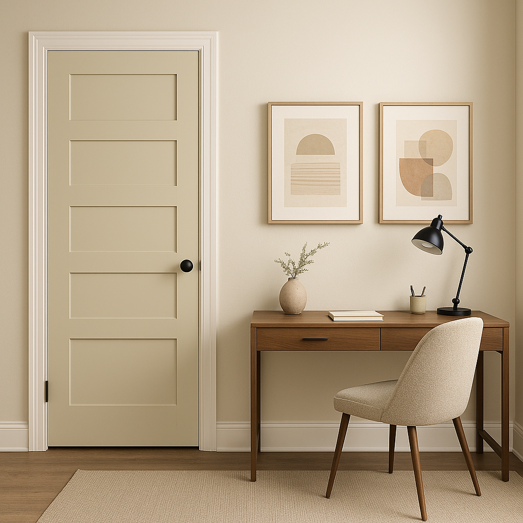
For a unique twist, consider using Nantucket for trim, moldings, or cabinetry. Paired with a lighter wall color like White Dove, this combination adds visual interest and a subtle contrast that feels luxurious and refined.
Nantucket can also serve as an accent color in spaces with lighter main hues. Use it to highlight architectural features or built-in shelving, or pair it with textured materials like reclaimed wood or brushed metals for a rustic yet polished look.
This neutral works beautifully for exterior siding, shutters, or doors. Its muted tone complements both modern and traditional architectural styles, enhancing curb appeal without overwhelming the design.
Nantucket can be incorporated into furniture finishes or soft furnishings like upholstered chairs, throw pillows, or area rugs. Its adaptability ensures it coordinates effortlessly with a wide range of fabrics, textures, and patterns.
Benjamin Moore Nantucket (521) is a masterful blend of warmth and coolness, offering a perfect neutral for spaces that need a touch of sophistication without feeling too stark or sterile. Its taupe-gray undertones provide depth and versatility, allowing you to pair it with an array of complementary shades and textures. Whether you’re designing a cozy retreat or a polished urban space, Nantucket delivers timeless elegance that adapts beautifully to your unique style.
View Colors Only by Brand (No Imagery):
Sherwin-Williams
|
Benjamin-Moore
|
Behr
|
Valspar
Live on the Eastern Slope of Colorado and looking for a local painting professional, check out all our painting services and reach out for a free estimate.
Copyright © 2026 : Wild Fox Painting Inc. : 12435 Mead Way, Littleton, CO 80125


