Benjamin Moore Ponderosa (531) is a rich, sophisticated green that exudes warmth and tranquility. Perfectly blending earthy tones with a subtle refined edge, this color creates a harmonious atmosphere in any space. Whether you're designing a cozy retreat or a bold, nature-inspired statement room, Ponderosa delivers an unparalleled depth that transforms interiors.
Ponderosa (531) carries deep forest green undertones, complemented by hints of muted brown and olive. These undertones imbue the color with a grounded, organic essence, making it an ideal choice for spaces that evoke comfort and connection to nature. Its earthy base ensures versatility, allowing it to adapt to a variety of design styles, from rustic to modern.
The subtle brown undertones soften its boldness, making Ponderosa approachable while retaining its dramatic impact. The olive influence lends a sophisticated edge, creating a color that feels timeless yet contemporary.
Benjamin Moore Ponderosa pairs beautifully with a range of coordinating colors, enabling you to create dynamic yet cohesive palettes. Here are some suggestions:
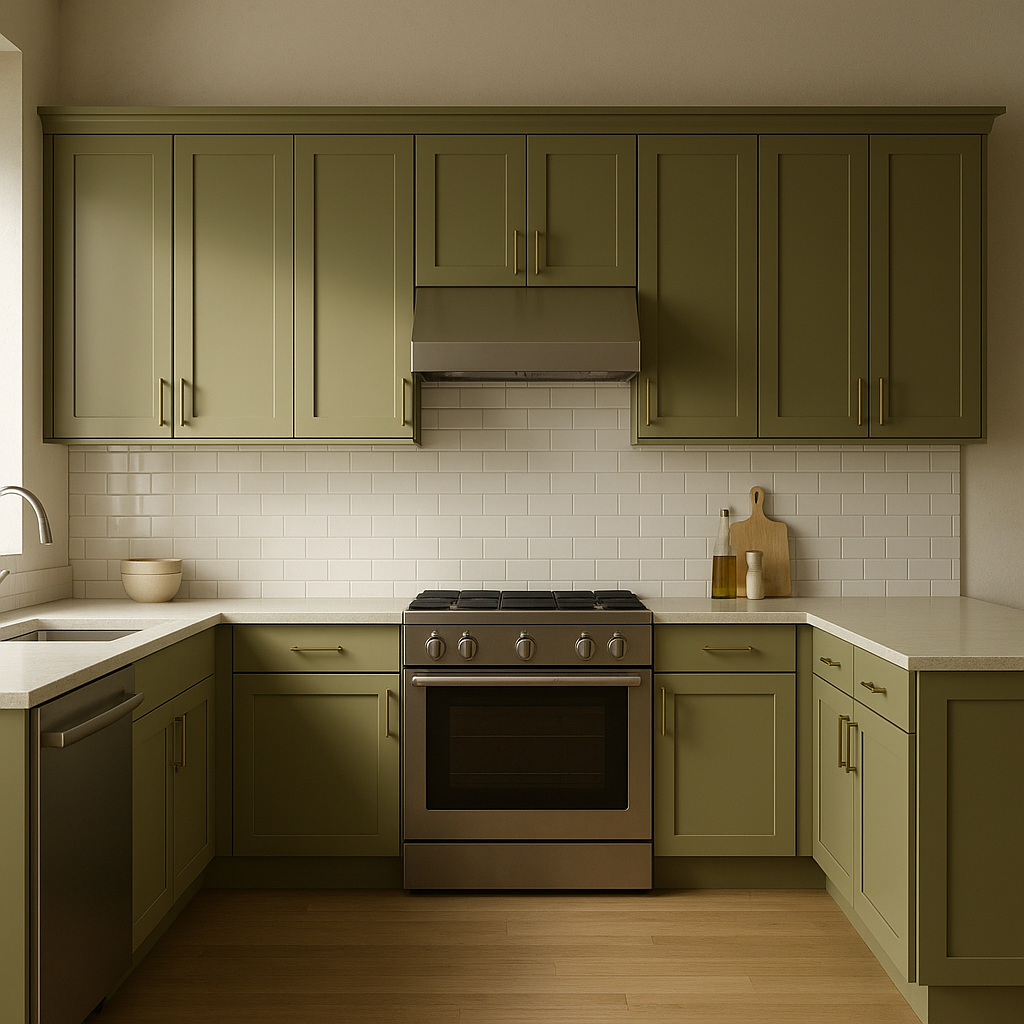
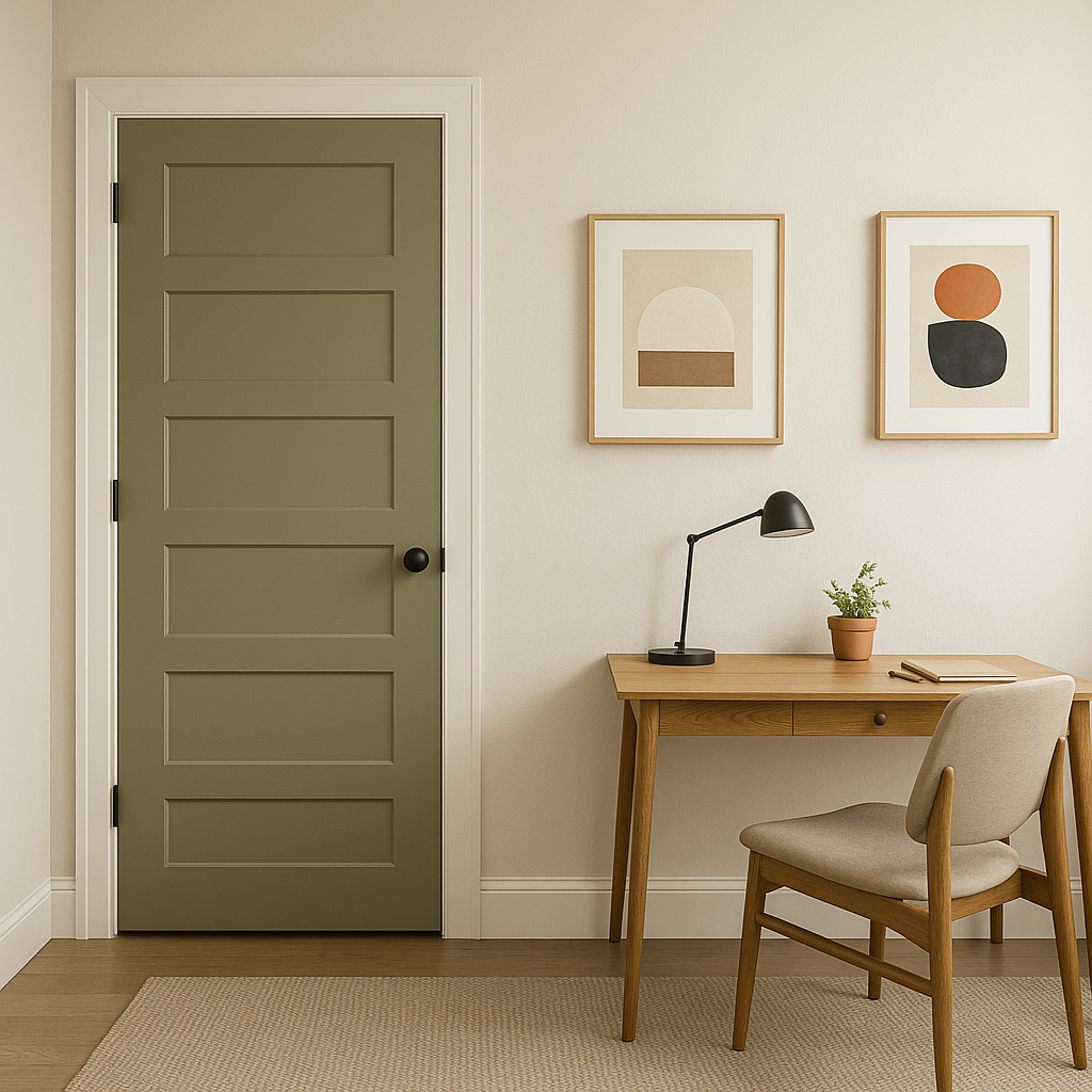
Ponderosa (531) is remarkably versatile, suitable for both residential and commercial spaces. Its lush green tone lends itself to a variety of uses:
Create an inviting, serene living room by using Ponderosa on the walls. Pair it with neutral furniture and natural textures like wood and linen for a cozy, grounded look. Add metallic accents like brass or gold to elevate the space.
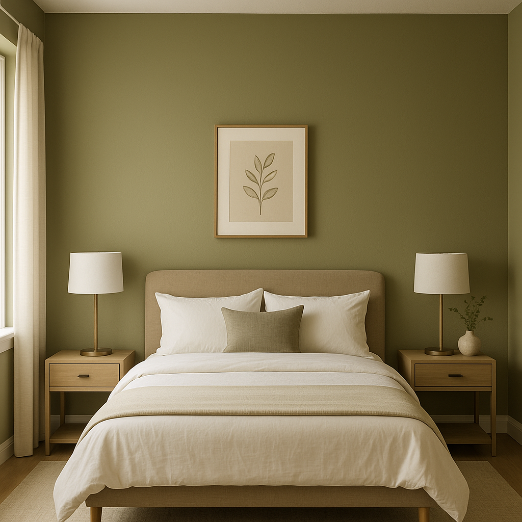
Transform your bedroom into a relaxing retreat with Ponderosa. Use it as an accent wall behind the bed, paired with soft cream or taupe bedding for a balanced and soothing effect.
Ponderosa shines in dining rooms, where its rich hue creates an intimate and elegant atmosphere. Combine it with darker wood furniture and warm lighting for a space that encourages connection and conversation.
In a study or office, Ponderosa fosters focus and creativity. Pair it with dark leather furniture and accents of black or charcoal gray for a commanding yet calming environment.
Ponderosa is equally stunning for exterior applications. As a siding or trim color, it blends seamlessly with natural surroundings while adding a touch of sophistication to a home’s facade.
Benjamin Moore Ponderosa (531) is an exceptional choice for those seeking a color that is both timeless and versatile. Its earthy undertones, ability to coordinate with diverse palettes, and adaptability to different spaces make it a standout option for creating interiors that feel connected to nature while remaining effortlessly elegant.
View Colors Only by Brand (No Imagery):
Sherwin-Williams
|
Benjamin-Moore
|
Behr
|
Valspar
Live on the Eastern Slope of Colorado and looking for a local painting professional, check out all our painting services and reach out for a free estimate.
Copyright © 2026 : Wild Fox Painting Inc. : 12435 Mead Way, Littleton, CO 80125


