Benjamin Moore Calming (533) is a soothing and versatile soft green that exudes tranquility and elegance. This delicate hue is perfect for creating serene spaces that feel both timeless and refreshing. Its subtle blend of color and undertones makes it a popular choice for both contemporary and traditional interiors. Whether you're designing a restful bedroom retreat or an inviting living room, Calming (533) effortlessly enhances the ambiance of any space.
Calming (533) features nuanced undertones that add depth and complexity to the color without overwhelming the room. Its gentle sage-green base is complemented by barely-there gray undertones, which help temper the green and give it a sophisticated, muted quality. Additionally, there’s a faint warmth in the undertone that ensures the color doesn’t appear too cool, making it adaptable to a variety of lighting conditions.
These undertones allow Calming (533) to work harmoniously in spaces that receive both natural and artificial light. In bright, sunlit rooms, the green appears slightly more vibrant, while in dimmer settings, its gray undertones create a more subdued and grounded effect.
Pairing Calming (533) with coordinating colors is an effortless way to create a cohesive and harmonious look. Its versatile nature allows it to complement a wide range of hues, from neutral tones to deeper, contrasting shades. Here are some excellent color pairings:
By thoughtfully combining these coordinating colors, you can tailor the space to your personal style while maintaining balance and harmony.
The versatility of Benjamin Moore Calming (533) makes it suitable for virtually any room in the home. Its tranquil aura lends itself beautifully to spaces where relaxation and rejuvenation are key, but it can also shine in areas where subtle sophistication is desired.
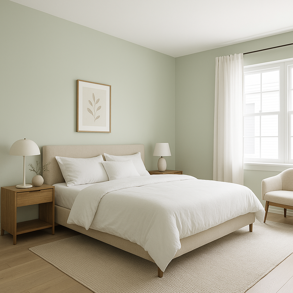
Calming is a natural choice for bedrooms due to its serene and restful quality. Pair it with soft white bedding, natural wood furniture, and textured fabrics to create a dreamy retreat that encourages relaxation.
In living spaces, Calming works well to foster a casual yet refined atmosphere. Incorporate neutral-toned upholstery, metallic accents, or darker woods for added contrast and visual interest.
Transform your bathroom into a spa-like haven with Calming on the walls. Pair it with marble tiles, brushed nickel fixtures, and crisp white towels for a fresh, clean aesthetic that promotes peace and relaxation.
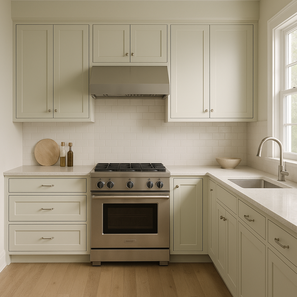
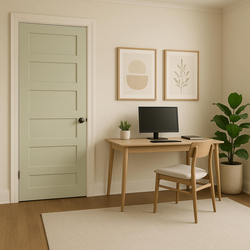
The soft green of Calming is an excellent choice for home offices, as it helps reduce eye strain and fosters a focused yet calming environment. Combine with warm neutrals and natural light for an inspiring workspace.
Make a welcoming first impression by using Calming in your entryway. Its muted green tone creates an inviting ambiance that sets the stage for the rest of your home.
Benjamin Moore Calming (533) strikes an ideal balance between subtlety and personality, making it an adaptable choice for a wide range of design styles. Whether you’re drawn to modern minimalism, rustic charm, or classic elegance, this soft green can seamlessly integrate into your vision. Its soothing undertones, wide range of coordinating colors, and ability to enhance any room make it a favorite among homeowners and interior designers alike.
For a color that embodies serenity and sophistication, Benjamin Moore Calming (533) is a timeless choice that will elevate your home’s aesthetic while creating spaces that truly feel like a sanctuary.
View Colors Only by Brand (No Imagery):
Sherwin-Williams
|
Benjamin-Moore
|
Behr
|
Valspar
Live on the Eastern Slope of Colorado and looking for a local painting professional, check out all our painting services and reach out for a free estimate.
Copyright © 2026 : Wild Fox Painting Inc. : 12435 Mead Way, Littleton, CO 80125


