Benjamin Moore Paradise (550) is a striking green paint color that instantly transforms any space into a lively, invigorating environment. With its rich, vibrant hue, Paradise evokes the lush greenery of tropical landscapes, making it the perfect choice for those seeking a bold yet versatile color that breathes life into their home. Whether you're designing a statement-making living room, a serene bedroom, or a playful accent wall, Paradise (550) delivers a refreshing splash of energy and sophistication.
Paradise (550) features subtle yellow undertones that give it warmth and vitality, setting it apart from cooler greens. These undertones imbue the color with a natural brightness, enhancing its tropical appeal while ensuring it doesn’t feel overly saturated or heavy. The yellow undertones make this shade adaptable, allowing it to harmonize beautifully with a variety of complementary hues, both bold and neutral.
To create a cohesive and thoughtfully designed space, pair Paradise (550) with colors that complement its vibrant character. Here are some inspiring combinations:
Neutral Pairings: Soft, muted tones like Benjamin Moore White Dove (OC-17) or Simply White (OC-117) provide a calming backdrop that allows Paradise to shine as the star of the space.
Earthy Complements: Warm browns and taupes like Kendall Charcoal (HC-166) or Edgecomb Gray (HC-173) balance the vibrancy of Paradise and add a grounded, natural feel.
Tropical Contrasts: For a bold, energizing look, pair Paradise with sunny yellows like Hawthorne Yellow (HC-4) or fresh corals like Coral Gables (2010-40). These colors amplify the tropical ambiance, creating a lively and cheerful environment.
Deep Accents: To add depth and drama, consider pairing Paradise with rich blues like Newburyport Blue (HC-155) or navy shades such as Hale Navy (HC-154). These pairings create a sophisticated contrast that works beautifully in modern or eclectic interiors.
This vibrant green is not just a color—it’s an experience. Its versatility makes it suitable for various interior design applications:
Paradise (550) is perfect for creating a statement-making accent wall that draws the eye and energizes the room. Use it in living rooms, dining rooms, or entryways to make a bold impression.
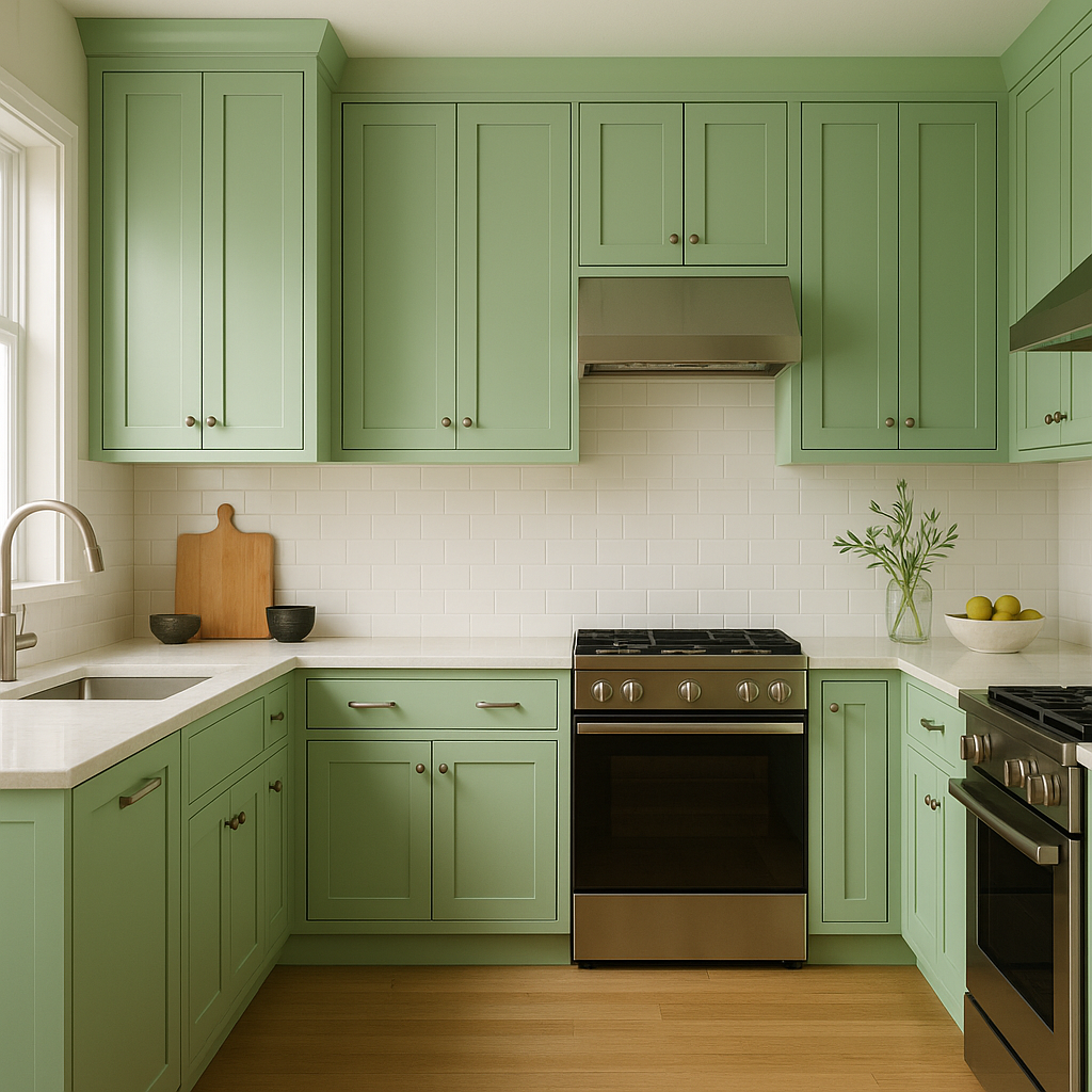
Infuse your culinary spaces with a sense of freshness and vitality by using Paradise on cabinets or walls. Pair it with white countertops or wooden surfaces for a balanced look that feels both modern and inviting.
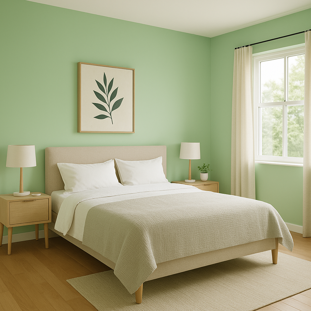
Transform your bedroom into a tranquil retreat by using Paradise on walls or furniture. Pair it with soft neutrals and natural textures like linen and rattan for a relaxing, tropical vibe.
The playful and cheerful nature of Paradise makes it ideal for kids’ spaces. It inspires creativity and brings a sense of fun to the room, especially when paired with bright accents like yellows or blues.
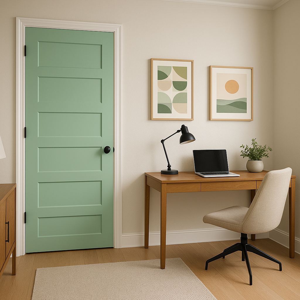
Extend the tropical feel to exterior spaces by using Paradise on patio furniture, planters, or even as a bold front door color. Its lush green tone blends seamlessly with outdoor surroundings, creating a harmonious and cheerful aesthetic.
When working with Paradise (550), balance is key. While its bold, vibrant nature can stand on its own, be mindful of the lighting in your space. Natural sunlight will amplify the color’s tropical energy, while dimmer lighting may highlight its yellow undertones for a softer effect. Incorporate natural materials like wood, bamboo, or jute to enhance the organic feel of the color, and layer textures for added dimension.
Benjamin Moore Paradise (550) is more than just a paint color—it’s a design tool that allows you to bring a sense of lush greenery and invigorating energy into your home. Whether you’re aiming for bold sophistication or playful charm, Paradise delivers a timeless yet refreshing aesthetic that’s sure to leave a lasting impression.
View Colors Only by Brand (No Imagery):
Sherwin-Williams
|
Benjamin-Moore
|
Behr
|
Valspar
Live on the Eastern Slope of Colorado and looking for a local painting professional, check out all our painting services and reach out for a free estimate.
Copyright © 2026 : Wild Fox Painting Inc. : 12435 Mead Way, Littleton, CO 80125


