Benjamin Moore Pleasant (552) is a soft and inviting paint color that exudes tranquility and understated elegance. Perfect for creating serene spaces, this hue is a versatile choice for homeowners and designers alike. With its subtle charm and ability to adapt to various design aesthetics, Pleasant (552) brings a sense of calm and sophistication to any interior.
Pleasant (552) is best described as a delicate, muted shade of green-gray, leaning slightly toward a sage-like softness. Its understated nature makes it ideal for spaces that require a fresh yet calming ambiance. The color carries gentle undertones of gray, lending it a modern edge, while the green influence evokes a connection to nature. These undertones ensure that Pleasant (552) feels balanced and neutral without overpowering a room’s decor.
The green undertones make this shade soothing to the eye, while the subtle gray provides versatility, allowing it to pair seamlessly with both warm and cool palettes. Pleasant (552) is a color that works harmoniously in spaces where subtle sophistication is key.
Benjamin Moore Pleasant (552) pairs beautifully with a wide range of coordinating colors, making it a favorite for layered and cohesive designs. Here are some standout companions:
These coordinating colors provide flexibility for designing spaces that range from soothing retreats to bold statement areas.
Pleasant (552) is a versatile shade that suits a wide variety of interior spaces. Its gentle green-gray undertones make it an excellent choice for creating rooms that are both calming and stylish. Here are some popular uses:
Pleasant (552) is perfect for living rooms where a cozy yet refined atmosphere is desired. Pair it with neutral furniture and textured fabrics for a space that feels inviting and timeless.
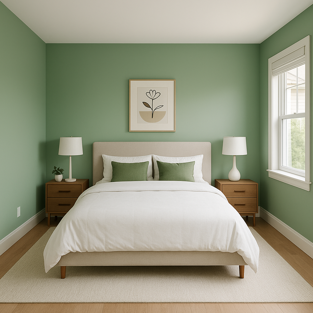
For a restful retreat, Pleasant (552) works wonderfully in bedrooms. Its soft green undertones promote relaxation and pair beautifully with white or light gray bedding for a serene, spa-like feel.
Bring a touch of nature into bathrooms by using Pleasant (552) as the wall color. It pairs beautifully with white subway tiles, brushed nickel fixtures, and natural wood accents to create a calm and refreshing environment.
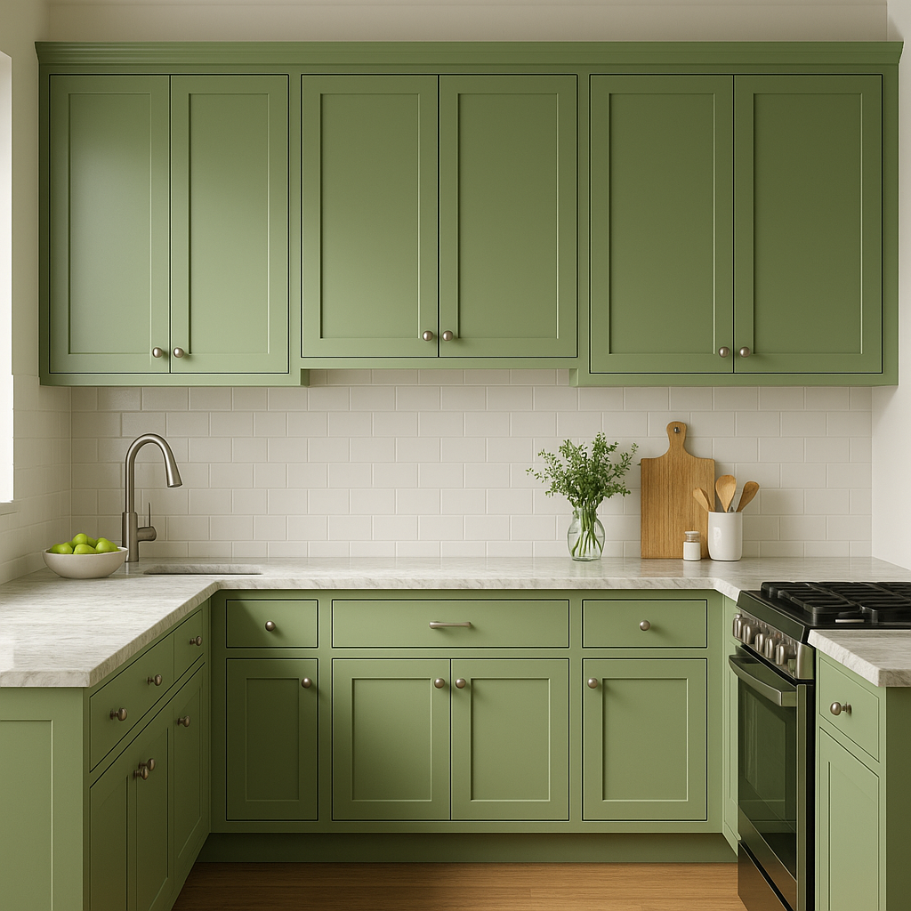
Pleasant (552) is an exceptional choice for kitchen cabinets or walls. It complements white or marble countertops and provides a soft, organic backdrop for modern or farmhouse-style kitchens.
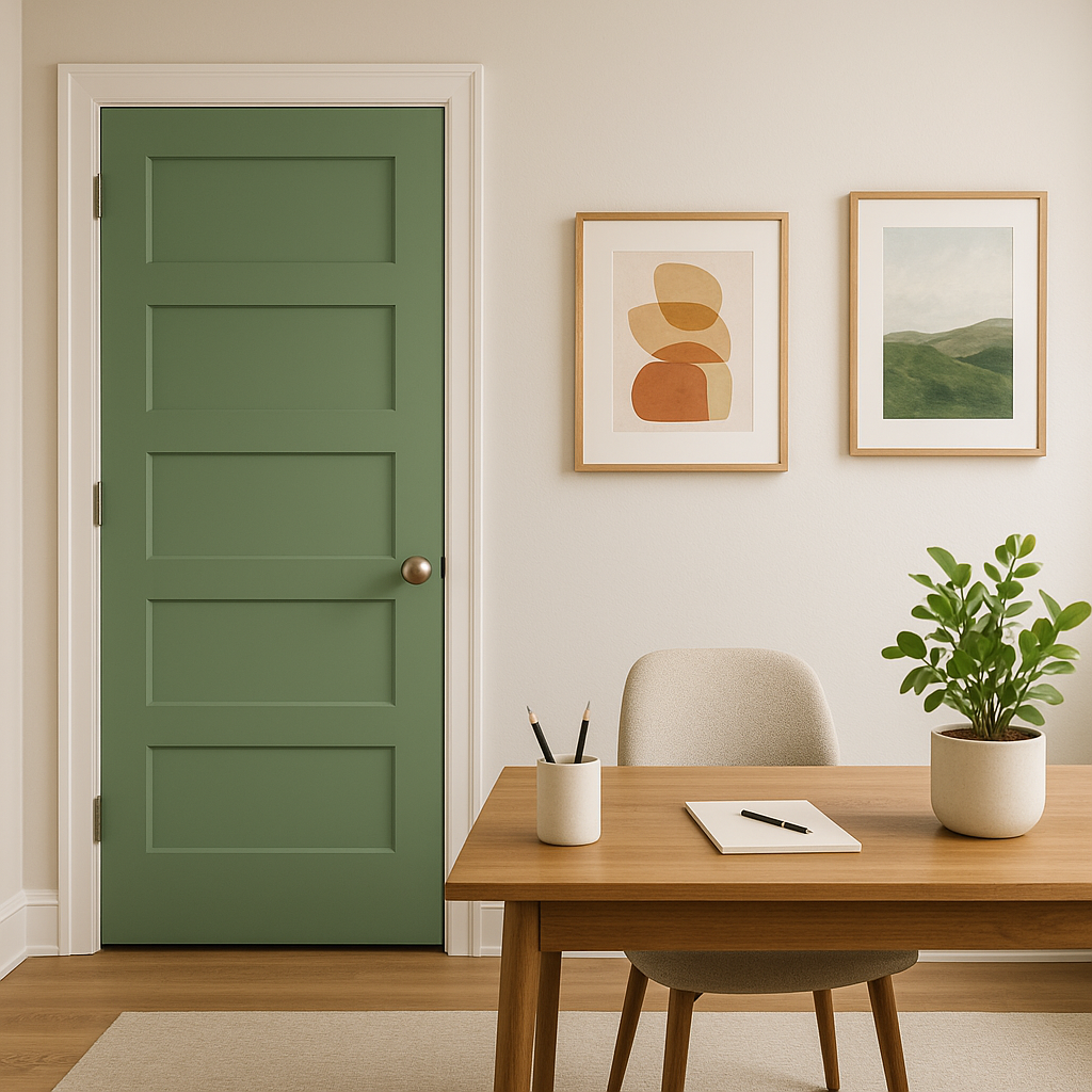
In home offices, Pleasant (552) can help foster focus and calmness. Pair it with wood furniture and metallic accents for a professional yet soothing workspace.
Benjamin Moore Pleasant (552) is more than just a color—it’s a mood. Its ability to blend seamlessly into both traditional and contemporary designs makes it a versatile choice for any interior project. Whether you’re looking to create a serene retreat or a polished, sophisticated space, Pleasant (552) delivers with its gentle undertones and timeless appeal.
View Colors Only by Brand (No Imagery):
Sherwin-Williams
|
Benjamin-Moore
|
Behr
|
Valspar
Live on the Eastern Slope of Colorado and looking for a local painting professional, check out all our painting services and reach out for a free estimate.
Copyright © 2026 : Wild Fox Painting Inc. : 12435 Mead Way, Littleton, CO 80125


