Benjamin Moore Paradise (559) is a lush, tropical teal that brings vibrancy and energy into any room. This striking yet versatile color offers a refreshing escape, evoking the serenity of a turquoise ocean or the lively ambiance of a botanical garden. With its unique balance of blue and green tones, Paradise is both invigorating and soothing, making it an exceptional choice for creating a space that feels like a personal retreat.
Paradise (559) is a mid-tone teal with subtle green undertones that soften its vibrancy, giving it an approachable and inviting quality. These undertones ensure the color avoids feeling overly bold, instead offering a natural, calming presence. The slight green influence makes Paradise feel grounded and organic, while its blue base adds depth and a sense of coolness. This harmonious blend allows Paradise to work beautifully across various design styles, from coastal-inspired interiors to modern eclectic spaces.
Benjamin Moore Paradise pairs seamlessly with a variety of colors, allowing for versatile design palettes. Here are some coordinating colors to consider:
Paradise (559) is a versatile color that can be used in a variety of ways to create impactful interiors:
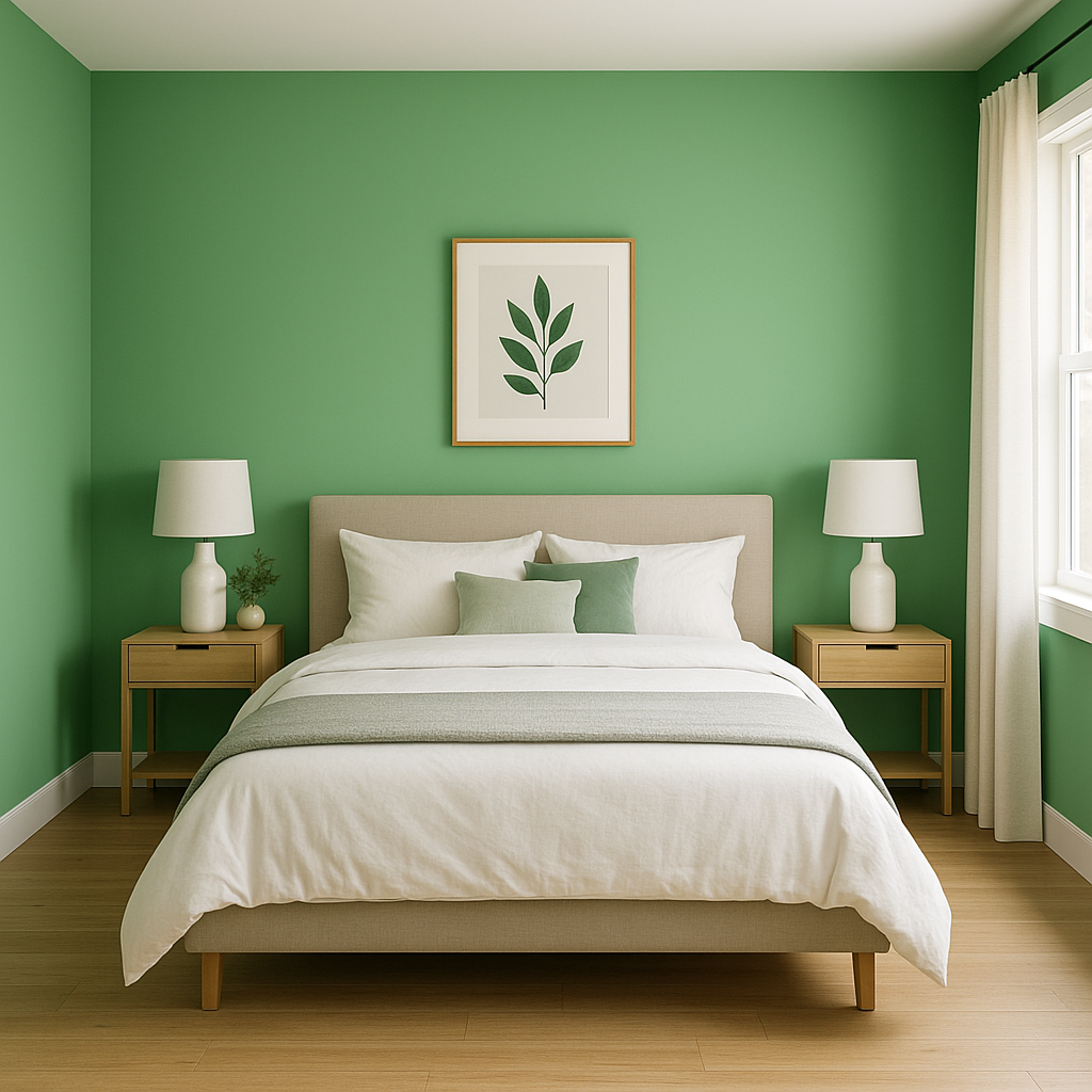
If you’re looking to make a statement, use Paradise as a feature wall in living rooms, dining areas, or bedrooms. Its bold yet calming presence draws attention without overwhelming the space. Pair it with light furnishings and metallic accents for a polished, modern look.
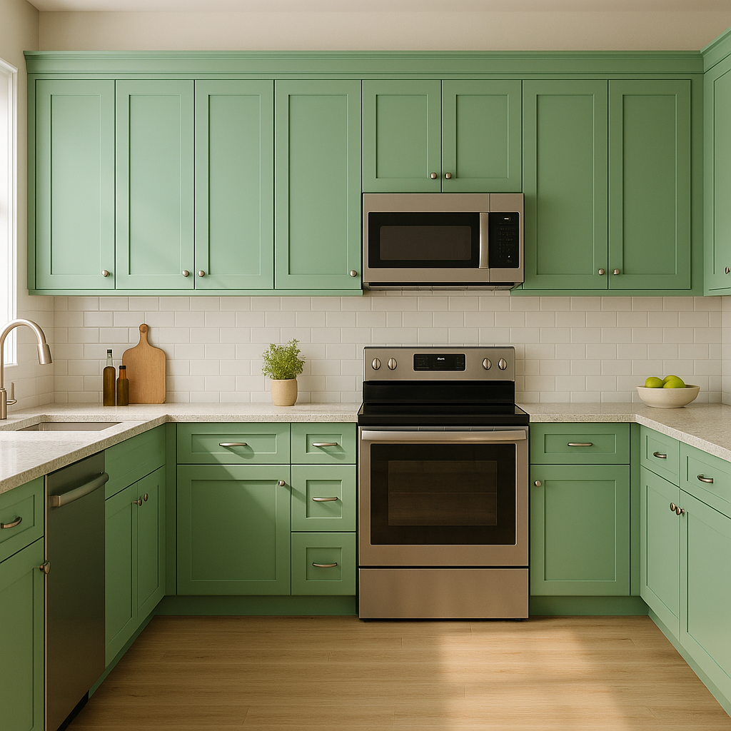
For a fresh, clean aesthetic, consider Paradise for cabinetry or walls in kitchens and bathrooms. The teal color adds a splash of personality while maintaining a serene atmosphere. Pair it with subway tiles, white countertops, and brushed nickel fixtures for a balanced design.
Paradise is a natural fit for coastal-themed interiors. Combine it with sandy beige tones, soft whites, and natural wood elements to recreate the essence of a beachside retreat. Add woven baskets, linen curtains, and driftwood decor to complete the look.
Its lively yet calming nature makes Paradise an excellent choice for children’s rooms or play spaces. Pair it with bright accents like yellow, pink, or lime green for a cheerful, energetic vibe.
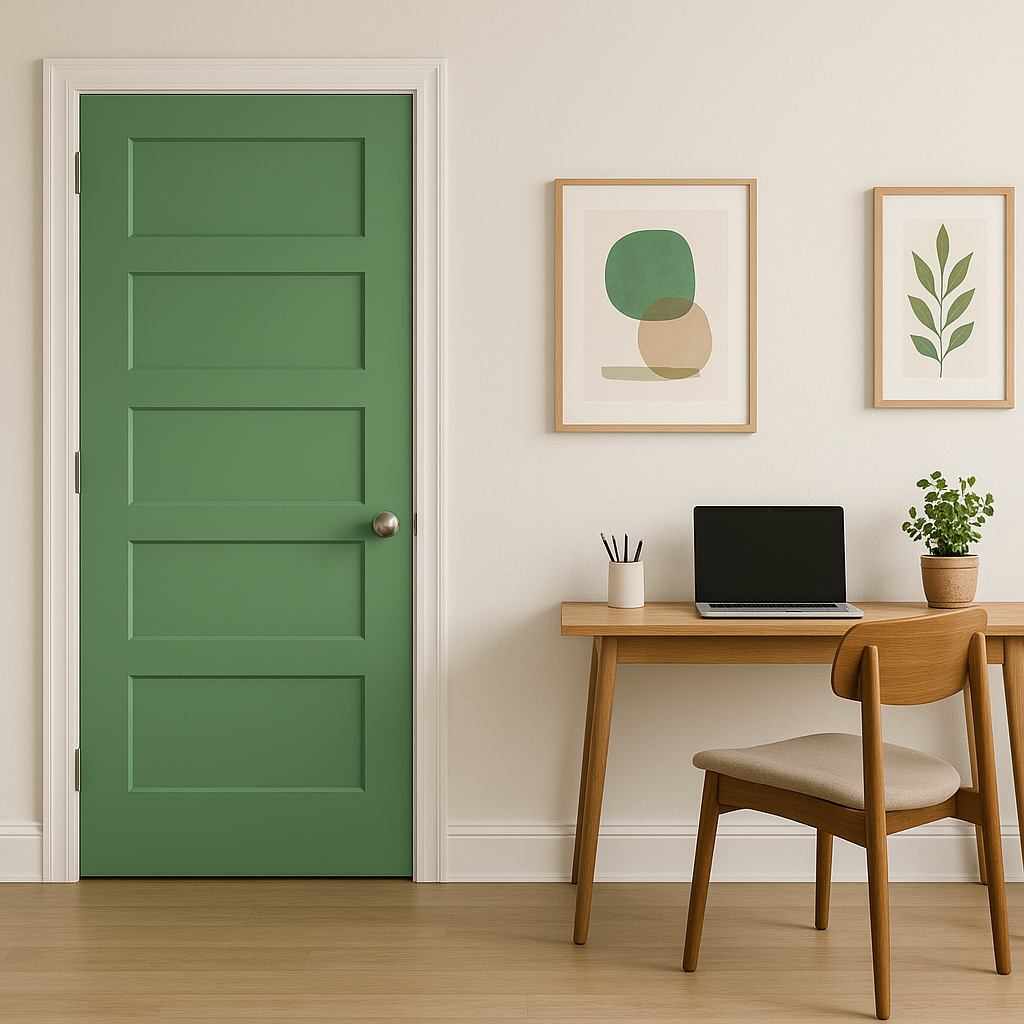
Use Paradise in a home office to inspire creativity and focus. Its cool undertones promote calm and concentration, making it ideal for spaces where productivity is key. Pair it with sleek furniture in neutral tones for a balanced and professional atmosphere.
The appearance of Benjamin Moore Paradise (559) can shift based on lighting conditions. In spaces with ample natural light, the color appears vibrant and dynamic, leaning more toward its teal side. In dimmer or artificial lighting, the green undertones become more pronounced, offering a softer and more subdued look. To achieve the best results, test the color in your space under different lighting conditions before committing.
Paradise (559) is a captivating choice for homeowners and designers seeking a versatile teal that radiates energy, tranquility, and sophistication. Its ability to pair well with a broad spectrum of colors and design elements makes it a standout option for spaces ranging from bold and dramatic to soft and serene. Whether you’re designing a cozy retreat, a lively gathering space, or a creative workspace, Paradise will infuse your interiors with a touch of tropical charm and timeless elegance.
View Colors Only by Brand (No Imagery):
Sherwin-Williams
|
Benjamin-Moore
|
Behr
|
Valspar
Live on the Eastern Slope of Colorado and looking for a local painting professional, check out all our painting services and reach out for a free estimate.
Copyright © 2026 : Wild Fox Painting Inc. : 12435 Mead Way, Littleton, CO 80125


