Benjamin Moore Floradale 581: A Versatile, Nature-Inspired Hue
Benjamin Moore Floradale 581 is a rich and grounding shade that brings the calming essence of nature into your space. This earthy green is a perfect choice for homeowners and designers seeking to infuse their interiors with a sense of balance and tranquility. Its sophisticated depth makes it a versatile option for a variety of design styles, from modern farmhouse to traditional and contemporary aesthetics.
Undertones of Floradale 581
Floradale 581 features a harmonious blend of muted green with warm undertones. These subtle yellow-brown undertones give the color a natural, organic quality, making it feel welcoming and serene. Unlike brighter greens, Floradale leans into a more subdued and timeless palette, ensuring it remains fresh and relevant over time. Its undertones allow it to pair seamlessly with both cool and warm accents, making it a flexible choice for various spaces.
Coordinating Colors for Floradale 581
To enhance the beauty of Floradale 581, consider pairing it with complementary or coordinating hues. Here are a few recommendations:
- Neutral Pairings: Colors like Benjamin Moore White Dove OC-17 or Simply White OC-117 create a crisp and clean contrast, ideal for trim, ceilings, or cabinetry. These whites help highlight the richness of Floradale without overpowering it.
- Warm Accents: Shades like Lenox Tan HC-44 or Rich Cream 2153-60 add warmth and depth, making the room feel cozy and inviting.
- Cool Compliments: To bring out Floradale's green undertones, consider cooler shades like Gray Owl OC-52 or Palladian Blue HC-144. These colors create a serene and cohesive look when used in adjoining spaces or as accents.
- Dramatic Contrast: For a bold design statement, pair Floradale with deeper tones such as Kendall Charcoal HC-166 or Hale Navy HC-154. These darker colors enhance the visual impact of Floradale, creating a striking, sophisticated palette.
Ideal Uses for Floradale 581
Floradale 581's versatility makes it suitable for a range of applications within your home. Its calming yet grounded presence adapts beautifully to different rooms and design purposes:
- Living Rooms: Use Floradale as a main wall color to create a cozy, inviting atmosphere. Pair it with light furniture and natural textures like linen or wood for a serene, nature-inspired look.
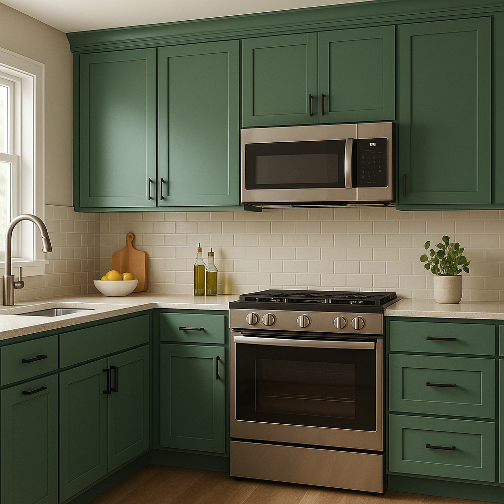
- Kitchens and Dining Areas: This shade feels especially at home in a kitchen or dining space, where its earthiness complements natural wood cabinetry, brass fixtures, and rustic elements.
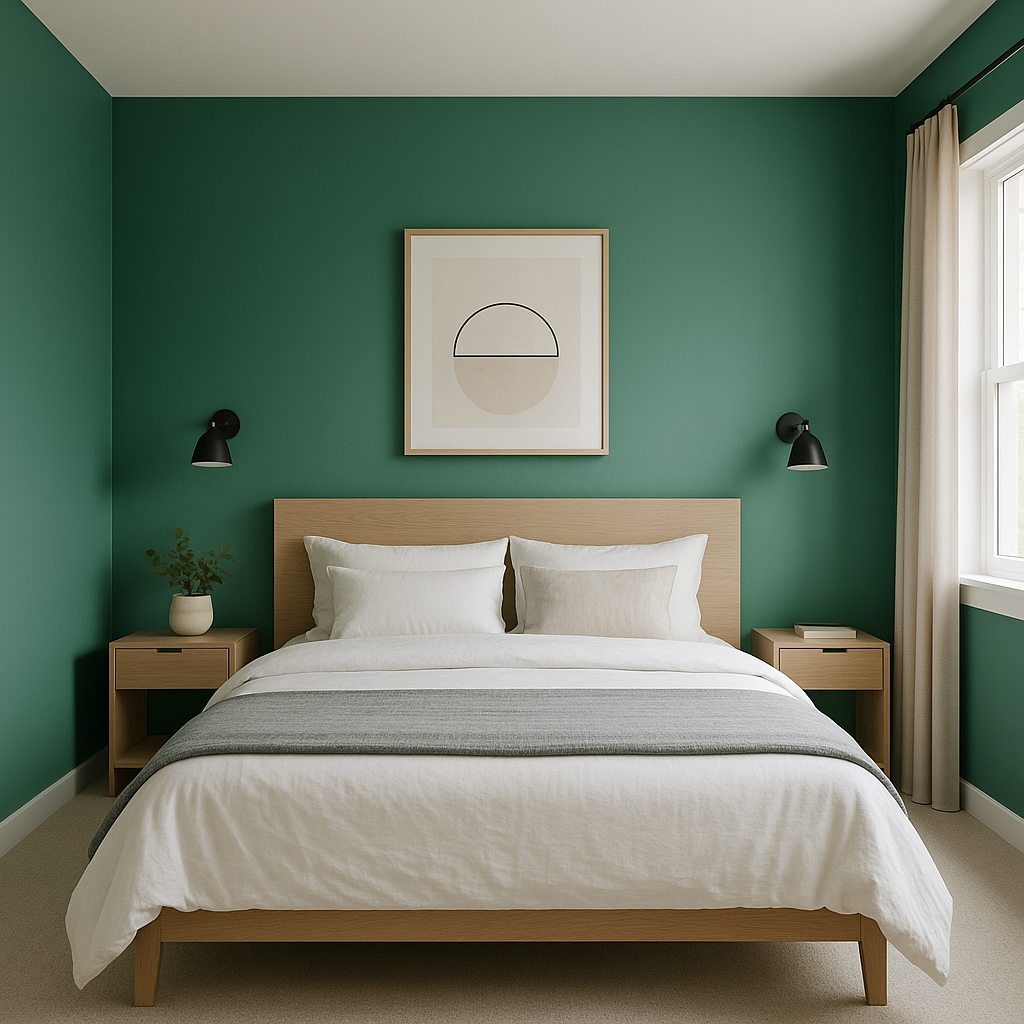
- Bedrooms: Floradale fosters relaxation, making it an excellent choice for bedroom walls. Pair it with soft, neutral bedding and warm-toned accents for a tranquil retreat.
- Bathrooms: Its muted green tone works well in bathrooms, especially when combined with white tiles, brushed nickel fixtures, and organic accessories like woven baskets or greenery.
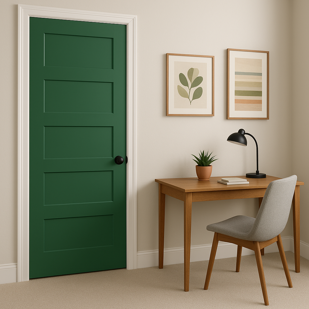
- Accent Walls: For those who prefer to use Floradale as a statement, it makes for a stunning accent wall in spaces like home offices, entryways, or reading nooks.
Pro Tips for Using Floradale 581
- Lighting Matters: The appearance of Floradale 581 can vary depending on the lighting in your space. In natural light, its green tones are more pronounced, while in artificial or dim lighting, its yellow-brown undertones create a warmer feel. Always test a sample in your room to see how it interacts with your specific lighting.
- Textures and Materials: Floradale pairs beautifully with natural materials like wood, rattan, and stone. These textures enhance its organic vibe,