Benjamin Moore Rosamilia 592 is a soft, muted shade that embodies understated elegance and versatility. This rich, creamy color is a delicate blend of sophistication and warmth, making it an excellent choice for both classic and contemporary interiors. Whether you're designing a cozy living room, a tranquil bedroom, or a stylish dining area, Rosamilia 592 offers a serene and inviting backdrop that enhances any space.
Rosamilia 592 features gentle pink undertones that are perfectly balanced with a hint of beige. These undertones give the color a warm, blushing quality without feeling overly feminine or overpowering. The subtle beige influence grounds the color, making it approachable and versatile. Depending on the lighting, Rosamilia 592 can range from a soft, rosy neutral to a delicate blush, creating an effortlessly sophisticated ambiance.
This nuanced interplay of pink and beige undertones makes Rosamilia 592 a chameleon-like color that adapts beautifully to its surroundings. It pairs equally well with light, airy palettes and richer, more dramatic tones.
Benjamin Moore Rosamilia 592 is a highly adaptable shade that works seamlessly with a variety of coordinating colors. Whether you're looking to create contrast or maintain a harmonious flow, here are some stunning pairings:
Soft Neutrals: Pair Rosamilia 592 with shades like Benjamin Moore Simply White (OC-117) or Chantilly Lace (OC-65) for a clean, fresh look. These whites enhance the soft blush undertones, creating a light and airy space.
Earthy Tones: Complement the warmth of Rosamilia 592 with earthy hues like Revere Pewter (HC-172) or Edgecomb Gray (HC-173). These colors create a grounded, balanced palette that's perfect for transitional or modern farmhouse designs.
Deep Accent Colors: For a bolder, moodier vibe, try pairing Rosamilia 592 with darker shades such as Hale Navy (HC-154) or Kendall Charcoal (HC-166). These deep tones add drama and sophistication, making Rosamilia 592 stand out as a soft, elegant contrast.
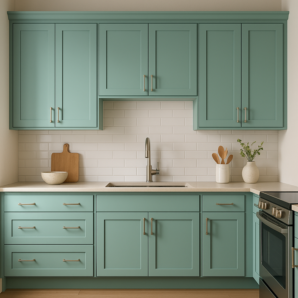
Soft Pastels: Incorporate pastel tones like Palladian Blue (HC-144) or Wedgewood Gray (HC-146) for a romantic and serene color scheme. These subtle blues and greens enhance the rosy warmth of Rosamilia 592, creating a calming, spa-like atmosphere.
Rosamilia 592 is a versatile color that can be used throughout the home, from walls to accents, adding a touch of refined warmth wherever it is applied. Here are some of its best applications:
Living Rooms: Create an inviting and cozy living space by using Rosamilia 592 on the walls. Pair with plush furniture in neutral tones and metallic accents for a sophisticated yet comfortable atmosphere.
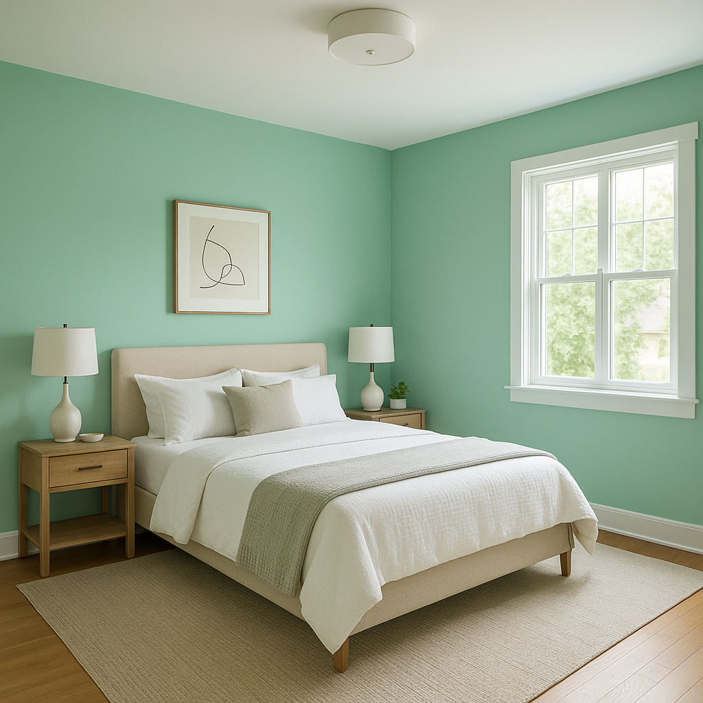
Bedrooms: The soft blush undertones of Rosamilia 592 make it a perfect choice for bedrooms. It promotes relaxation and pairs beautifully with layered textiles in neutral or pastel shades.
Dining Rooms: Use Rosamilia 592 to add an elegant and intimate feel to your dining area. Pair it with rich wood furniture and warm lighting to enhance its inviting quality.
Bathrooms: The subtle warmth of Rosamilia 592 brings a luxurious, spa-like feel to bathrooms. Coordinate with marble finishes, soft whites, and pastel accents for a serene retreat.
Accent Walls: If you’re hesitant to commit to Rosamilia 592 for an entire room, try it as an accent wall. It pairs beautifully with neutral tones and adds depth and character to any space.
View Colors Only by Brand (No Imagery):
Sherwin-Williams
|
Benjamin-Moore
|
Behr
|
Valspar
Live on the Eastern Slope of Colorado and looking for a local painting professional, check out all our painting services and reach out for a free estimate.
Copyright © 2026 : Wild Fox Painting Inc. : 12435 Mead Way, Littleton, CO 80125


