Benjamin Moore Spring (603) is a delicate green paint color that captures the essence of renewal and growth. This soft, muted green is reminiscent of tender leaves unfurling in early spring, imparting a sense of freshness and tranquility to any space. Its understated elegance makes it versatile enough to suit both traditional and modern interiors, creating a calm and inviting ambiance.
Spring (603) features subtle yellow undertones that warm this gentle green, giving it a welcoming softness without appearing overly saturated. The yellow undertones help the color maintain a cheerful and uplifting quality, while ensuring it doesn't lean too cool or overly minty. This balance makes Spring (603) a great choice for spaces where you want a harmonious blend of nature-inspired serenity and liveliness.
Spring (603) pairs beautifully with an array of colors, making it easy to integrate into your color palette. Here are some coordinating colors to inspire your design:
Spring (603) is a versatile color that can be used in various rooms and design styles. Its light green hue is ideal for creating environments that feel fresh, airy, and rejuvenating.
Create a tranquil yet inviting living room by using Spring (603) on the walls. Pair it with neutral furniture, natural wood tones, and pops of white for a polished look. This color also works beautifully with botanical prints or indoor plants, further emphasizing its connection to nature.
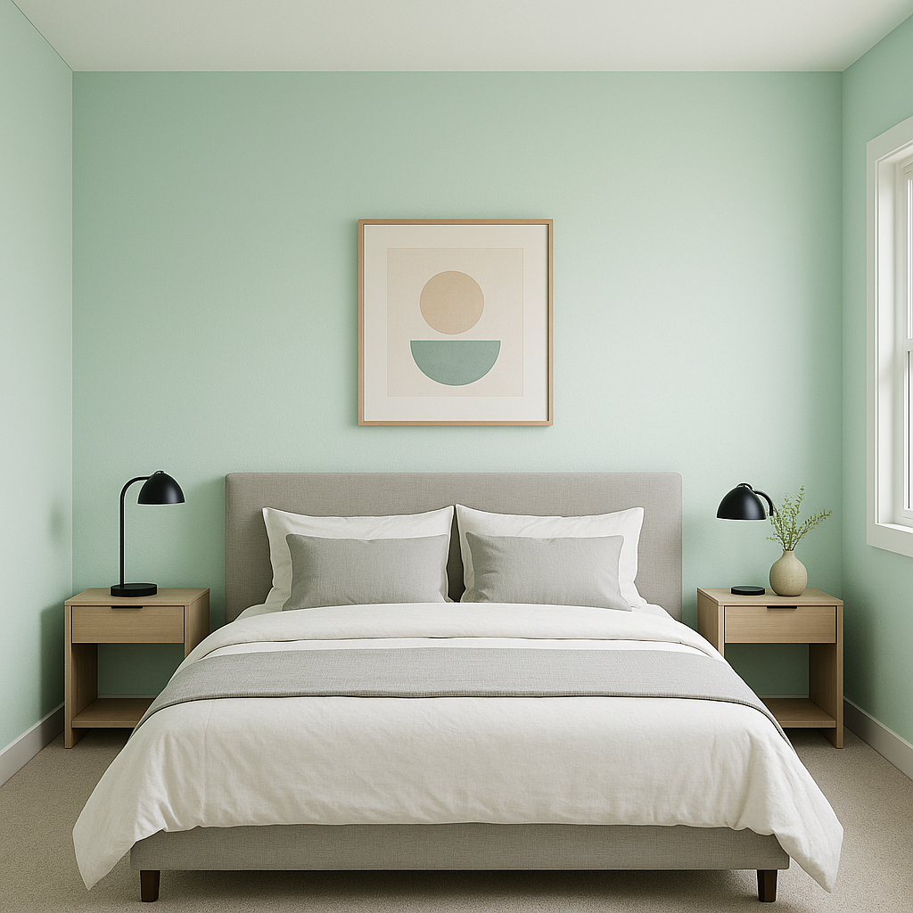
Spring (603) is a soothing choice for bedrooms, making it easy to unwind at the end of the day. Use it as a wall color and complement it with soft linens in whites, creams, or pale yellows. Add subtle metallic accents like brushed gold or antique brass for a refined touch.
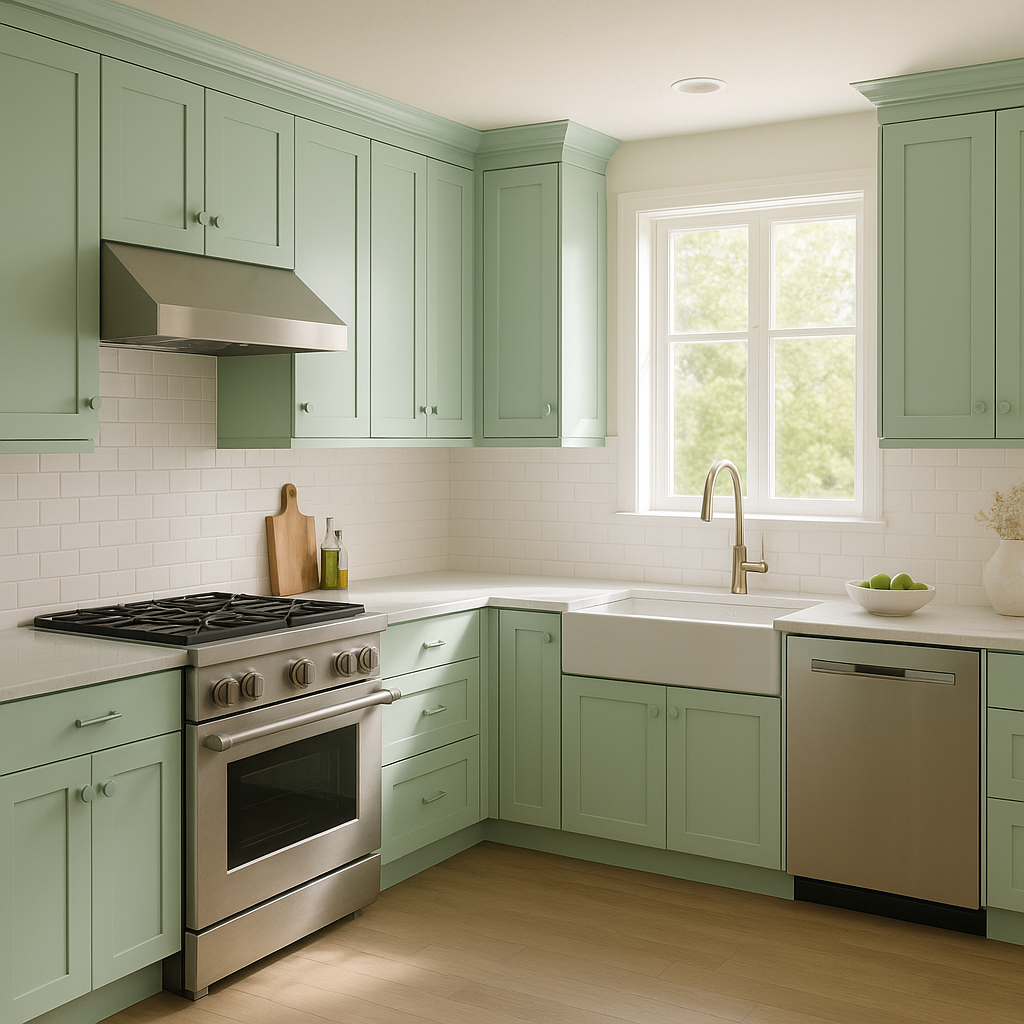
Bring a fresh and cheerful vibe to your kitchen with Spring (603). Use it on cabinetry or walls and pair it with white subway tiles and warm wood countertops for a farmhouse-inspired look. For a modern twist, combine it with matte black fixtures and sleek stainless steel appliances.
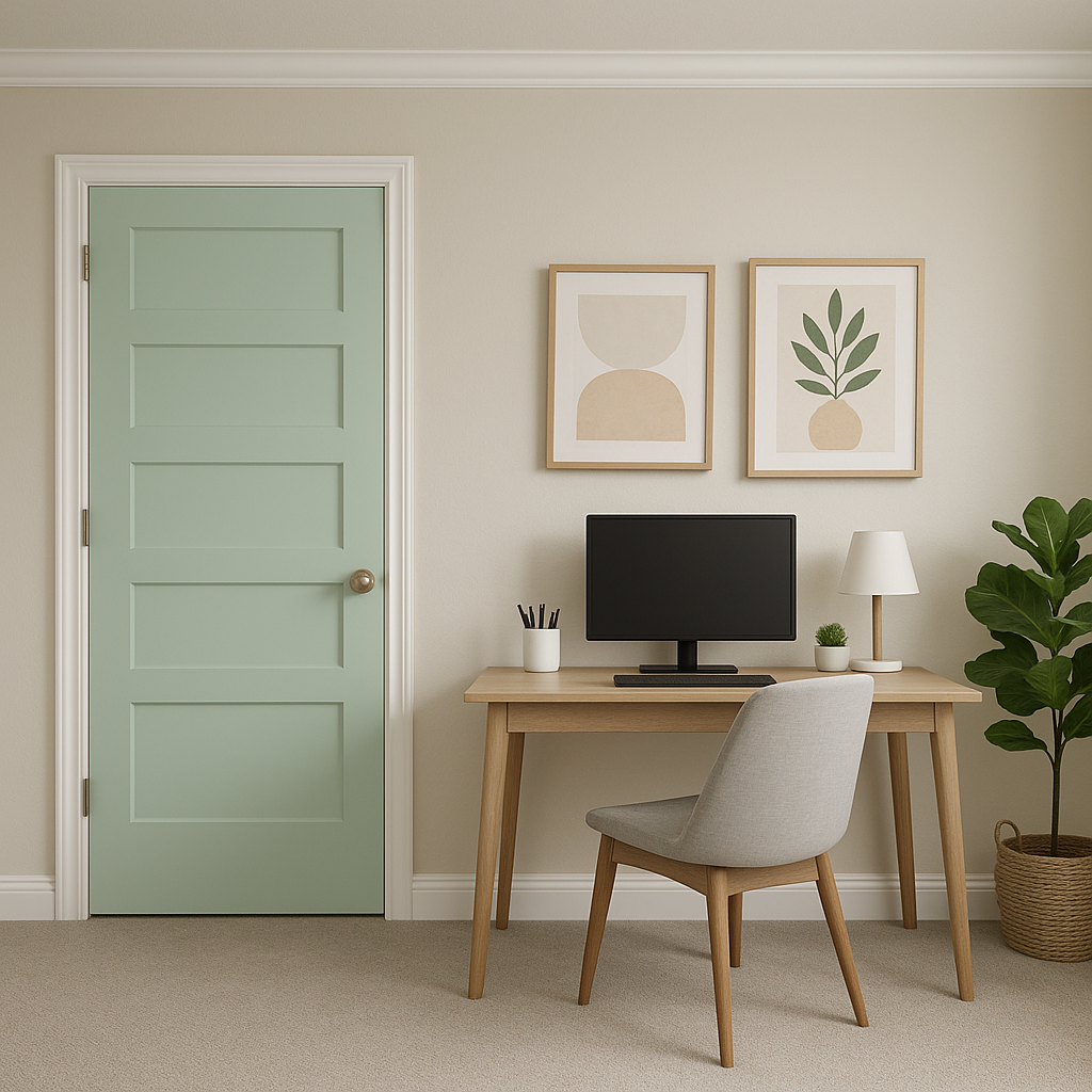
In a home office, Spring (603) fosters focus and calm, making it an excellent choice for a productive workspace. Pair it with darker greens or grays to create a sophisticated yet energizing atmosphere.
Transform your bathroom into a tranquil retreat with Spring (603). It pairs beautifully with white tiles, marble finishes, and polished chrome fixtures. Incorporate soft towels in complementary neutral or pastel shades for a spa-like feel.
The appearance of Spring (603) can vary based on lighting conditions. In spaces with abundant natural light, its yellow undertones will stand out more, giving it a sunny and cheerful vibe. In dimly lit rooms, it may lean slightly cooler, offering a subtle and calming presence. To ensure the color works in your space, test it under different lighting conditions before committing.
Benjamin Moore Spring (603) is the perfect paint choice for anyone seeking a green that feels fresh, timeless, and versatile. Whether used as a primary wall color or an accent, its harmonious undertones and ability to coordinate with a wide range of hues make it a standout option for interior design projects.
View Colors Only by Brand (No Imagery):
Sherwin-Williams
|
Benjamin-Moore
|
Behr
|
Valspar
Live on the Eastern Slope of Colorado and looking for a local painting professional, check out all our painting services and reach out for a free estimate.
Copyright © 2026 : Wild Fox Painting Inc. : 12435 Mead Way, Littleton, CO 80125


