Benjamin Moore Biscayne 604 is a captivating paint color that effortlessly channels the breezy, tranquil essence of coastal living. This soft and versatile hue strikes a perfect balance between sophistication and relaxation, making it a favorite choice for those who appreciate understated elegance. Biscayne 604 is part of Benjamin Moore's expansive color collection, celebrated for its ability to transform interiors and exteriors alike.
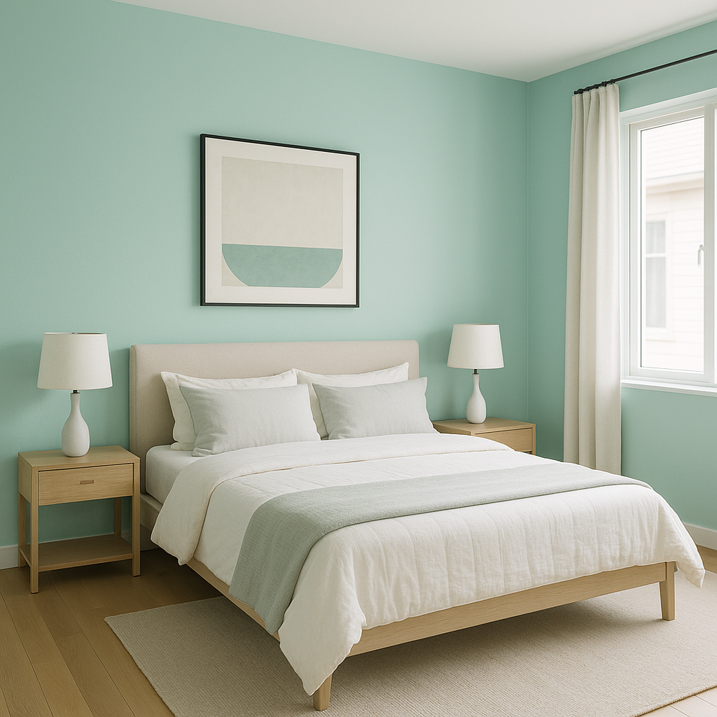
Biscayne 604 is a light aqua-blue with a refreshing and airy quality. Its subtle green undertone brings depth and dimension, creating a gentle interplay of color that mirrors the serene beauty of ocean waves. Depending on the lighting, this hue can appear slightly more blue in cooler spaces and more green in warmer, sunlit rooms. This dual personality allows Biscayne to adapt beautifully to varying design styles and settings.
When paired thoughtfully, Biscayne 604 can serve as a stunning centerpiece or a soft backdrop for your design vision. Below are some complementary color suggestions to enhance its natural beauty:
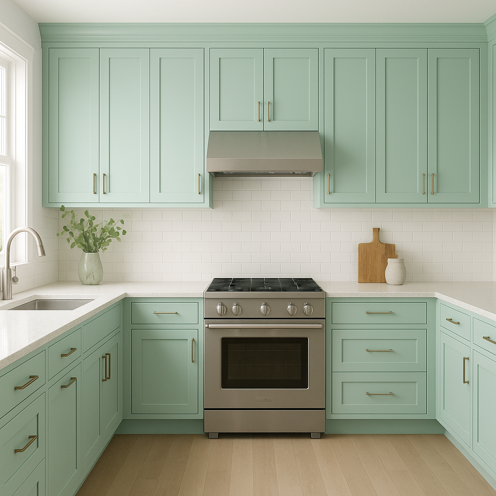
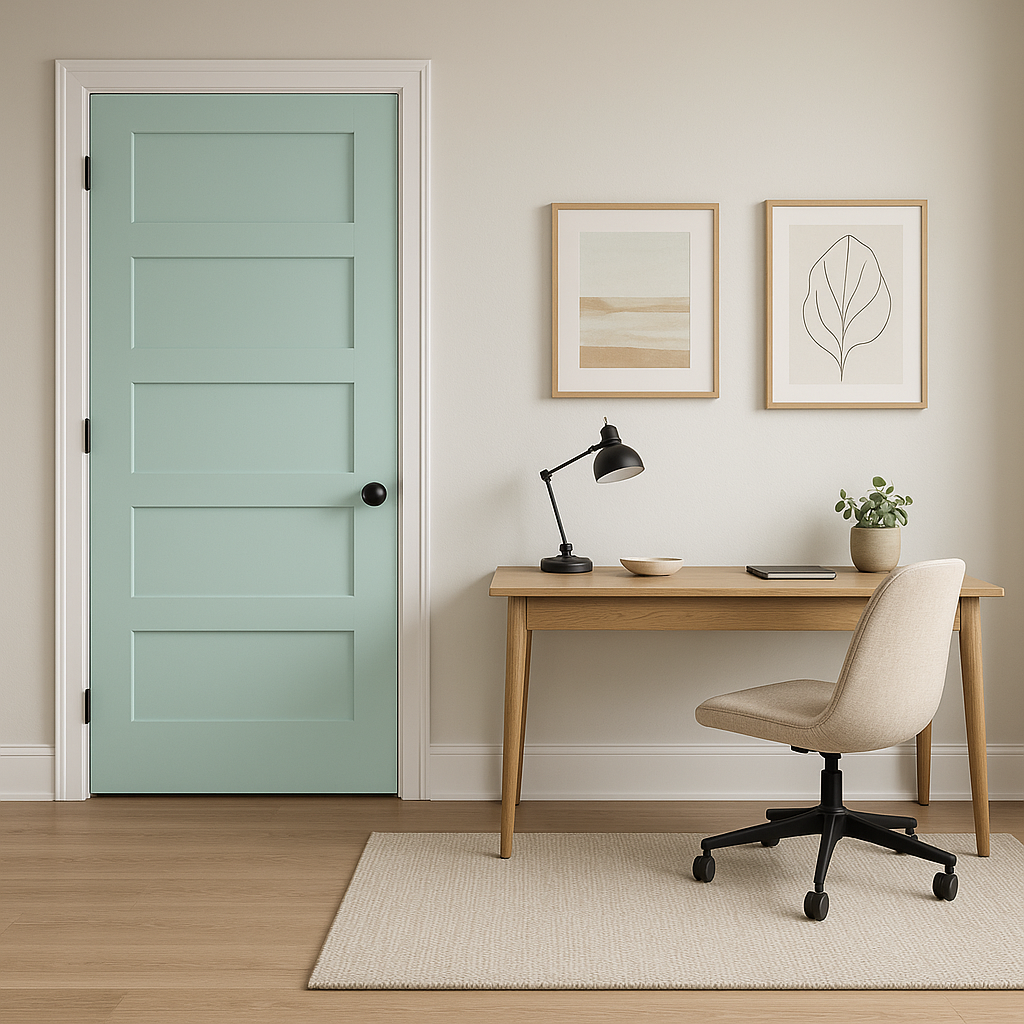
Biscayne 604 is as versatile as it is beautiful, working seamlessly across a variety of spaces and design applications. Here are some of the most effective ways to incorporate this color into your home:
The way Biscayne 604 presents itself depends heavily on the lighting conditions in your space. In rooms with ample natural light, the color takes on a more vibrant, beachy aqua tone. In dimly lit areas or spaces with artificial lighting, its green undertones become more prominent,
View Colors Only by Brand (No Imagery):
Sherwin-Williams
|
Benjamin-Moore
|
Behr
|
Valspar
Live on the Eastern Slope of Colorado and looking for a local painting professional, check out all our painting services and reach out for a free estimate.
Copyright © 2026 : Wild Fox Painting Inc. : 12435 Mead Way, Littleton, CO 80125


