Benjamin Moore Calming (605) is a soft, muted shade that evokes tranquility and a sense of quiet elegance. This delicate gray with subtle lavender undertones is ideal for creating soothing spaces that feel both modern and timeless. Its understated beauty makes it versatile enough to complement a wide range of interior styles, from minimalist to traditional. Whether you’re designing a cozy bedroom retreat or a sophisticated living room, Calming is a perfect choice for cultivating a restful ambiance.
One of the defining characteristics of Calming is its gentle lavender undertone, which sets it apart from conventional grays. This hint of purple adds warmth and depth to the hue, preventing it from feeling flat or overly cool. Depending on the lighting conditions, Calming can lean slightly toward a lavender-gray or even a greige tone, giving it a chameleon-like quality. In spaces with natural light, the lavender undertones become more pronounced, adding a refreshing softness. In dimmer settings, the color shifts to a more neutral gray, making it adaptable and versatile.
Calming pairs beautifully with a curated palette of complementary colors that enhance its soothing nature. Whether you’re looking to create a monochromatic scheme or add contrast, here are some coordinating colors:
To incorporate natural warmth into the space, consider wood finishes in light oak or walnut tones, as these add a grounding element that complements Calming’s soft undertones.
The versatility of Benjamin Moore Calming makes it suitable for a wide range of interior applications. Here are some ideas to inspire your next design project:
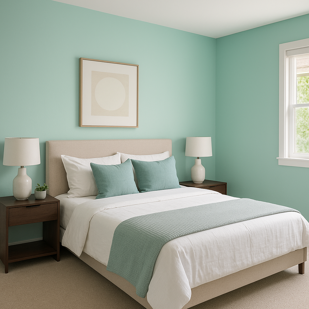
Calming is an exceptional choice for bedrooms, where relaxation is a priority. Its subdued lavender undertones create a serene atmosphere that encourages restful sleep. Pair it with plush bedding in crisp white or pale blush tones for a luxurious, spa-like vibe.
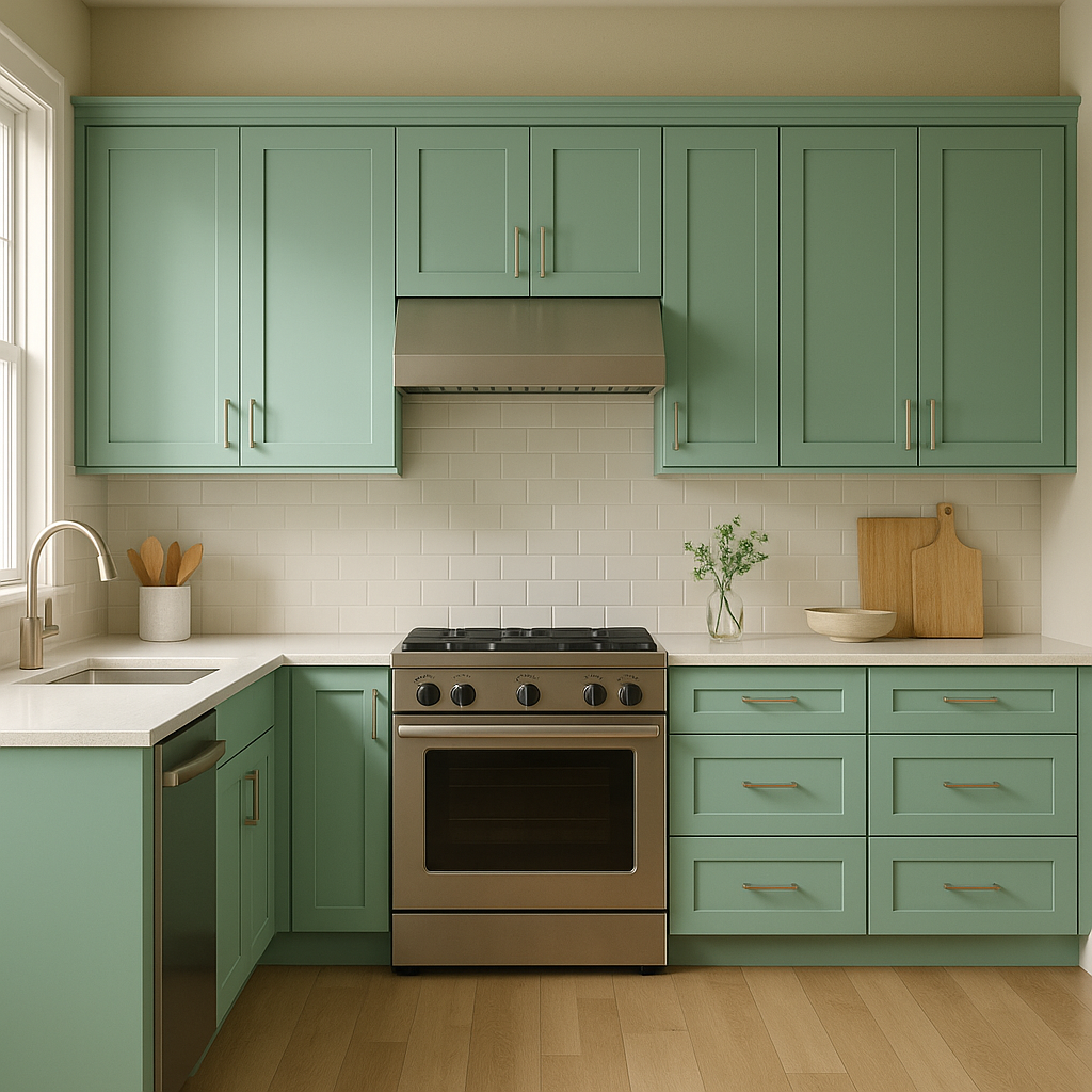
Use Calming to set the stage for elegant yet approachable living spaces. Combine it with neutral furniture and textured throw pillows for depth, or introduce metallic accents like brushed nickel or antique gold for a touch of sophistication.
Bring tranquility into your bathroom with Calming. Its fresh yet muted tone pairs beautifully with white subway tiles, marble countertops, and soft blue or green accents for a coastal-inspired retreat.
In a home office, Calming promotes focus and productivity without feeling sterile. Pair it with natural wood furniture and greenery to create a balanced, peaceful workspace.
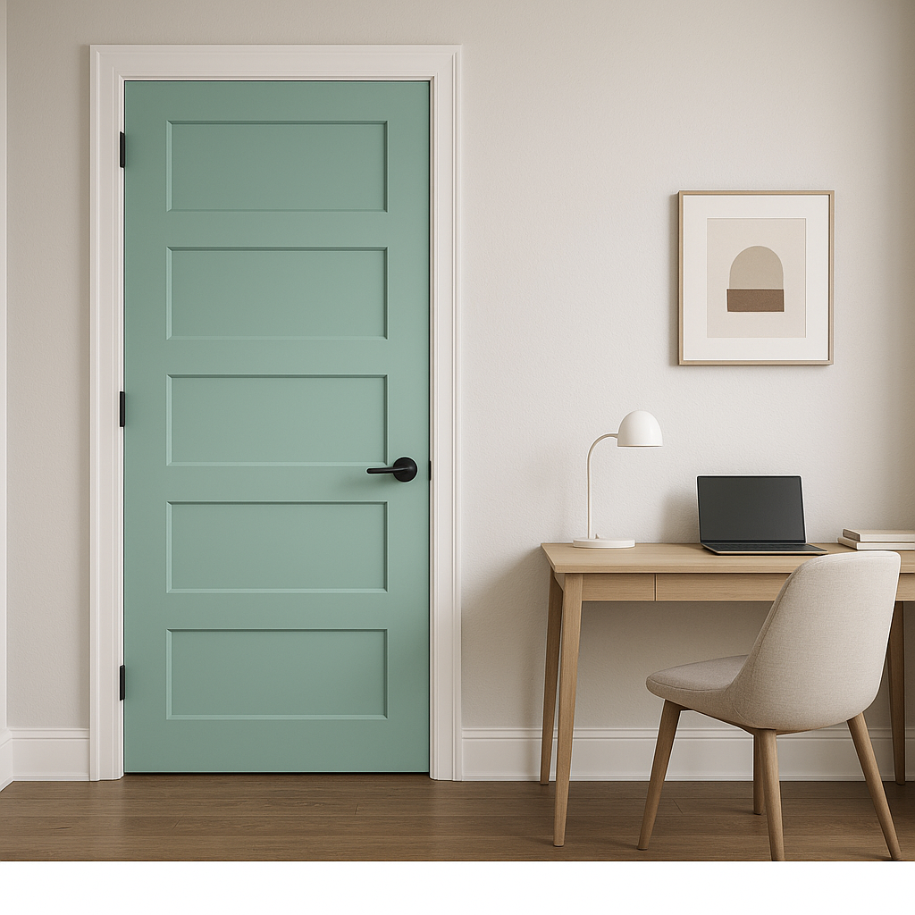
Using Calming in entryways and hallways provides a welcoming and cohesive look. Its neutral tone acts as a bridge between adjoining rooms with varying color schemes.
Benjamin Moore Calming (605) can transform depending on the lighting in your space. In rooms with abundant natural light, its lavender undertones will shine through, creating an airy and open feel. Conversely, in spaces with artificial or low lighting, the gray base becomes more dominant, lending a sophisticated yet subtle presence. To maximize its beauty, test Calming in different lighting conditions to ensure it achieves the desired effect.
Benjamin Moore Calming (605) is a masterful hue that blends serenity, elegance, and versatility. Its nuanced undertones and ability to pair with a wide variety of colors make it a standout choice for designing interiors that feel harmonious and refined. Whether used as a main wall color, an accent, or part of a layered palette, Calming is sure to bring a sense of peace and timeless charm to any space.
View Colors Only by Brand (No Imagery):
Sherwin-Williams
|
Benjamin-Moore
|
Behr
|
Valspar
Live on the Eastern Slope of Colorado and looking for a local painting professional, check out all our painting services and reach out for a free estimate.
Copyright © 2026 : Wild Fox Painting Inc. : 12435 Mead Way, Littleton, CO 80125


