Benjamin Moore Albuquerque 607 is a warm, earthy neutral that exudes timeless sophistication. This versatile shade sits comfortably between taupe and beige, offering a grounded yet elegant aesthetic for a variety of spaces. Its natural warmth and effortless charm make it a go-to choice for homeowners and designers seeking a color that feels both inviting and refined.
One of the defining features of Albuquerque 607 is its subtle undertones. This shade carries a delicate balance of red and pink undertones, giving it a soft, rosy warmth that sets it apart from cooler neutrals. These undertones lend a cozy, approachable feel to the color, making it particularly well-suited for creating intimate and welcoming environments. While the red undertones are noticeable, they remain understated, ensuring the color doesn’t feel overpowering or overly saturated. Depending on the lighting, Albuquerque 607 may appear warmer in direct sunlight or more muted in dimly lit spaces, giving it a dynamic quality that adapts beautifully to its surroundings.
Pairing Albuquerque 607 with complementary colors is an opportunity to create a cohesive and visually stunning palette. Its versatility allows it to coordinate well with both warm and cool tones, making it an excellent choice for layered and dynamic design schemes. Here are a few suggestions:
Soft Whites and Creams: Colors like Benjamin Moore Simply White (OC-117) or Chantilly Lace (OC-65) provide a crisp, clean contrast to Albuquerque 607 while enhancing its warm undertones. This pairing works wonderfully in traditional and modern spaces alike.
Muted Greens: Shades like Saybrook Sage (HC-114) or October Mist (1495) bring out Albuquerque 607's earthy qualities, creating a natural, serene palette reminiscent of verdant landscapes.
Rich Browns and Taupes: Try pairing it with shades like Kendall Charcoal (HC-166) or Woodlawn Brown (HC-76) to emphasize Albuquerque 607’s depth and warmth for a more dramatic, grounded look.
Dusty Pinks and Corals: For a subtle nod to its rosy undertones, incorporate complementary colors like First Light (2102-70) or Coral Buff (126) to add a touch of softness and romance.
Deep Blues: Rich, moody blues such as Hale Navy (HC-154) or Van Deusen Blue (HC-156) create a stunning contrast, balancing Albuquerque 607’s warmth with a cool, bold counterpart.
With its welcoming warmth and understated elegance, Albuquerque 607 is a highly adaptable color that works beautifully across a wide range of design styles and applications. Here are some ideas for incorporating this versatile shade into your home:
Albuquerque 607 is an excellent choice for living rooms, creating a cozy yet polished backdrop for your furniture and decor. Pair it with plush textiles and warm wood tones to enhance its inviting quality, or layer it with metallic accents for a more contemporary look.
The soothing undertones of Albuquerque 607 make it a perfect color for bedrooms, where relaxation and comfort are key. Use it as the main wall color and pair it with soft linens in muted greens or whites to create a tranquil retreat.
For a formal yet welcoming dining area, Albuquerque 607 provides the perfect balance of sophistication and warmth. Accent it with deep blues or rich browns for an elegant, upscale ambiance.
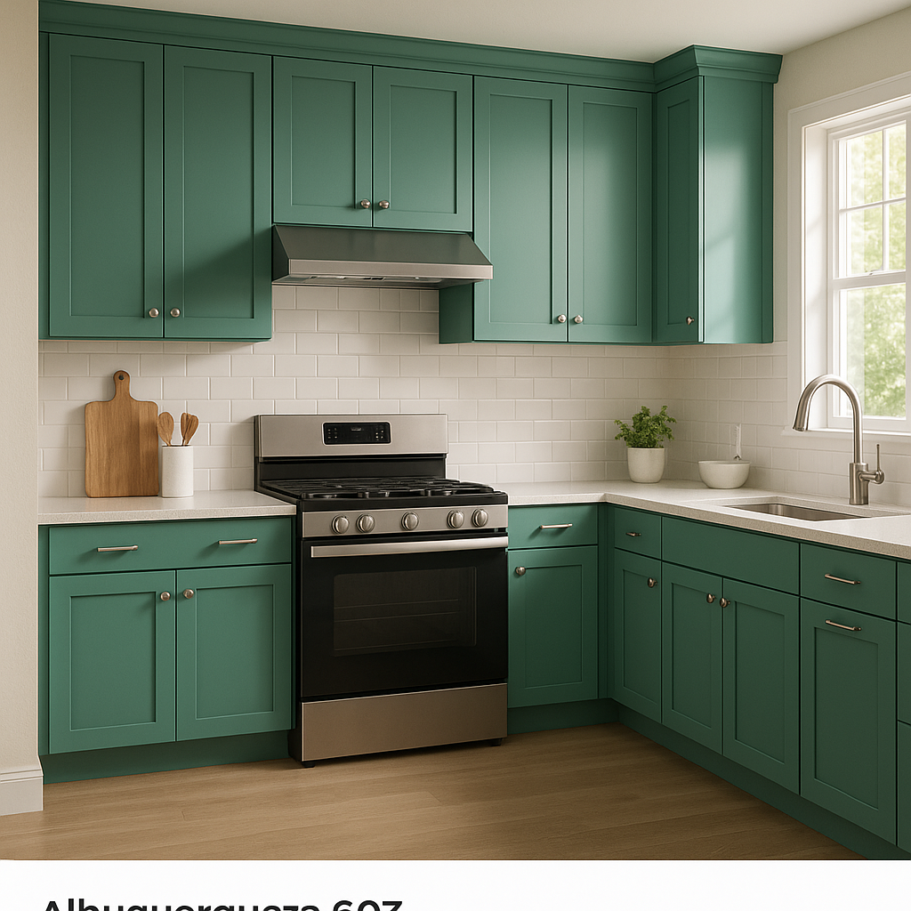
Albuquerque 607 brings an understated warmth to kitchens and bathrooms, working well with natural materials like stone, tile, and wood. Consider pairing it with white cabinetry and brass fixtures for a timeless, farmhouse-inspired look, or with sleek, modern finishes for a more contemporary vibe.
As a neutral with personality,
View Colors Only by Brand (No Imagery):
Sherwin-Williams
|
Benjamin-Moore
|
Behr
|
Valspar
Live on the Eastern Slope of Colorado and looking for a local painting professional, check out all our painting services and reach out for a free estimate.
Copyright © 2026 : Wild Fox Painting Inc. : 12435 Mead Way, Littleton, CO 80125


