Benjamin Moore Alpine (622) is a soft, muted green that evokes the tranquil beauty of a mountain landscape. This versatile paint color is perfect for creating a calm and refreshing atmosphere in any space. Whether used as a primary wall color or as an accent, Alpine brings a sense of balance and quiet sophistication to interiors.
Alpine (622) is a gentle green with subtle gray undertones, which gives it a grounded and modern appearance. The gray undertones help temper the green, ensuring it doesn’t feel overly vibrant or juvenile. This muted quality makes Alpine a highly adaptable choice for a variety of design styles, from contemporary to traditional. The color leans slightly toward a cool tone, making it ideal for spaces where you want to evoke a sense of calm, like bedrooms, living rooms, or bathrooms.
Benjamin Moore Alpine (622) pairs beautifully with a range of coordinating colors, making it easy to incorporate into your design palette. Here are some complementary shades:
Alpine (622) is a versatile color that works in a variety of spaces and applications. Here's how you can incorporate it into your home:
Alpine creates a relaxed and welcoming environment in living rooms, especially when paired with neutral furniture and natural textures like wood or rattan. Use it on the walls to anchor your space, and accessorize with cream or beige upholstery for a harmonious look.
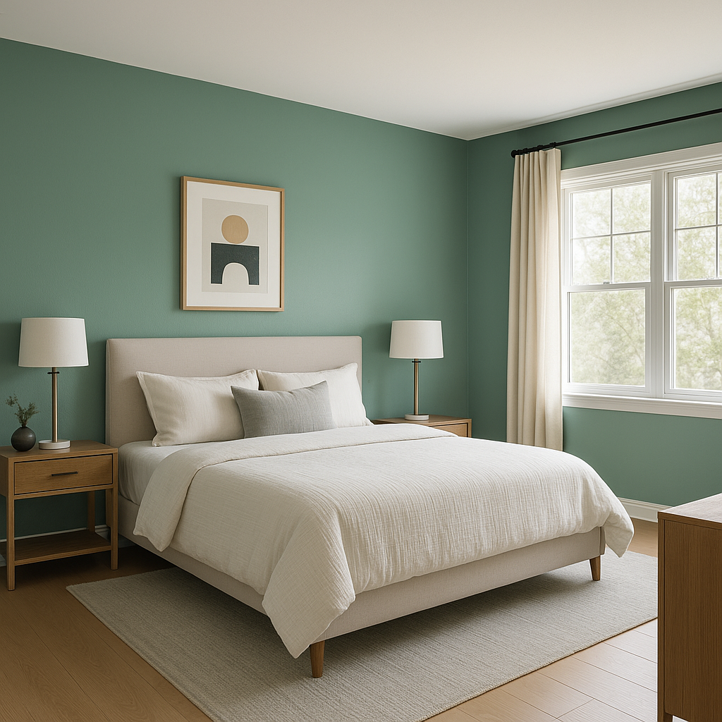
The soothing nature of Benjamin Moore Alpine makes it a perfect choice for bedrooms. Its muted tones help foster relaxation and rest, especially when paired with soft linens in white or light gray. Consider painting all four walls for an immersive experience or using it as an accent wall color behind your bed.
Bring the tranquility of nature into your bathroom with Alpine. Its cool undertones work well with white subway tiles, marble countertops, or brushed nickel fixtures. Add greenery or botanical accessories to enhance the natural vibe.
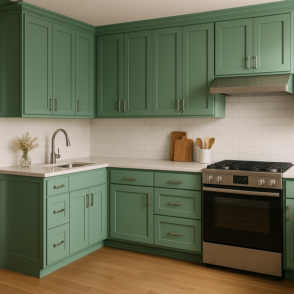
For a fresh and modern kitchen, Alpine can be used as a wall color or even on cabinetry. Pair it with white countertops and backsplash tiles for a clean, cohesive look. Metallic accents like brass or stainless steel can bring a contemporary edge.
The soft green of Alpine promotes focus and calm, making it an excellent option for a home office. Combine it with warm wood tones and textured fabrics to create a comfortable yet productive workspace.
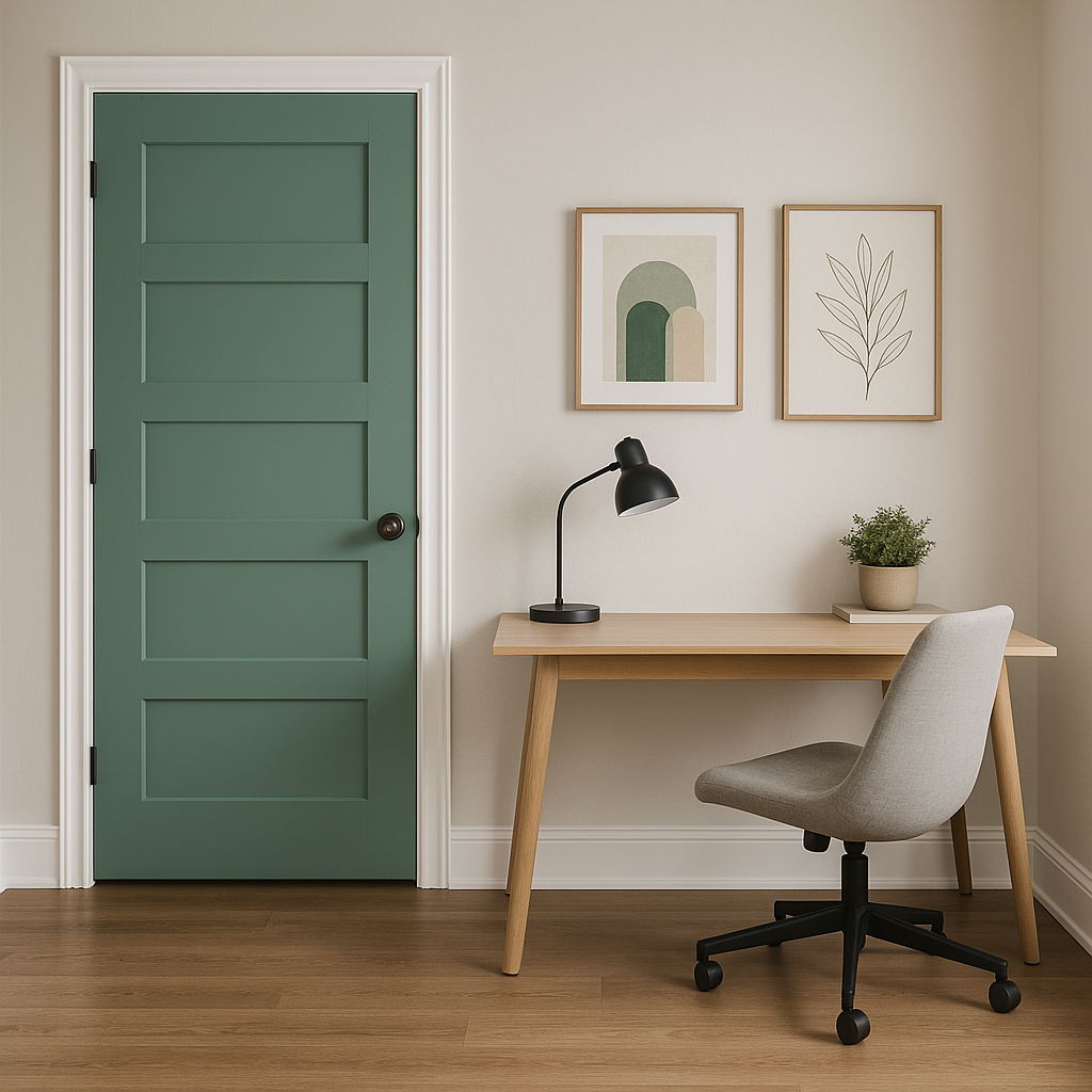
If you’re not ready to commit to using Alpine as a full wall color, it works beautifully as an accent. Consider painting trim, doors, or built-in shelving in Alpine for a subtle yet impactful pop of color.
Benjamin Moore Alpine (622) is a masterfully balanced shade that blends sophistication and serenity. Its muted tones and subtle gray undertones make it a timeless choice for interiors, while its versatility allows it to complement a wide range of palettes and styles. Whether you're redesigning a single room or your entire home, Alpine offers a fresh and refined option that feels both modern and grounded.
By choosing Alpine, you're not just selecting a paint color; you're creating an atmosphere—a serene retreat inspired by the natural beauty of the outdoors.
View Colors Only by Brand (No Imagery):
Sherwin-Williams
|
Benjamin-Moore
|
Behr
|
Valspar
Live on the Eastern Slope of Colorado and looking for a local painting professional, check out all our painting services and reach out for a free estimate.
Copyright © 2026 : Wild Fox Painting Inc. : 12435 Mead Way, Littleton, CO 80125


