Benjamin Moore Spring 627 is a soft, delicate green that evokes the rejuvenating energy of springtime. This versatile shade is ideal for creating a calming, natural ambiance in any interior or exterior space. With its subtle sophistication and balanced tone, Spring 627 is a perfect choice for homeowners and designers looking to infuse a touch of nature into their living spaces.
Spring 627 has gentle undertones of cool gray and muted yellow, which enhance its natural appeal and make it highly adaptable. These undertones help the color strike a perfect balance between warm and cool, allowing it to harmonize with a variety of palettes. The presence of gray keeps it grounded and modern, while the hint of yellow adds warmth and vitality.
This nuanced undertone gives Spring 627 its signature versatility. It avoids being overly bright or bold, making it suitable for both traditional and contemporary spaces.
Benjamin Moore Spring 627 pairs beautifully with a wide range of colors, making it easy to design cohesive and polished interiors. Here are a few coordinating color suggestions:
Neutral Pairings:
Combine Spring 627 with soft whites like Benjamin Moore White Dove OC-17 or Chantilly Lace OC-65 for a clean and airy feel. These neutrals highlight the green's natural softness without overwhelming the space.
Earthy Tones:
Pair it with muted beige or taupe shades like Revere Pewter HC-172 or Edgecomb Gray HC-173 to create an organic, earthy palette. These colors provide a grounded, harmonious contrast that enhances the green's subtle warmth.
Bold Accents:
For a more dynamic look, try pairing Spring 627 with deeper blues like Hale Navy HC-154 or rich mustard tones like Golden Retriever 2165-30. These accents bring a pop of vibrancy while maintaining balance.
Complementary Greens:
Layer Spring 627 with darker greens such as Backwoods 469 or lighter, minty greens like Pale Vista 458 for a monochromatic palette that feels serene and cohesive.
The soft yet invigorating nature of Spring 627 makes it an excellent choice for a variety of applications throughout your home:
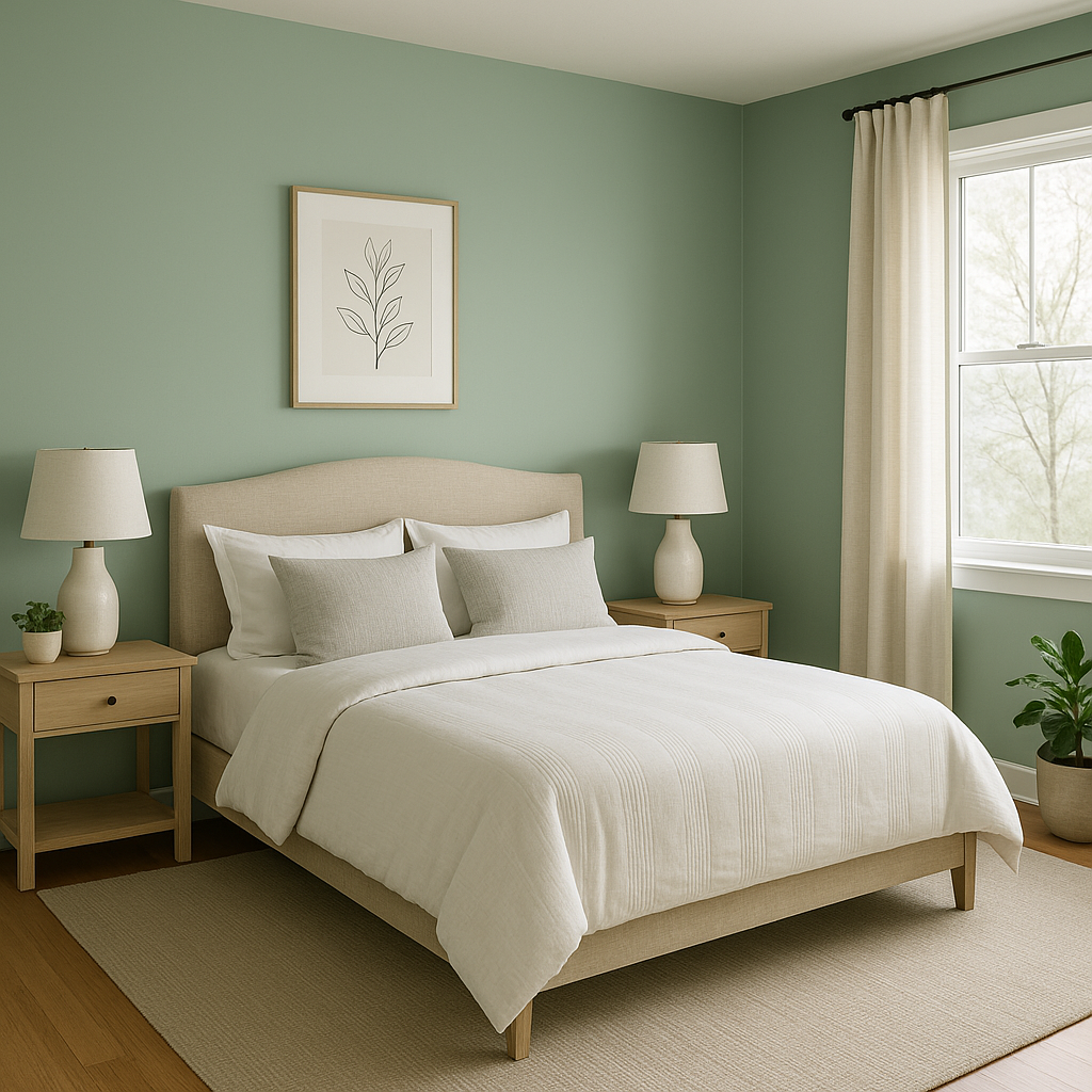
Living Rooms and Bedrooms:
Create a tranquil retreat by using Spring 627 on the walls of your living room or bedroom. Its soothing green tone promotes relaxation and pairs well with soft furnishings in neutral or pastel hues.
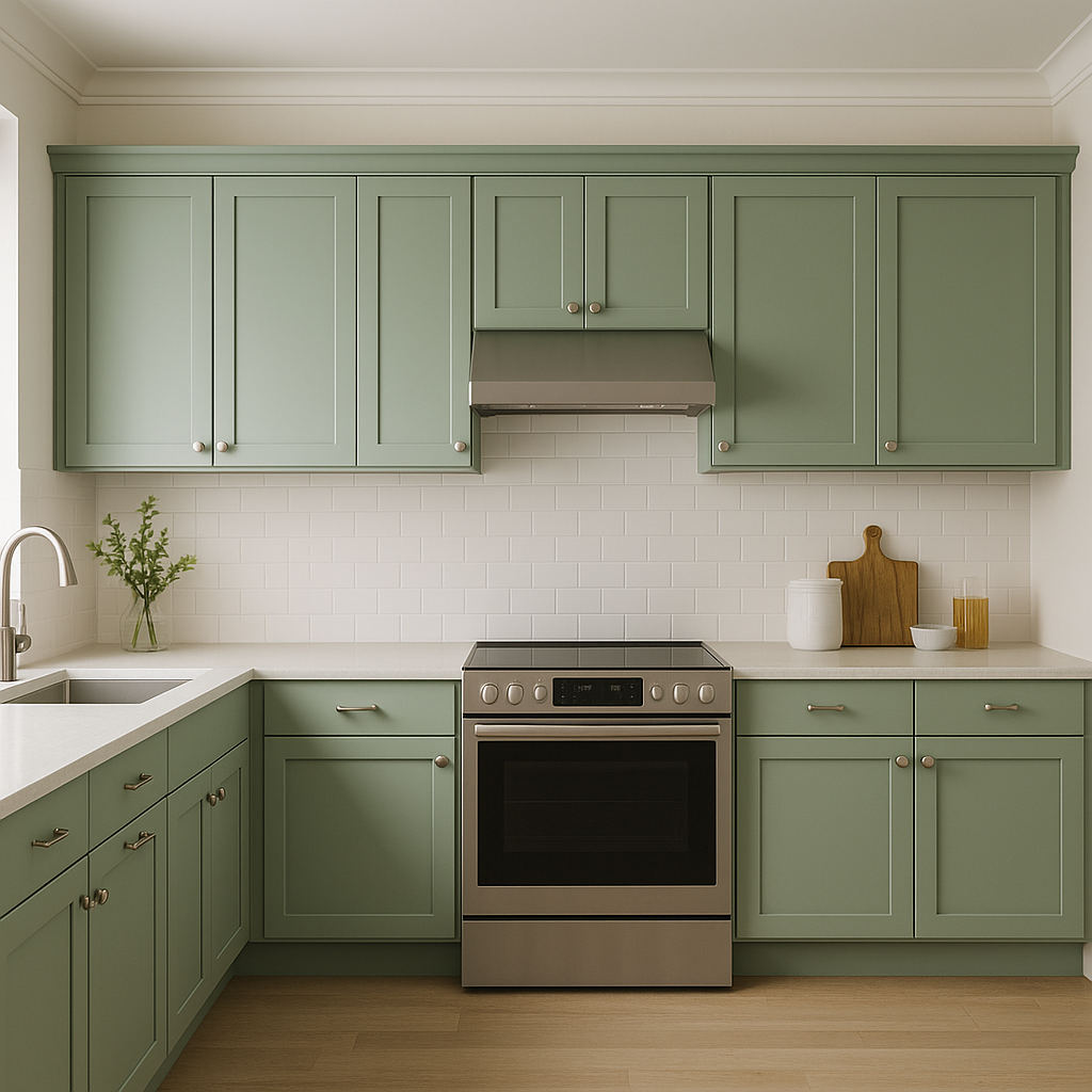
Kitchen and Dining Areas:
Use Spring 627 in kitchens and dining rooms to bring a fresh and inviting vibe. It works beautifully with natural wood finishes, white cabinetry, and stainless steel accents.
Bathrooms:
Spring 627 is also a popular choice for bathrooms, where its calming qualities can transform the space into a spa-like sanctuary. Pair it with crisp whites and polished chrome fixtures for a clean, timeless look.
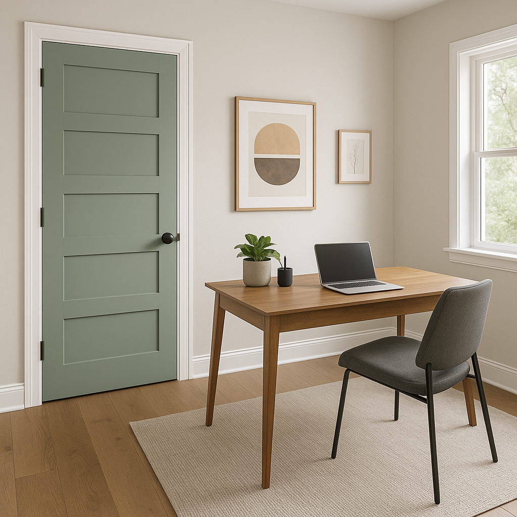
Home Offices:
This color’s natural and balanced tone makes it an excellent backdrop for home offices. It fosters focus and productivity without feeling sterile or overwhelming.
Exteriors:
On the exterior, Spring 627 is a fantastic choice for siding, shutters, or doors. Its soft green tone blends seamlessly with natural surroundings, making it particularly appealing for homes in wooded or coastal areas.
Benjamin Moore Spring 627 is more than just a color—it’s a mood. It brings a sense of renewal and harmony to any space, making it a timeless choice for homeowners who want to embrace a subtle yet impactful shade. Its versatile undertones, coordinating possibilities,
View Colors Only by Brand (No Imagery):
Sherwin-Williams
|
Benjamin-Moore
|
Behr
|
Valspar
Live on the Eastern Slope of Colorado and looking for a local painting professional, check out all our painting services and reach out for a free estimate.
Copyright © 2026 : Wild Fox Painting Inc. : 12435 Mead Way, Littleton, CO 80125


