
Benjamin Moore Weeping (629) is a soft, muted green that evokes a sense of tranquility and understated sophistication. With its gentle presence, this hue offers a perfect balance between nature-inspired serenity and refined charm, making it a versatile choice for a variety of design styles. Whether you're aiming to create a soothing retreat or an effortlessly elegant living space, Weeping delivers a calm, grounded aesthetic that invites relaxation and harmony into any interior.
One of the defining characteristics of Weeping is its subtle undertones. This shade carries delicate hints of gray, which serve to neutralize its green base, giving it a cool, subdued appearance. These gray undertones prevent it from feeling overly vibrant or saturated, ensuring it remains soft and approachable. The understated complexity of Weeping allows it to adapt beautifully to both modern and traditional interiors, as it pairs equally well with crisp whites or deeper earth tones.
Weeping (629) is an incredibly versatile green, lending itself to a variety of complementary color palettes. Here are some coordinating colors to consider:
Warm Neutrals: Pair Weeping with creamy whites like Benjamin Moore White Dove (OC-17) or soft beiges such as Benjamin Moore Edgecomb Gray (HC-173). These warm neutrals enhance the coziness of the green, creating a welcoming ambiance.
Crisp Whites: Opt for a clean contrast with shades like Benjamin Moore Chantilly Lace (OC-65). The crispness of Chantilly Lace highlights the gray undertones in Weeping, resulting in a fresh and contemporary look.
Earthy Browns and Taupes: Colors like Benjamin Moore Sparrow (AF-720) or Kendall Charcoal (HC-166) add depth and richness to the palette, creating a harmonious, grounded vibe reminiscent of nature.
Soft Blues: Consider pairing Weeping with Benjamin Moore Smoke (2122-40) or Gray Cashmere (2138-60) for a serene, coastal-inspired look. These gentle blues complement the cool undertones of Weeping beautifully.
Weeping (629)’s versatility makes it an excellent choice for a variety of applications throughout your home, whether it’s a primary wall color or an accent.
Living Rooms: Bring a sense of calm and sophistication to your living area with Weeping on your walls. Pair it with neutral furniture and soft textures like linen or wool for an inviting, cozy space.
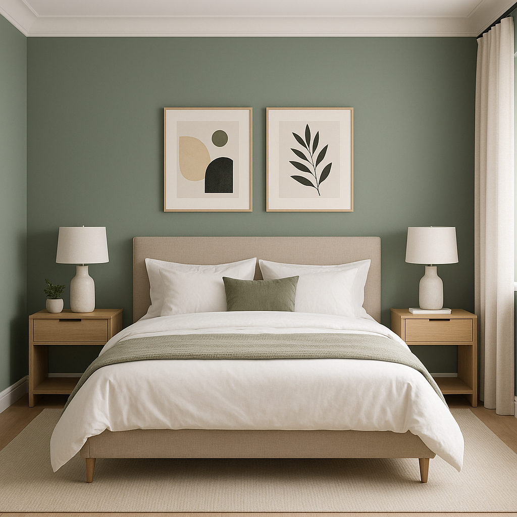
Bedrooms: Create a tranquil retreat by using Weeping in the bedroom. Its muted green feels soothing and restorative, making it ideal for fostering relaxation. Add layers of plush bedding and soft lighting to enhance the atmosphere.
Bathrooms: Weeping is a fantastic choice for bathrooms, especially when paired with white subway tiles and brushed nickel or chrome fixtures. Its spa-like quality can transform your bathroom into a peaceful sanctuary.
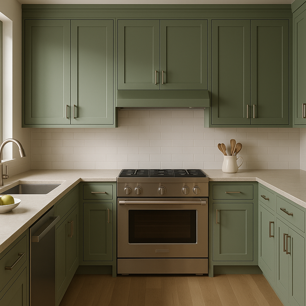
Kitchens: Use Weeping for cabinetry or as a wall color in kitchens for a fresh, timeless look. Pair it with marble countertops and brass hardware to elevate the space with subtle elegance.
Entryways: Welcome guests with Weeping in your entryway or foyer. Its soft, inviting hue sets the tone for a stylish and serene home.
Accent Walls: If you’re not ready to commit to painting an entire room, use Weeping as an accent wall color. It pairs beautifully with neutral tones, adding depth and personality to a space without overwhelming it.
Benjamin Moore Weeping is a versatile, understated green that adapts to a range of design styles and settings. Its delicate balance of softness and sophistication makes it a perfect choice for homeowners seeking a subtle yet impactful shade. Whether you’re designing a contemporary space or embracing a more traditional aesthetic, Weeping offers the timeless elegance and calming presence of nature in your home.
View Colors Only by Brand (No Imagery):
Sherwin-Williams
|
Benjamin-Moore
|
Behr
|
Valspar
Live on the Eastern Slope of Colorado and looking for a local painting professional, check out all our painting services and reach out for a free estimate.
Copyright © 2026 : Wild Fox Painting Inc. : 12435 Mead Way, Littleton, CO 80125


