Benjamin Moore Let It Rain 639: A Sophisticated and Timeless Hue
Benjamin Moore’s Let It Rain 639 is a captivating medium blue-gray shade that exudes a sense of calm, sophistication, and versatility. It’s a color that strikes the perfect balance between cool and warm tones, making it a popular choice for both classic and contemporary interiors. Whether you're refreshing your living space or designing a serene retreat, Let It Rain offers a timeless aesthetic that works beautifully across a variety of styles.
Undertones of Let It Rain 639
One of the defining characteristics of Let It Rain is its subtle undertones, which shift depending on lighting and surrounding colors. This hue has:
- Blue Undertones: The primary blue base gives the color a soothing and tranquil vibe, reminiscent of a soft raincloud or misty skyline.
- Gray Undertones: The touch of gray tempers the blue, keeping it from feeling overly vibrant or overwhelming while adding a sophisticated depth.
- Green Hints: In certain lighting conditions, you may notice a faint green undertone, adding complexity and versatility to the shade.
These undertones allow Let It Rain to adapt gracefully to a variety of spaces, creating a grounded yet airy ambiance.
Coordinating Colors for Let It Rain 639
To make the most of Let It Rain’s rich and nuanced personality, pair it with complementary and harmonious shades that enhance its beauty. Here are some ideas for coordinating colors:
- Soft Neutrals: Pair Let It Rain with whites such as Benjamin Moore Simply White OC-117 or Chantilly Lace OC-65 for a clean, crisp look that brightens the space. These soft neutrals balance the depth of the blue-gray tone.
- Earthy Warm Tones: Try pairing it with warm beige or taupe tones like Edgecomb Gray HC-173 or Revere Pewter HC-172 for a cozy, inviting feel. The warmth of these shades contrasts beautifully with the coolness of Let It Rain.
- Deep Accents: For a bold and dramatic aesthetic, incorporate deeper colors such as Hale Navy HC-154 or Kendall Charcoal HC-166. These accents add depth and create a striking contrast.
- Pale Greens and Blues: To emphasize the serene qualities of Let It Rain, pair it with muted greens like Pale Oak OC-20 or soft blues like Breath of Fresh Air 806.
These coordinating colors can be used for trim, accent walls, furniture, or accessories to create a cohesive and polished design.
Ideal Uses for Let It Rain 639
The versatility of Let It Rain makes it suitable for virtually any room in your home. Its calming and balanced qualities make it a perfect choice for spaces where relaxation and reflection are key. Below are some ideas for how to use this color effectively:
- Living Rooms: Create a cozy yet sophisticated living space by using Let It Rain as the main wall color. Pair it with plush textures, natural wood furniture, and soft lighting to enhance its inviting appeal.
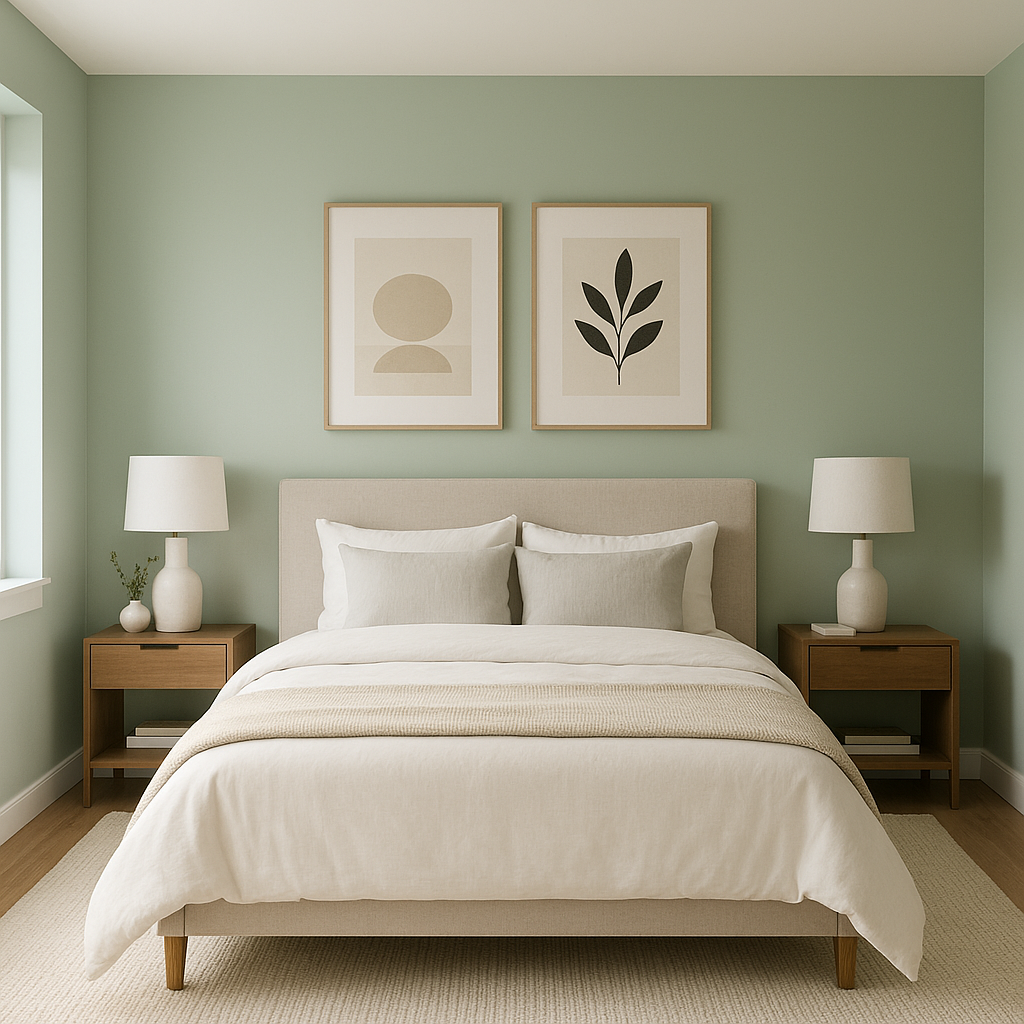
- Bedrooms: Let It Rain is an excellent choice for bedrooms, where its tranquil and grounding nature promotes rest and relaxation. Accent it with crisp white linens and soft gray or navy throw pillows for a serene retreat.
- Bathrooms: The spa-like feel of Let It Rain makes it a great option for bathrooms. Use it on the walls or cabinetry, and pair it with marble countertops, chrome fixtures, and crisp white towels for a fresh and elegant look.
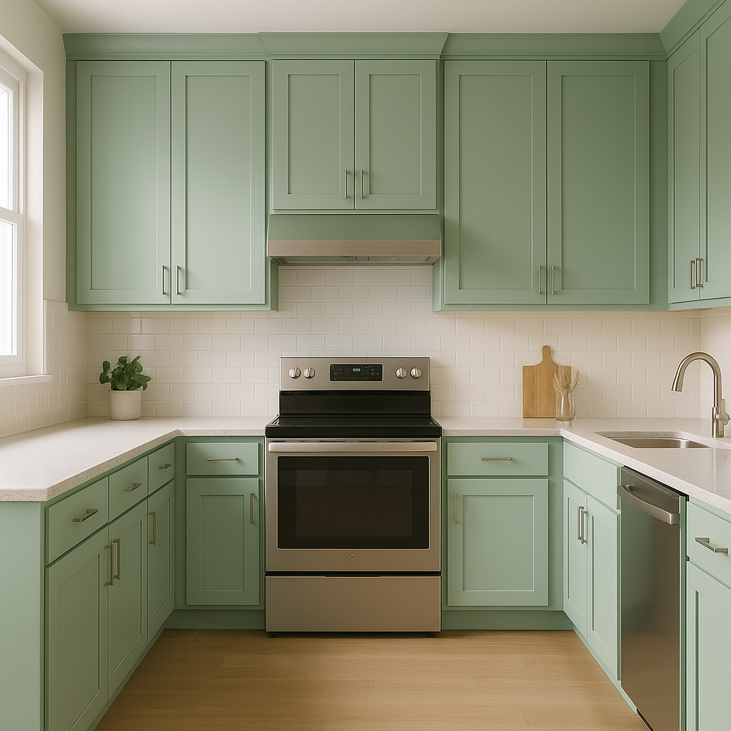
- Kitchens: For a unique and modern touch, consider using Let It Rain on kitchen cabinetry or a backsplash. Its cool tone works beautifully with white or light gray countertops and stainless steel appliances.
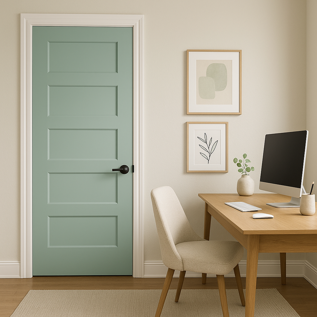
- Home Offices: Foster focus and creativity by painting your home office in Let It Rain. Its soothing yet refined vibe helps create a productive environment.
Lighting Considerations