Benjamin Moore Kokopelli (648) is a striking terracotta-inspired paint color that exudes warmth, richness, and character. This earthy hue is a captivating blend of red and orange tones, reminiscent of sunbaked clay and the vibrant hues found in desert landscapes. Kokopelli brings depth and a sense of grounded tranquility to any space, making it a perfect choice for homeowners and designers seeking a bold yet versatile statement color.
Kokopelli is characterized by its warm undertones, which lean towards red with subtle hints of brown. These undertones give the color a natural, organic feel that makes it easy to incorporate into a variety of design schemes. The slight brown influence softens the vibrancy, ensuring Kokopelli remains sophisticated and not overly saturated. This balance allows it to work beautifully in rustic, Southwestern, or Mediterranean-inspired interiors, as well as modern spaces craving a touch of earthy refinement.
Benjamin Moore Kokopelli shines when paired with complementary and contrasting colors that enhance its warm, earthy personality. Here are some potential coordinating colors to consider:
Neutral Pairings: To create an elegant and grounded palette, pair Kokopelli with warm neutrals like Benjamin Moore White Dove (OC-17) or Edgecomb Gray (HC-173). These soft hues provide balance and contrast without overpowering the richness of the terracotta tone.
Earthy Greens: For a harmonious, nature-inspired aesthetic, use muted greens such as Benjamin Moore Saybrook Sage (HC-114) or Dry Sage (2142-40). These greens echo the organic feel of Kokopelli, creating a grounded and serene ambiance.
Deep Browns and Charcoals: Accentuate the warmth of Kokopelli by pairing it with rich, dark tones like Benjamin Moore Iron Mountain (2134-30) or Van Buren Brown (HC-70). These dramatic shades add depth and sophistication to the overall palette.
Vibrant Blues: For a bold and lively contrast, consider pairing Kokopelli with deep blues like Benjamin Moore Hale Navy (HC-154) or Blue Note (2129-30). The cool tones counterbalance the earthy warmth, creating an impactful and energizing duo.
Kokopelli (648) is a versatile color that can transform various spaces depending on the application. Its bold yet inviting nature makes it ideal for the following uses:
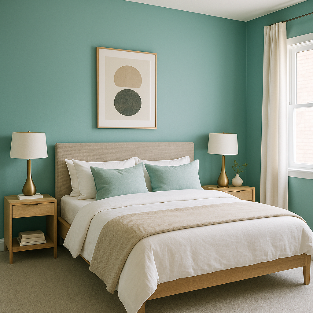
Accent Walls: Create a dynamic focal point by using Kokopelli on a feature wall in living rooms, dining rooms, or bedrooms. Its rich terracotta tone draws attention while adding depth and character to the space.
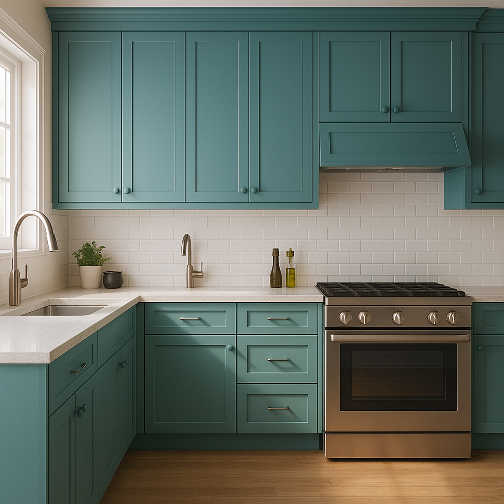
Kitchen and Dining Spaces: Bring a warm, welcoming ambiance to kitchens and dining areas. Pair Kokopelli with natural wood cabinetry or rustic finishes for a cozy, Southwest-inspired vibe.
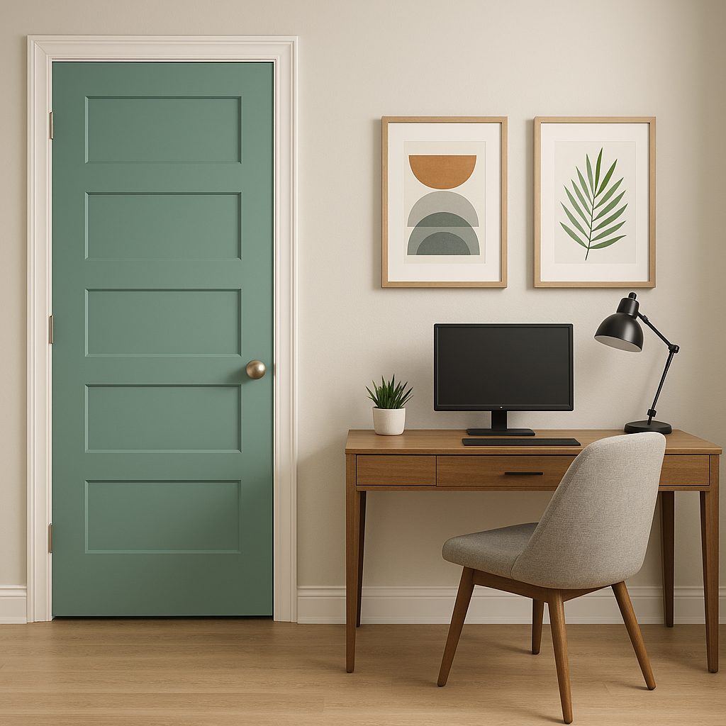
Exteriors: Kokopelli is also an excellent choice for exterior applications. Whether used for a front door, trim, or siding, its earthy richness complements natural landscapes beautifully.
Textured Surfaces: Highlight architectural details, such as brick, stucco, or shiplap walls, with the bold warmth of Kokopelli. Its terracotta hue enhances the tactile quality of textured surfaces, adding visual interest.
When working with Kokopelli, balance is key. Although it’s a bold color, layering it with softer tones and textures ensures it doesn’t overwhelm the space. Incorporate natural materials like wood, stone, or woven fabrics to emphasize its organic appeal. Add pops of metallic finishes, such as bronze or copper, for a touch of elegance.
Benjamin Moore Kokopelli (648) is a celebration of earthy sophistication and bold design. With its warm undertones, versatile pairings, and dynamic applications, it is the perfect choice for making a lasting design statement that feels both grounded and inviting.
View Colors Only by Brand (No Imagery):
Sherwin-Williams
|
Benjamin-Moore
|
Behr
|
Valspar
Live on the Eastern Slope of Colorado and looking for a local painting professional, check out all our painting services and reach out for a free estimate.
Copyright © 2026 : Wild Fox Painting Inc. : 12435 Mead Way, Littleton, CO 80125


