Benjamin Moore Oceanfront (660) is a captivating paint color that merges the serene qualities of blue with the rich depth of green, creating a bold yet refined statement for any space. This deeply saturated hue evokes imagery of the ocean’s tranquil yet dramatic presence, offering a sense of sophistication and calm that works beautifully in a variety of design styles. Whether you're aiming for a coastal-inspired retreat or a modern, moody interior, Oceanfront is versatile enough to adapt to your creative vision.
Oceanfront possesses distinct undertones that set it apart from other blue-green shades. While the primary color reads as a deep teal, subtle gray undertones balance its vibrancy, lending the hue a muted sophistication. These gray undertones ensure that the color feels grounded and elegant, avoiding the overly saturated or overly bright appearance that some teal shades can exhibit. This makes Oceanfront ideal for spaces where you want to create a cozy yet elevated atmosphere.
When building a color palette around Benjamin Moore Oceanfront, consider pairing it with complementary and contrasting hues to enhance its impact:
Oceanfront’s versatility allows it to shine in various applications across your home or workspace. Here are some ideas for incorporating this bold, sophisticated hue:
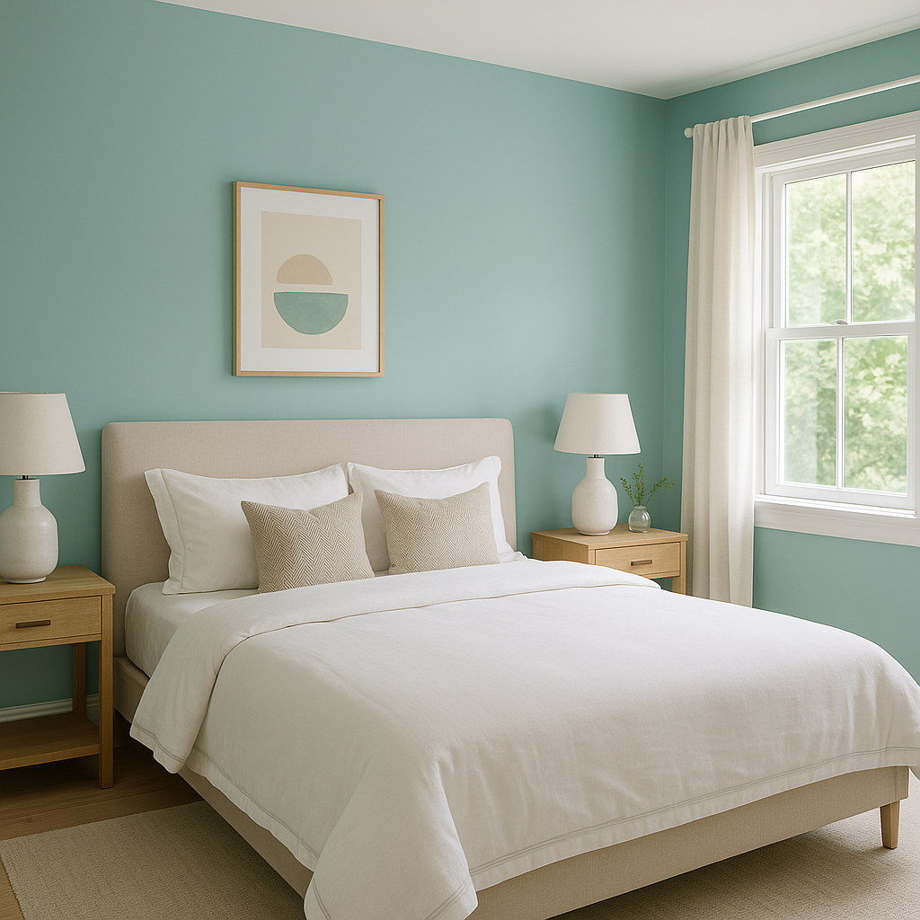
Transform a room with a dramatic accent wall featuring Oceanfront. Its depth makes it perfect for creating a focal point in living rooms, bedrooms, or dining areas. Pair it with neutral surrounding walls to let the color stand out without overwhelming the space.
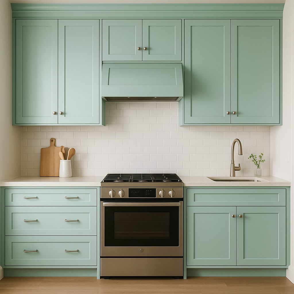
Oceanfront is an excellent choice for kitchen or bathroom cabinets, especially when paired with white countertops, brass hardware, or subway tile. Its moody elegance adds a luxurious touch to these spaces.
If painting walls feels too bold, consider using Oceanfront on a piece of furniture like a bookshelf, dresser, or sideboard. This pop of color can elevate the room's overall design and tie together other elements in the space.
For a daring yet cozy look, bring Oceanfront to the ceiling of a room, especially in smaller spaces like powder rooms or home offices. It draws the eye upward and creates a unique, enveloping ambiance.
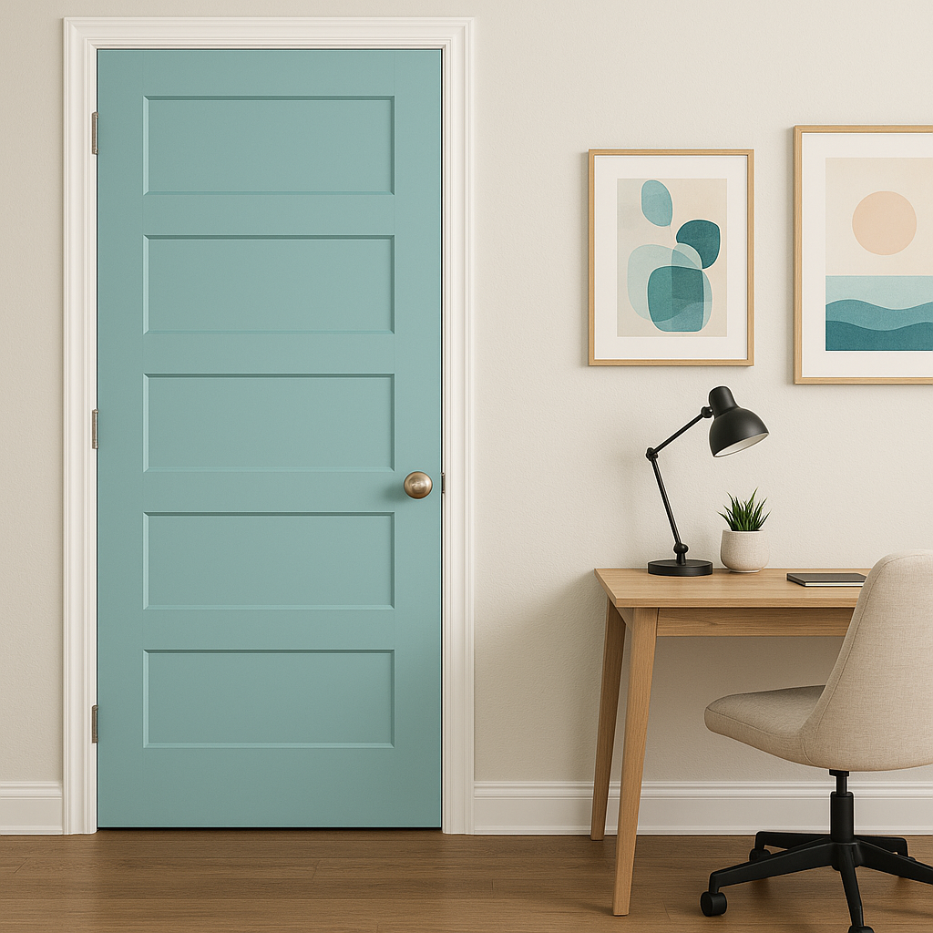
Oceanfront makes a striking choice for exterior applications, such as front doors, shutters, or siding. Its rich tone works beautifully against natural landscaping and neutral stone or brick finishes.
Oceanfront can adapt seamlessly to a variety of design aesthetics:
Benjamin Moore Oceanfront (660) is a color that makes a statement while remaining approachable and versatile. Its rich blend of blue, green, and gray undertones allows you to incorporate depth, drama, and elegance into your home design, whether you’re creating a serene retreat or an energetic gathering space. Let Oceanfront transport your interiors to a place of beauty and inspiration.
View Colors Only by Brand (No Imagery):
Sherwin-Williams
|
Benjamin-Moore
|
Behr
|
Valspar
Live on the Eastern Slope of Colorado and looking for a local painting professional, check out all our painting services and reach out for a free estimate.
Copyright © 2026 : Wild Fox Painting Inc. : 12435 Mead Way, Littleton, CO 80125


