Benjamin Moore Soft (671) is a delicate and understated neutral that evokes a sense of calm and serenity. With its gentle beige-gray tone, this versatile color is perfect for creating tranquil spaces that feel both inviting and harmonious. Whether you're designing a cozy living room, a serene bedroom, or even a professional office, Soft (671) delivers a timeless appeal with its subtle sophistication.
Soft (671) features warm beige undertones with a whisper of gray, making it a balanced neutral that works beautifully in a variety of lighting conditions. The warmth in the undertones lends a comforting feel, while the touch of gray adds modernity and refinement. It's neither too cool nor too warm, making it adaptable to both traditional and contemporary design styles.
In spaces with ample natural light, Soft (671) may lean slightly warmer, highlighting its beige qualities. In rooms with lower light or artificial lighting, the gray undertones become more pronounced, giving the color a cooler and more muted appearance. This dual personality allows Soft (671) to transition effortlessly between day and night while maintaining its soothing aura.
Benjamin Moore Soft (671) pairs beautifully with a wide range of coordinating colors, allowing you to craft stunning color palettes for your interiors.
Warm Pairings: For a cohesive and inviting look, pair Soft (671) with creamy whites like Benjamin Moore White Dove (OC-17) or Benjamin Moore Cloud White (OC-130). These shades accentuate the warmth in Soft (671) and create a soft, layered effect.
Cool Pairings: To emphasize its gray undertones, opt for cooler tones like Benjamin Moore Gray Owl (2137-60) or a soft blue-gray such as Benjamin Moore Boothbay Gray (HC-165). These combinations bring a refined, contemporary feel to any space.
Accent Colors: Add depth and contrast with rich accent colors like Benjamin Moore Hale Navy (HC-154) or dramatic blacks like Benjamin Moore Onyx (2133-10). For a playful pop of color, consider muted greens or blush tones like Benjamin Moore Saybrook Sage (HC-114) or Benjamin Moore Italian Rose (2083-30).
Benjamin Moore Soft (671) shines in spaces where you want to cultivate a calm and neutral backdrop. Here are some ideas for incorporating this versatile shade into your home:
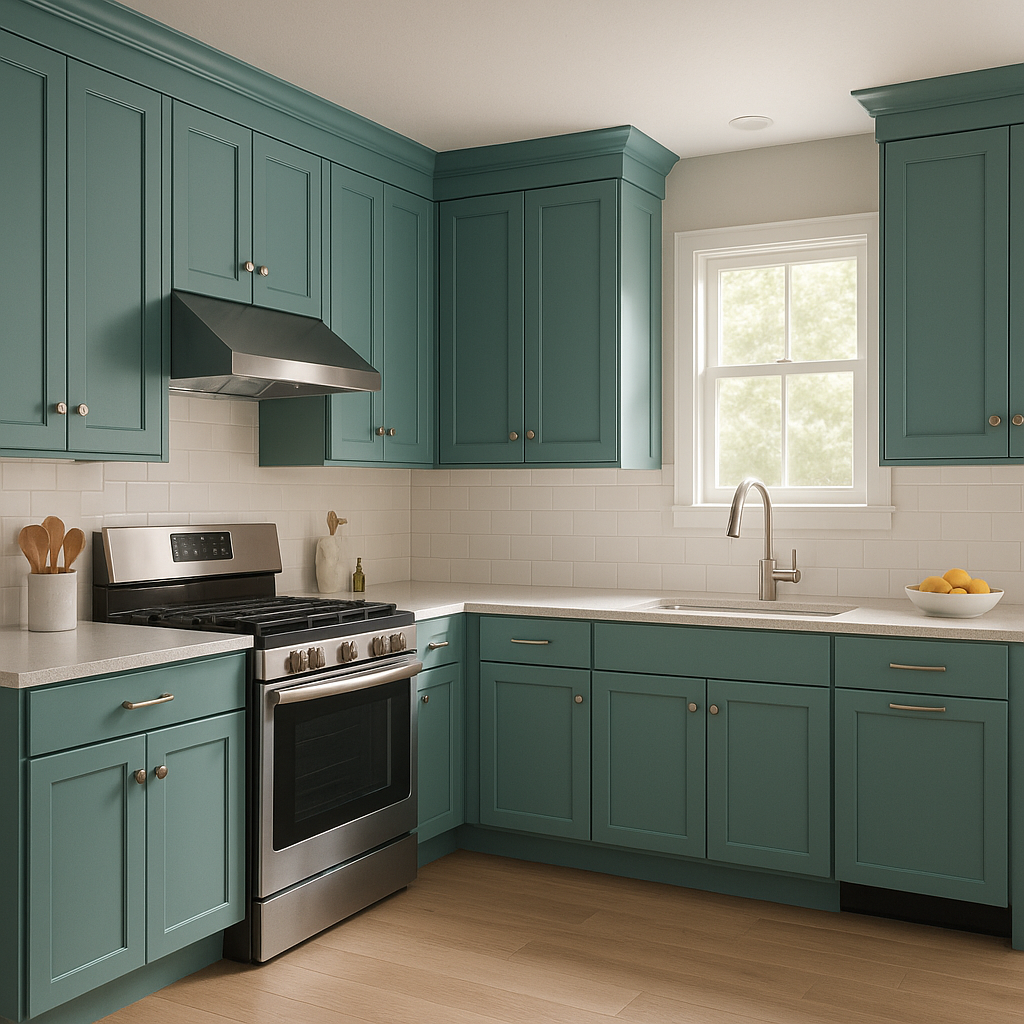
Living Rooms: Create a warm and inviting living room by using Soft (671) on your walls. Pair it with plush furniture in natural fabrics like linen or cotton, and layer textures with area rugs and throw pillows in coordinating neutral tones.
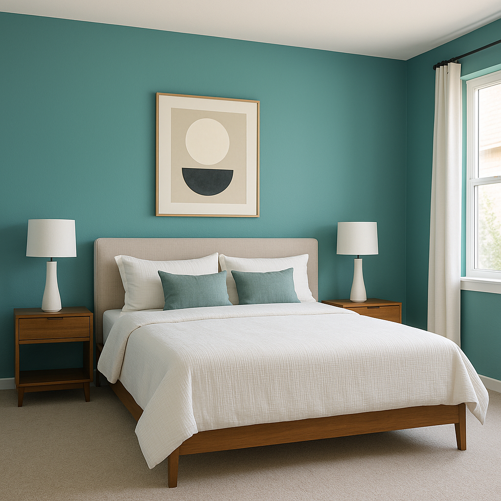
Bedrooms: For a restful retreat, use Soft (671) as the main wall color and complement it with soft, muted bedding in whites, taupes, or gentle blues. Add natural wood furniture or metallic accents for a touch of elegance.
Bathrooms: Soft (671) is an excellent choice for bathrooms, offering a clean and serene look. Pair it with crisp white tiles, brushed nickel fixtures, and subtle greenery for a spa-like atmosphere.
Hallways and Entryways: This neutral shade works wonderfully in transitional spaces like hallways or entryways, creating an inviting flow throughout your home. Combine it with white trim for a polished and classic aesthetic.
Offices: If you're redesigning a home office, Soft (671) provides a calm and focused backdrop. Pair it with darker furniture finishes and pops of color through desk accessories to keep the space lively yet professional.
Benjamin Moore Soft (671) is the perfect choice for homeowners and designers seeking a versatile neutral that balances warmth and sophistication. Its understated elegance allows it to serve as a foundation for virtually any design style, from minimalist modern to cozy farmhouse. With its ability to adapt to different lighting conditions and pair seamlessly with coordinating colors, Soft (671) is a timeless option that will elevate your interiors effortlessly.
View Colors Only by Brand (No Imagery):
Sherwin-Williams
|
Benjamin-Moore
|
Behr
|
Valspar
Live on the Eastern Slope of Colorado and looking for a local painting professional, check out all our painting services and reach out for a free estimate.
Copyright © 2026 : Wild Fox Painting Inc. : 12435 Mead Way, Littleton, CO 80125


