Benjamin Moore Turquoise 695 is a captivating shade that exudes charm, energy, and sophistication. This rich, jewel-toned bluish-green offers a perfect balance of vibrancy and depth, making it an excellent choice for a variety of design styles, from coastal chic to eclectic modern. Whether you're looking to create a bold statement wall, add a pop of color to cabinetry, or bring life to your decor with accent pieces, Turquoise 695 is a versatile color that delivers an unforgettable impression.
Turquoise 695 features a harmonious blend of cool blue and green undertones. Its blue base gives it a calming and serene vibe, while the green undertones add warmth and a touch of earthiness, making it a well-rounded color. Depending on the lighting, this shade may lean more blue in natural daylight or reveal its green undertone in softer, warm lighting. This dynamic quality allows the color to shift and adapt, giving your space a fresh and lively feel throughout the day.
This stunning turquoise pairs beautifully with a wide range of complementary shades, enabling you to create a cohesive and balanced color palette. Here are some recommended coordinating colors for Benjamin Moore Turquoise 695:
Neutral Coordinators:
Earthy Tones:
Bold Pairings:
Monochromatic Layers:
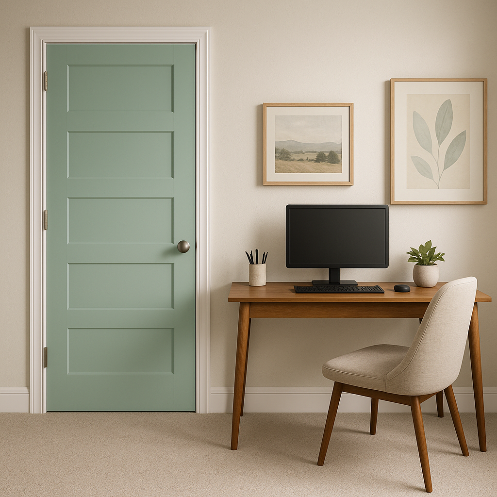
Turquoise 695 is a highly versatile color that works beautifully across different spaces and design elements. Here are some creative ways to incorporate this hue into your home or commercial interiors:
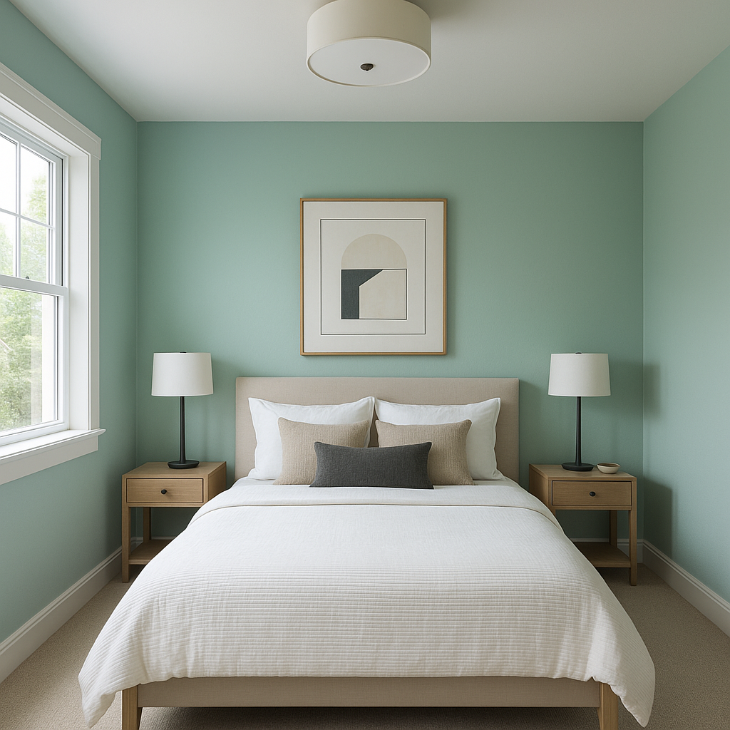
Use Turquoise 695 to create a focal point in living rooms, bedrooms, or dining areas. Its rich, jewel-toned quality draws the eye and adds personality to any space. Pair it with neutral furnishings to let the color stand out or with bold patterns for a dramatic effect.
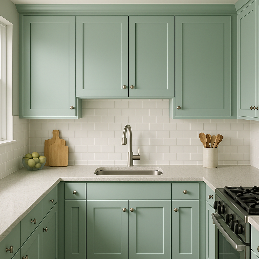
This shade is a striking choice for cabinetry, whether you're designing a modern farmhouse kitchen or a retro-inspired space. It also works wonderfully on furniture pieces like a statement dresser, console table, or headboard.
Turquoise 695 can transform a bathroom or powder room into a serene oasis. Pair it with crisp whites and metallic accents like chrome or brass for a spa-like vibe or with wood tones for a more natural, earthy feel.
The blue-green undertones of Turquoise 695 make it a natural fit for coastal-inspired interiors. Combine it with sandy beige tones,
View Colors Only by Brand (No Imagery):
Sherwin-Williams
|
Benjamin-Moore
|
Behr
|
Valspar
Live on the Eastern Slope of Colorado and looking for a local painting professional, check out all our painting services and reach out for a free estimate.
Copyright © 2026 : Wild Fox Painting Inc. : 12435 Mead Way, Littleton, CO 80125


