Benjamin Moore Polished (713) is a sophisticated and versatile neutral paint color that exudes a sense of refinement and balance. This elegant shade is a soft, muted gray with subtle warm undertones, making it a perfect choice for spaces that require a touch of understated elegance. Its gentle hue provides a serene backdrop that complements a variety of design styles, from classic to contemporary.
Polished (713) carries a delicate warmth in its undertones, which sets it apart from cooler grays. The soft beige-infused warmth gives the color greater flexibility, allowing it to adapt beautifully to different lighting conditions. In natural light, it appears as a calming, slightly warm gray, while in artificial light, the beige undertones become more pronounced, creating a cozy and inviting atmosphere. These nuanced undertones make Polished a reliable choice for homeowners and designers seeking a neutral that won’t feel overly stark or cold.
Benjamin Moore Polished (713) pairs effortlessly with a wide range of colors, offering endless possibilities for creating harmonious interiors. Here are a few coordinating colors to consider:
When selecting accent colors, consider the mood you want to achieve. Polished serves as a versatile canvas, allowing you to play with bold or muted tones to suit your style.
The adaptability of Polished (713) makes it a go-to choice for various applications within the home. Here are some ideas for incorporating this timeless neutral:
Polished creates a calming and inviting atmosphere perfect for gathering spaces. Its understated elegance works well with both traditional and modern furniture, making it a versatile choice for living rooms and family areas.
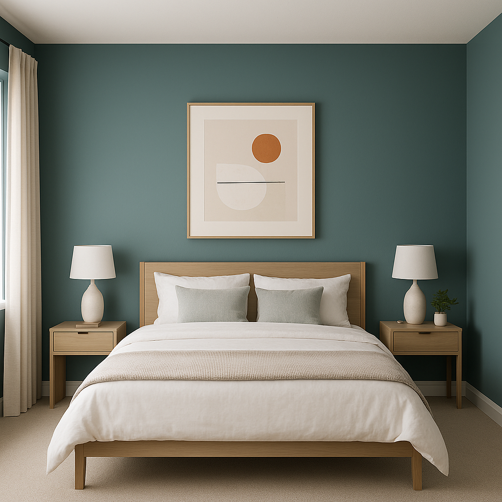
For a restful and serene retreat, use Polished on bedroom walls. Its soft warmth promotes relaxation, especially when paired with plush textiles and soft lighting.
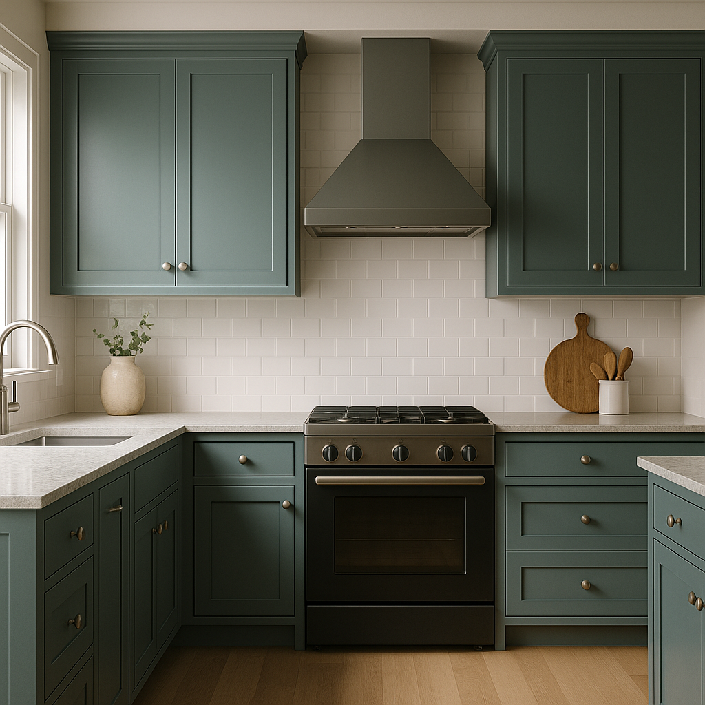
Polished thrives in kitchens and dining spaces where a neutral backdrop is desired. It pairs beautifully with white cabinetry, marble countertops, or warm wood finishes to create a polished aesthetic.
In bathrooms, Polished enhances the sense of cleanliness and tranquility. Pair it with white or black accents for a timeless and spa-like feel.
As a neutral with depth, Polished adds subtle sophistication to entryways and hallways. Its ability to reflect light makes these transitional spaces feel more open and inviting.
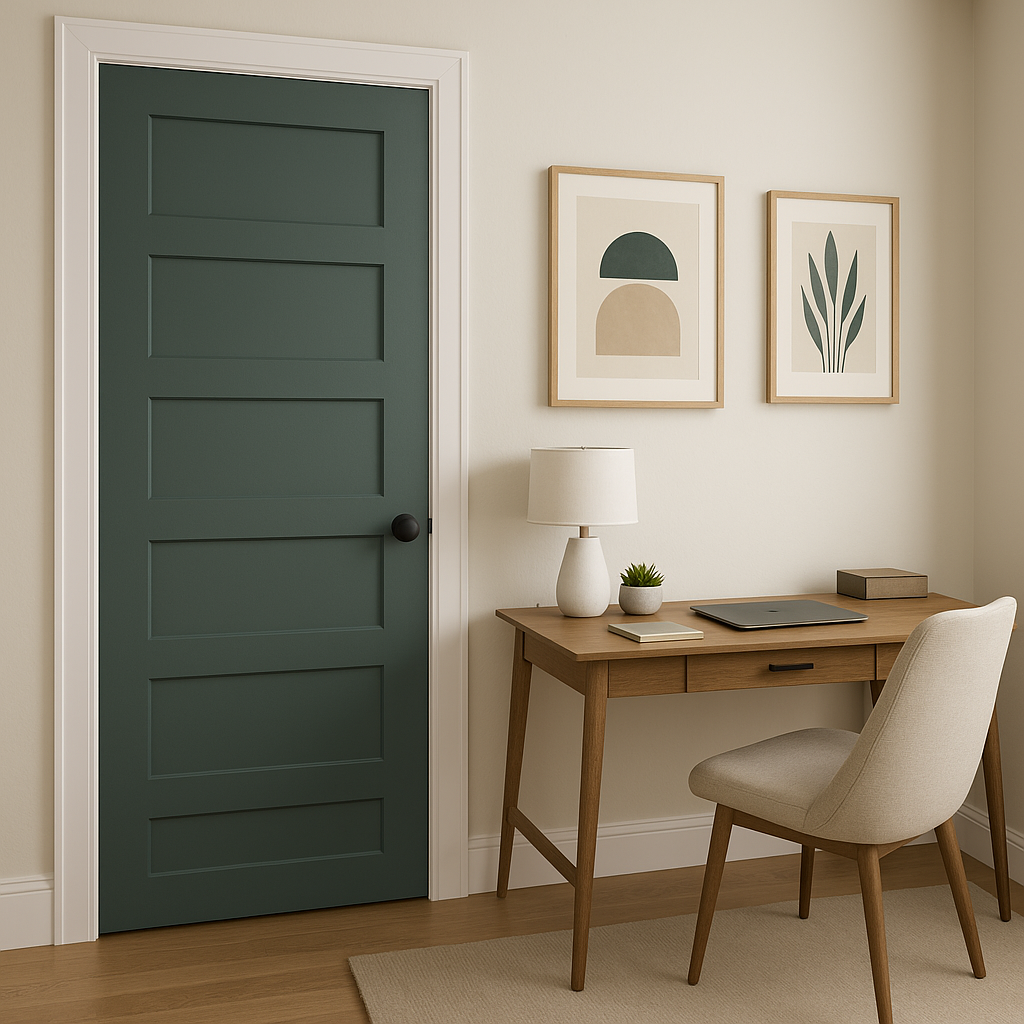
Polished fosters focus and productivity in home offices. Its muted tone reduces visual distraction while maintaining a sense of style and professionalism.
Polished (713) is an exceptional choice for creating a timeless and adaptable color scheme. Its warm undertones, balanced neutrality, and versatility make it suitable for any room in the home. Whether used as the primary wall color or as part of a broader palette, Polished delivers a sense of harmony that elevates interiors with understated sophistication.
When designing your space with Polished, don’t forget to test it in different lighting conditions to fully appreciate its subtle beauty. Whether you’re aiming for a minimalist aesthetic or seeking to enhance a layered, eclectic design, Benjamin Moore Polished (713) is a neutral that offers both style and versatility to suit your vision.
View Colors Only by Brand (No Imagery):
Sherwin-Williams
|
Benjamin-Moore
|
Behr
|
Valspar
Live on the Eastern Slope of Colorado and looking for a local painting professional, check out all our painting services and reach out for a free estimate.
Copyright © 2026 : Wild Fox Painting Inc. : 12435 Mead Way, Littleton, CO 80125


