Benjamin Moore In (715) is a versatile neutral paint color that brings sophistication and effortless elegance to any space. Its subtle yet impactful presence makes it a favorite among interior designers for creating serene, harmonious environments. Perfect for modern, transitional, or classic designs, this shade strikes a balance between warmth and coolness, offering a refined backdrop that complements a wide range of aesthetics.
At its core, In (715) is a soft beige with a slight greige influence, marrying the warmth of beige with the subtle coolness of gray. This blend results in a perfectly balanced neutral that feels cozy yet contemporary. The undertones of the color lean towards a gentle taupe, with whispers of lavender and beige, giving it a unique depth that shifts depending on the lighting conditions.
These dynamic undertones make In (715) a chameleon-like neutral that adapts beautifully to different settings, ensuring it remains timeless and versatile.
Benjamin Moore In (715) pairs effortlessly with a variety of shades, making it an excellent choice for both monochromatic and contrasting palettes. Here are some recommended coordinating colors:
Monochromatic Pairings:
Contrasting Colors:
Nature-Inspired Pairings:
These coordinating colors allow homeowners or designers to experiment with various styles—whether aiming for understated elegance or bold contrast.
Benjamin Moore In (715) is a paint color that works seamlessly across several spaces. Its neutral profile makes it highly adaptable, ensuring it complements different architectural styles and personal preferences. Here are some of the best uses for this timeless shade:
Create a welcoming and cozy atmosphere by using In (715) on walls in living rooms or open-concept spaces. Pair it with natural wood tones, soft textiles, and layered neutrals for a serene and inviting setting. Its balanced undertones make it perfect for spaces where you want to encourage relaxation and connection.
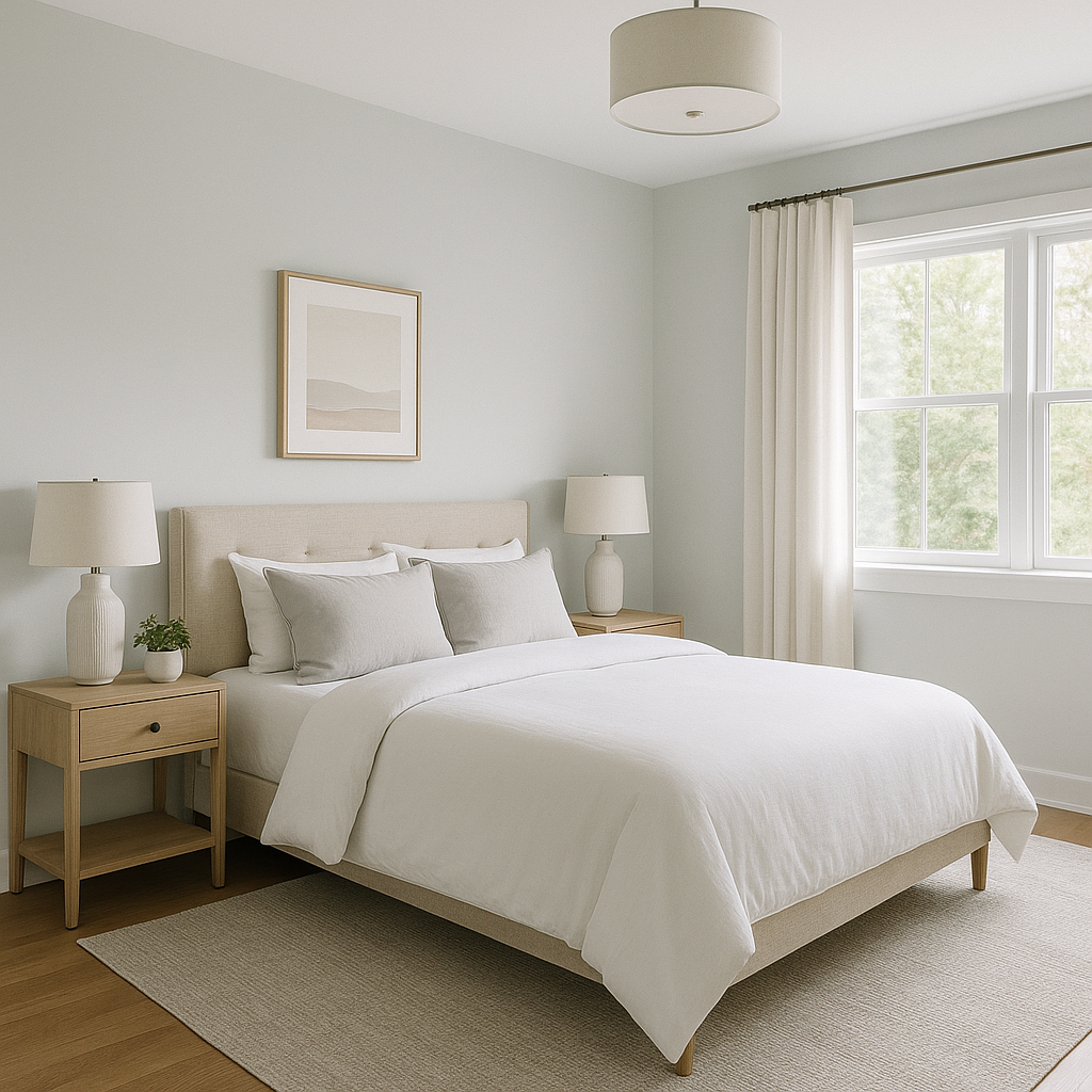
The subtle taupe undertones lend a calming quality to bedrooms, making In (715) an ideal choice for a restful retreat. Pair it with warm whites, soft grays, and muted pastel accents to create a tranquil and restorative environment.
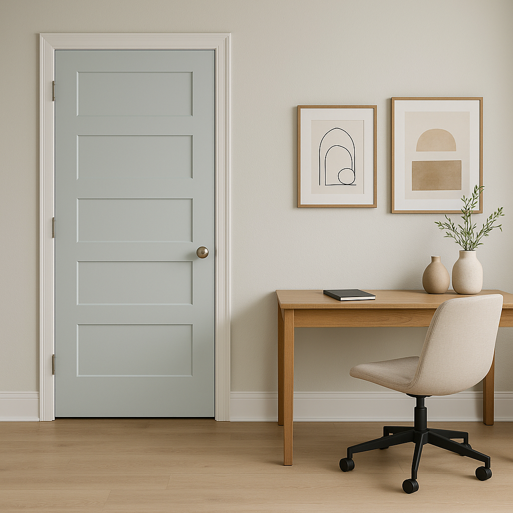
For workspaces, In (715) offers a neutral backdrop that enhances focus and creativity. Pair it with sleek metallic accents, deep navy blues, or rich greens to add depth and style while maintaining productivity.
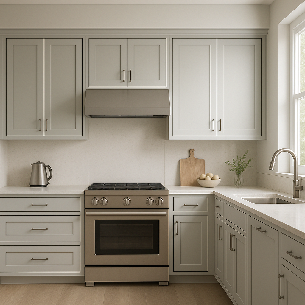
This versatile neutral shines in kitchens and dining areas. Use it on walls to complement white cabinetry and stainless steel appliances, or pair it with darker tones like charcoal or black for a modern, high-contrast aesthetic. It also works beautifully with natural stone countertops and wood finishes for a timeless design.
In bathrooms, In (715) creates a spa-like ambiance when paired with crisp whites and soft grays. Add polished chrome fixtures and luxurious marble accents to elevate the space into a serene retreat.
Benjamin Moore In (715) is a perfect choice for anyone seeking a neutral that offers subtle sophistication without feeling stark or overly sterile. Its nuanced undertones and versatility allow it to shine in virtually any room, with the ability to adapt to changing light and surrounding colors. Whether you're designing a minimalist space or layering textures and hues, In (715) serves as an impeccable foundation for your vision.
Allow this timeless neutral to transform your interiors, bringing balance, warmth, and elegance to your home.
View Colors Only by Brand (No Imagery):
Sherwin-Williams
|
Benjamin-Moore
|
Behr
|
Valspar
Live on the Eastern Slope of Colorado and looking for a local painting professional, check out all our painting services and reach out for a free estimate.
Copyright © 2026 : Wild Fox Painting Inc. : 12435 Mead Way, Littleton, CO 80125


