Benjamin Moore Paradiso (717) is a captivating teal that effortlessly combines depth and vibrancy. This rich hue evokes the serenity of tropical waters paired with the sophistication of a jewel-toned accent. Paradiso is a bold choice that brings energy and personality to any space, making it perfect for those who want to make a statement with their interior design. Whether you’re designing a modern space or looking to add a touch of eclectic charm, Paradiso delivers a unique aesthetic that’s both luxurious and approachable.
Paradiso carries distinct blue-green undertones, making it a versatile shade within the teal family. The balance between blue and green ensures that it remains grounded while still offering vibrancy. Its subtle cool undertones lend a soothing quality that’s ideal for creating spaces that feel both dynamic and tranquil. Depending on the lighting, Paradiso may lean more toward its blue side in cooler light or display its green nuances in warmer light.
Benjamin Moore Paradiso pairs beautifully with a wide range of complementary and contrasting colors. Whether you want to create a harmonious palette or a bold juxtaposition, these suggestions will help you achieve your desired look:
Paradiso is a versatile shade that can transform a variety of spaces depending on how it’s applied. Its bold hue works well in:
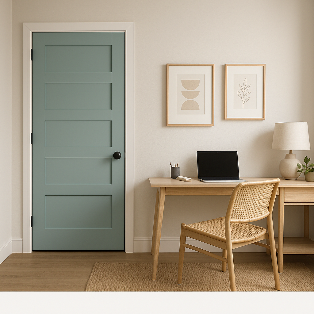
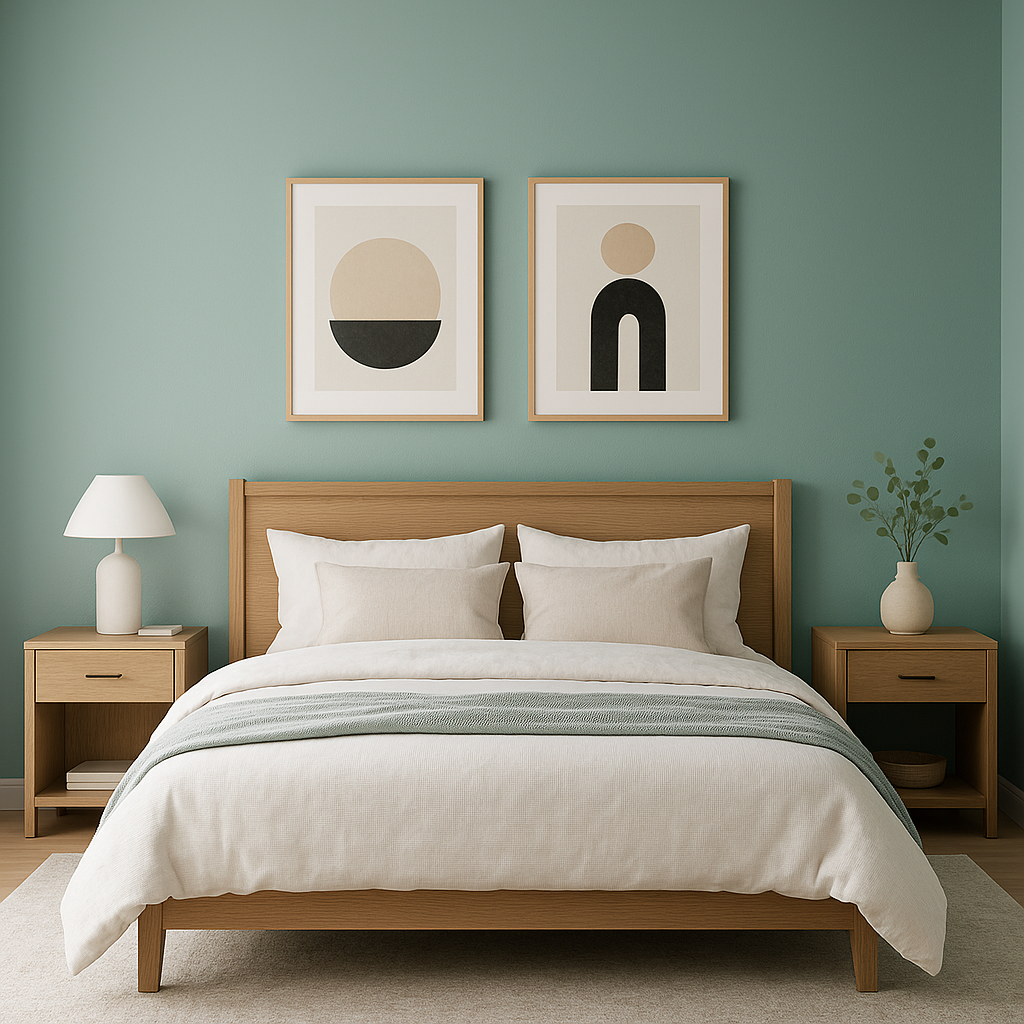
Paradiso shines as an accent wall, creating a focal point that draws the eye. Use it in living rooms or bedrooms to add depth and personality without overwhelming the space.
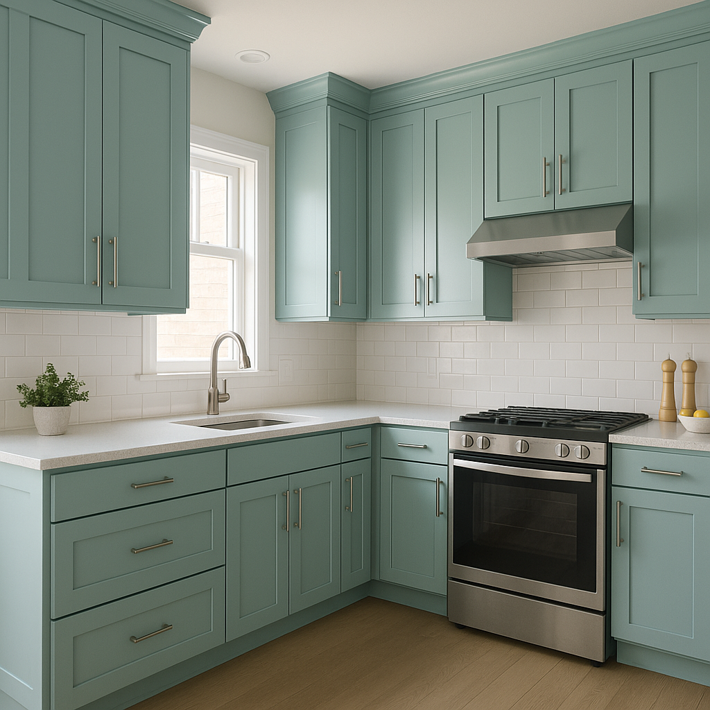
For a more unconventional application, Paradiso can be used on furniture pieces or built-in cabinetry. It’s ideal for modern kitchens or as a pop of color on a bookshelf to elevate a neutral space.
In smaller spaces like bathrooms, Paradiso creates a spa-like atmosphere that feels both luxurious and refreshing. Pair it with crisp whites and metallic fixtures for a polished look.
Make a lasting first impression by using Paradiso in your entryway. Its boldness sets the tone for the rest of your home, creating a welcoming yet striking ambiance.
Benjamin Moore Paradiso (717) is a bold, dynamic choice that can breathe life into any interior. Its unique balance of vibrancy and depth makes it a standout option for adventurous homeowners or designers looking to make a lasting impact.
View Colors Only by Brand (No Imagery):
Sherwin-Williams
|
Benjamin-Moore
|
Behr
|
Valspar
Live on the Eastern Slope of Colorado and looking for a local painting professional, check out all our painting services and reach out for a free estimate.
Copyright © 2026 : Wild Fox Painting Inc. : 12435 Mead Way, Littleton, CO 80125


