Benjamin Moore Vanderberg (721) is a rich, earthy shade that exudes a sense of warmth, elegance, and tradition. This medium olive green with subtle brown undertones feels grounded and inviting, making it an excellent choice for spaces that aim to balance sophistication with comfort. Its classic depth and versatility make it a standout color for both modern and traditional interiors.
The beauty of Vanderberg lies in its nuanced undertones. While predominantly an olive green, it carries subtle hints of brown and a whisper of grey. These undertones lend the color a warm, organic quality that feels nature-inspired yet polished. The brown undertones soften the green, ensuring it doesn’t veer into overly vibrant or cool territory, while the grey adds depth and modernity. This combination results in a timeless hue that feels both bold and approachable.
When designing with Vanderberg, selecting complementary colors can elevate its beauty and create a harmonious palette. Here are some excellent coordinating options:
Neutrals for Balance: Pair Vanderberg with soft neutrals like Benjamin Moore "Simply White" (OC-117) or "White Dove" (OC-17) to create a fresh, bright contrast. These whites highlight Vanderberg’s warmth and ensure the space feels open and airy.
Earthy Complements: To enhance the natural, grounded feel, consider pairing it with warm taupes or beiges like "Edgecomb Gray" (HC-173) or "Revere Pewter" (HC-172). These shades echo Vanderberg’s earthy undertones and create a cohesive, serene palette.
Bold Accents: For a striking contrast, use deep, moody colors like "Hale Navy" (HC-154) or "Kendall Charcoal" (HC-166). These darker hues amplify Vanderberg’s richness and lend a dramatic, high-end feel to any room.
Pops of Color: Add energy and vibrancy with accents in golden yellows like "Hawthorne Yellow" (HC-4) or muted terracottas like "Adobe Dust" (2174-30). These tones bring out Vanderberg’s warm green while adding visual interest.
Vanderberg is a versatile color that works beautifully in a variety of applications. Its balance of warmth and depth makes it suitable for both large-scale and accent uses:
Living Rooms: Create a cozy yet sophisticated gathering space by using Vanderberg on walls. Pair it with plush furnishings in neutral tones and metallic accents for a modern, polished look.
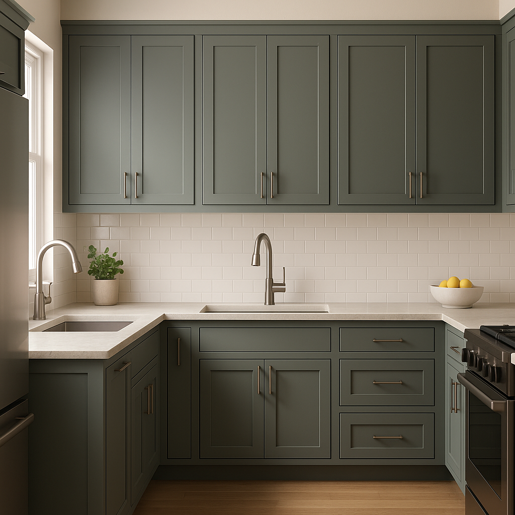
Kitchens and Dining Rooms: Bring an organic, farm-to-table feel to your kitchen or dining area. Use Vanderberg on cabinetry or accent walls, and pair it with natural wood finishes and creamy countertops for a timeless aesthetic.
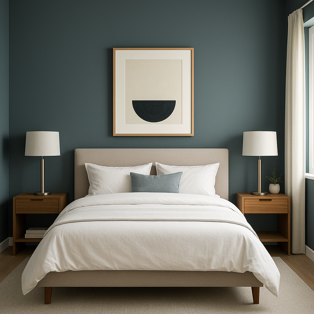
Bedrooms: Vanderberg’s soothing, earthy tones make it an excellent choice for bedrooms. Use it as an accent wall behind the bed or as the main wall color, complemented by soft linens and textured throws in light neutrals.
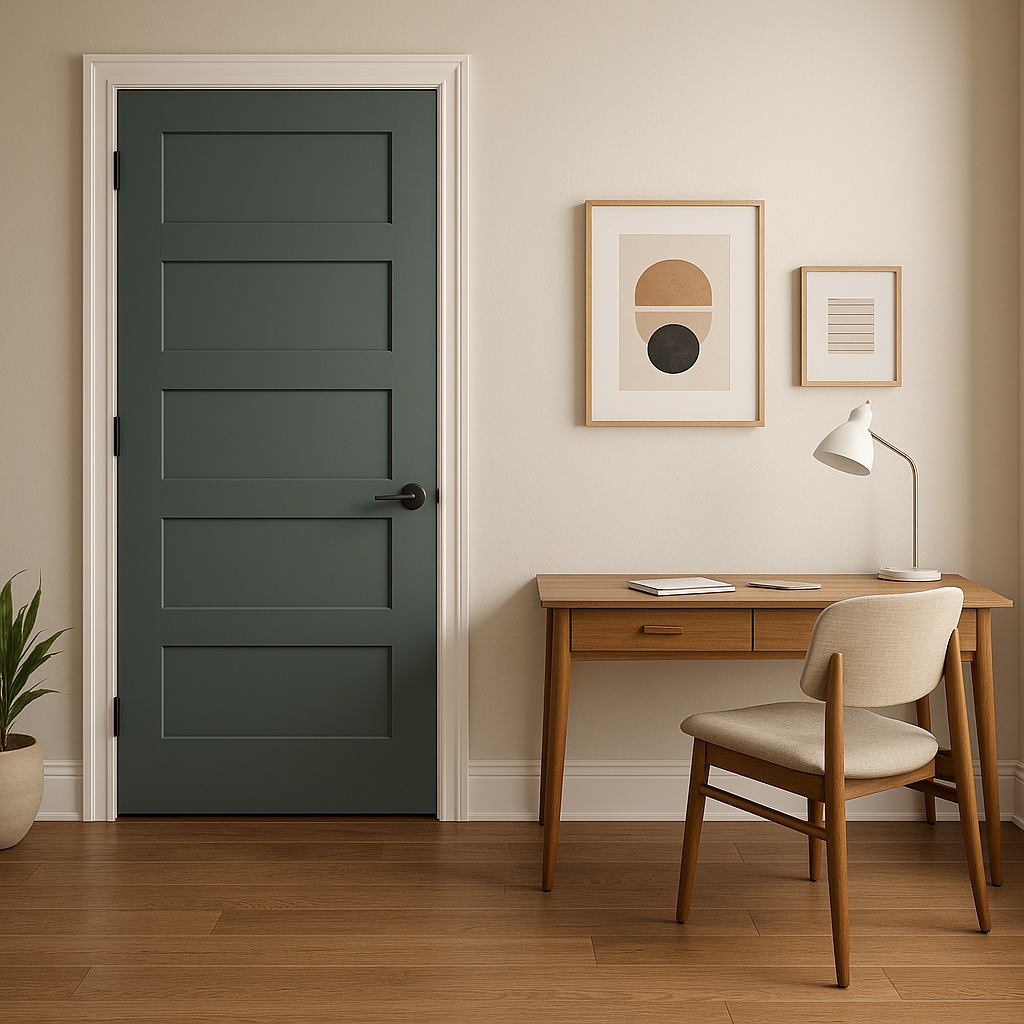
Offices and Libraries: Add depth and focus to work or reading spaces by incorporating Vanderberg on walls or built-ins. Its rich tone fosters a sense of calm and concentration, perfect for productivity.
Exteriors: Vanderberg is a stunning choice for exterior siding, shutters, or front doors. Its earthy undertones blend beautifully with natural surroundings, creating a home that feels welcoming and timeless.
Benjamin Moore Vanderberg (721) is more than just a paint color—it's a design statement. Its warm, earthy elegance makes it a versatile choice for any home, while its sophisticated green tone adds character and depth to your space. Whether used as the main color or as an accent, Vanderberg enhances interiors and exteriors alike, offering a timeless, nature-inspired aesthetic that feels both grounded and refined.
View Colors Only by Brand (No Imagery):
Sherwin-Williams
|
Benjamin-Moore
|
Behr
|
Valspar
Live on the Eastern Slope of Colorado and looking for a local painting professional, check out all our painting services and reach out for a free estimate.
Copyright © 2026 : Wild Fox Painting Inc. : 12435 Mead Way, Littleton, CO 80125


