Benjamin Moore San (741) is a sophisticated and understated neutral that brings warmth and refinement to any space. With its balanced beige tones, this color effortlessly bridges the gap between cool and warm palettes, making it an enduring favorite for homeowners and designers alike. Its subtle character allows it to adapt beautifully to a range of interior design styles, from classic and traditional to modern and minimalist.
San (741) features nuanced undertones that make it incredibly versatile. It leans slightly warm with a faint hint of taupe, offering a soft, earthy base without appearing overly yellow or muddy. These subtle undertones add depth and dimension to the paint color, creating a welcoming and approachable atmosphere.
Depending on the lighting conditions, San may reveal gentle gray or creamy beige hues. In well-lit spaces, it shines brighter, showcasing its warmer side, while in dimmer areas, its gentle taupe undertones come to the forefront, lending a cozy and grounded feel.
Benjamin Moore San (741) pairs seamlessly with a variety of colors thanks to its neutral yet layered composition. Here are some exceptional coordinating options to consider:
San (741) is highly versatile and works well in a wide range of spaces and applications. Here are some ideas to inspire:
Transform your living room into a haven of comfort and elegance with San. Its neutral warmth sets the stage for layered textures and accent colors, creating a cozy yet sophisticated space. Pair it with light wood furniture, plush textiles, and metallic accents for a modern organic look.
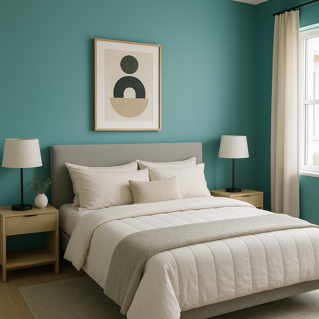
San’s inviting tones make it a perfect choice for bedrooms. Use it to create a soothing retreat by pairing it with soft linens, natural wood elements, and subtle pops of color. Its balanced undertones ensure a restful atmosphere that feels neither too stark nor overly saturated.
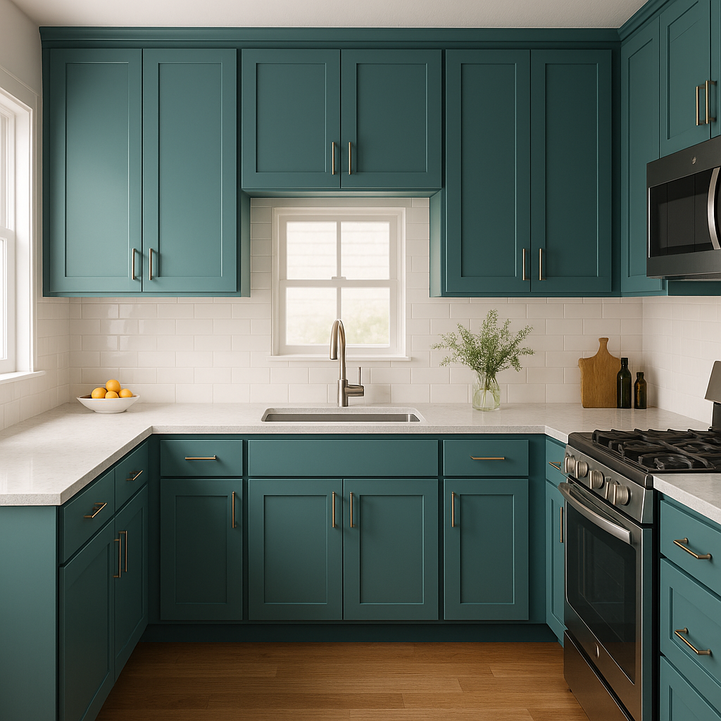
For kitchens or dining areas, San offers an excellent backdrop for cabinetry, countertops, and decor. Pair it with white subway tiles, brushed nickel hardware, and muted green or blue accents for a fresh, timeless look.
San is an ideal choice for hallways and entryways, as its neutral hue creates a seamless transition between adjoining rooms. It’s particularly effective in smaller spaces where its warm undertones can make the area feel more inviting and open.
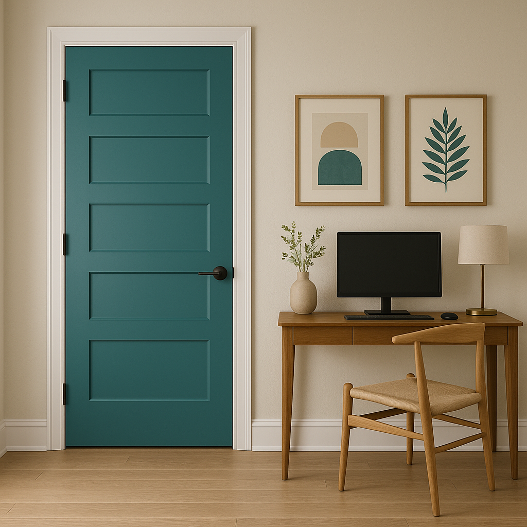
Create a calming and productive workspace with Benjamin Moore San. Its subtle taupe undertones foster focus and clarity without feeling overly sterile, making it a great choice for home offices or creative studios.
Whether used as a primary wall color or a complementary accent, Benjamin Moore San (741) offers endless possibilities for creating spaces that feel grounded, welcoming, and timeless. Its balanced blend of warm and cool undertones ensures it remains a versatile and enduring choice for any design scheme.
View Colors Only by Brand (No Imagery):
Sherwin-Williams
|
Benjamin-Moore
|
Behr
|
Valspar
Live on the Eastern Slope of Colorado and looking for a local painting professional, check out all our painting services and reach out for a free estimate.
Copyright © 2026 : Wild Fox Painting Inc. : 12435 Mead Way, Littleton, CO 80125


