Benjamin Moore Bayville (747) is a stunning medium-toned green that effortlessly blends richness and tranquility. This color embodies a grounded, nature-inspired aesthetic, making it an excellent choice for spaces that call for a sense of calm sophistication. Whether you're designing a cozy retreat or a polished, modern interior, Bayville offers a timeless charm that pairs beautifully with various styles and palettes.
Bayville is a deep, muted green with subtle gray undertones. These gray notes give the color a soft, refined edge, preventing it from feeling overly vibrant or saturated. The undertones create a balanced hue that adapts well to different lighting conditions, shifting from a richer green in dim light to a softer, cooler tone in bright spaces. This versatility makes Bayville ideal for both intimate areas and larger rooms.
Benjamin Moore Bayville (747) pairs wonderfully with a wide range of coordinating colors, enhancing its versatility across different design schemes. Whether you're aiming for contrast or harmony, here are a few suggestions:
Neutrals:
Complement the gray undertones of Bayville with neutrals like Classic Gray (OC-23) or White Dove (OC-17). These soft shades provide a crisp, clean balance while allowing Bayville to take center stage.
Warm Accents:
Add warmth and depth by incorporating colors such as Golden Straw (2152-50) or Hawthorne Yellow (HC-4). These golden tones create a lively yet elegant contrast.
Earthy Tones:
Pair Bayville with hues like Edgecomb Gray (HC-173) or Iron Mountain (2134-30) for a grounded, nature-inspired palette that emphasizes the organic feel of the green.
Cool Blues:
For a fresh, coastal-inspired look, coordinate Bayville with soft blues like Woodlawn Blue (HC-147) or Boothbay Gray (HC-165). These cooler shades enhance the serene vibe of the space.
Bayville is an adaptable color that can be used in various ways throughout your home. Its sophisticated tone makes it suitable for both bold statement walls and subtle accents. Here are some ideas for incorporating Bayville into your space:
Living Rooms:
Use Bayville as a feature wall to create a warm, inviting atmosphere. Pair it with neutral furniture and accessories to maintain a balanced look, or add metallic accents for a touch of glamour.
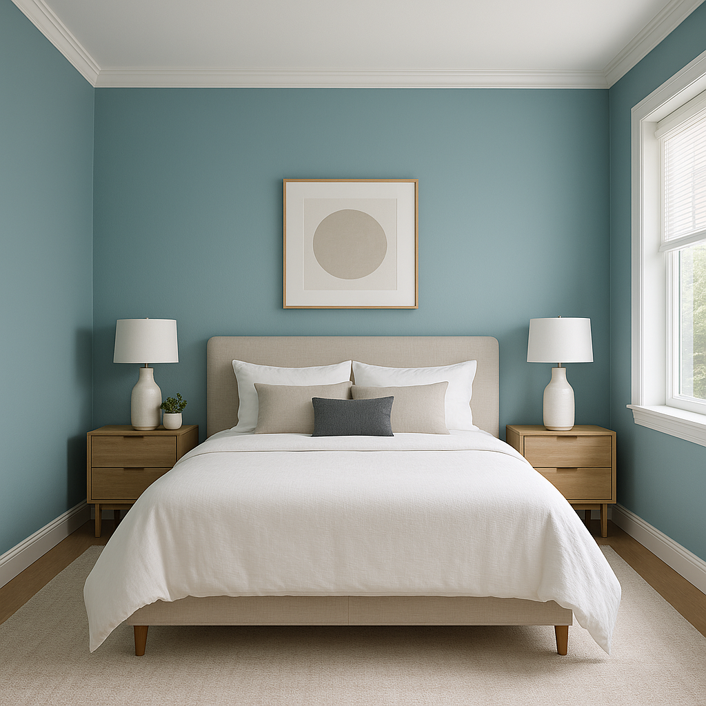
Bedrooms:
Transform your bedroom into a restful haven with Bayville. Its muted green tone provides a calming backdrop, especially when paired with soft linens and natural textures like wood or wicker.
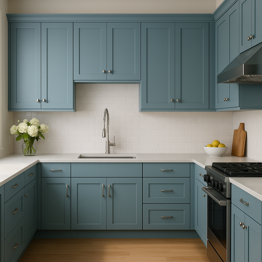
Kitchens:
Bayville is an ideal color for cabinetry or accent walls in kitchens. It pairs beautifully with white or cream countertops and brass hardware, creating a modern yet timeless aesthetic.
Bathrooms:
Give your bathroom a spa-like feel by using Bayville on the walls or vanity. Pair it with marble finishes, crisp whites, or muted grays to enhance the sense of relaxation.
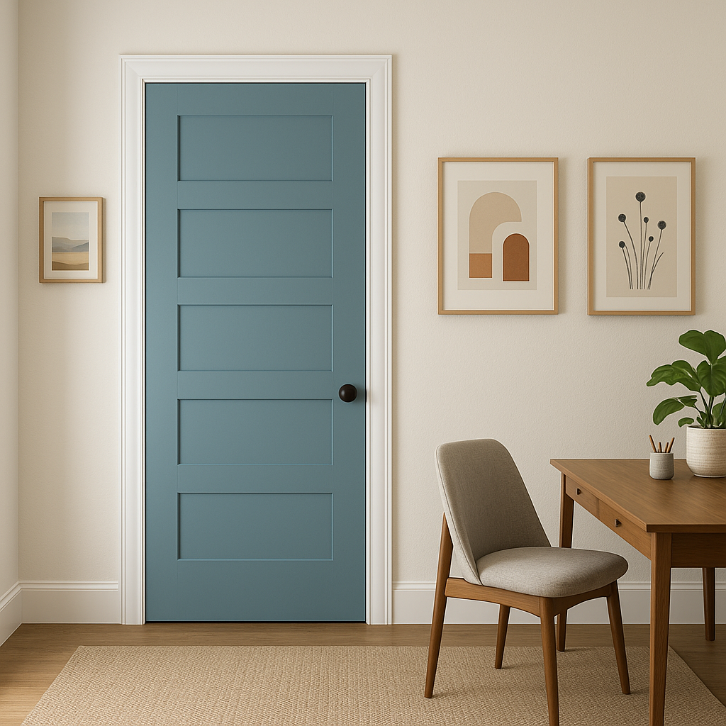
Entryways and Hallways:
Use Bayville to make a bold first impression in your entryway. Its rich yet understated tone adds depth and personality without overwhelming the space.
Bayville's versatility is partially attributed to its ability to adapt to different lighting conditions. In spaces with ample natural light, the green appears vibrant yet elegant, while in dimly lit areas, its gray undertones emerge, creating a more subdued and cozy vibe. Be sure to test Bayville in your space with varying light sources to ensure the desired effect.
Benjamin Moore Bayville (747) is a captivating choice for anyone seeking a color that blends sophistication, tranquility, and timeless appeal. With its adaptable undertones, myriad coordinating options, and versatile uses, Bayville is a designer favorite that can elevate both classic and contemporary interiors alike.
View Colors Only by Brand (No Imagery):
Sherwin-Williams
|
Benjamin-Moore
|
Behr
|
Valspar
Live on the Eastern Slope of Colorado and looking for a local painting professional, check out all our painting services and reach out for a free estimate.
Copyright © 2026 : Wild Fox Painting Inc. : 12435 Mead Way, Littleton, CO 80125


