Benjamin Moore Seabrook (750) is a stunning paint color that effortlessly captures the serene essence of coastal living. This mid-tone blue-green shade evokes the calming beauty of ocean waves and lush seaside landscapes, making it an excellent choice for homeowners seeking a tranquil yet refreshing atmosphere. Its versatility and soothing aesthetic make it a favorite among interior designers for both modern and classic spaces.
Seabrook (750) is a well-balanced shade with subtle green undertones that gently ground its blue base. These undertones lend warmth and depth to the color, ensuring it doesn’t feel too cool or stark. The green undertones also make it adaptable to a variety of lighting conditions, allowing the color to shift beautifully throughout the day—from a soft, muted tone in the morning light to a richer, more saturated hue in the evening. These nuanced undertones make Seabrook a versatile choice, perfect for creating a peaceful yet dynamic environment.
Pairing Seabrook (750) with complementary colors can enhance its coastal charm and create a harmonious palette. Consider these coordinating colors:
Neutral Pairings: Crisp whites such as Benjamin Moore Chantilly Lace (OC-65) or Simply White (OC-117) provide a clean, fresh contrast, emphasizing Seabrook's vibrancy. Soft grays like Gray Owl (OC-52) or Edgecomb Gray (HC-173) can add a sophisticated touch without overpowering the space.
Earthy Accents: Warm beige tones like Manchester Tan (HC-81) or creamy taupes like Pale Oak (OC-20) pair beautifully with Seabrook, creating a grounded and inviting aesthetic.
Bold Contrasts: For a more dramatic look, pair Seabrook with darker hues like Hale Navy (HC-154) or Black Forest Green (HC-187). These rich colors can add depth and dimension while complementing the blue-green undertones.
Pop of Color: Add a playful twist by incorporating coral or peach accents, such as Benjamin Moore Coral Gables (2010-40). These vibrant hues bring energy to the space, balancing Seabrook's calm demeanor.
Seabrook’s versatility allows it to shine in a variety of spaces and applications. Here are some ideal ways to use this coastal-inspired shade:
Living Rooms: Create a relaxed and welcoming living area by using Seabrook as the primary wall color. Pair it with light wood furniture and soft textiles in neutral tones for a chic coastal vibe.
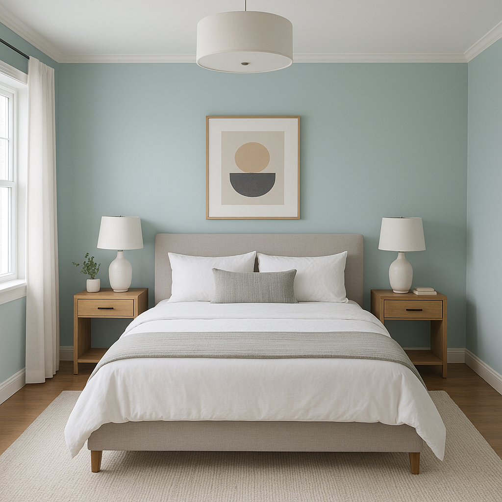
Bedrooms: Transform your bedroom into a calming retreat by using Seabrook on the walls. Layer soft white bedding and natural textures like rattan or linen for a cozy yet elegant atmosphere.
Bathrooms: This serene shade works beautifully in bathrooms, creating a spa-like ambiance. Complement it with crisp white subway tiles and polished chrome fixtures for a fresh, clean look.
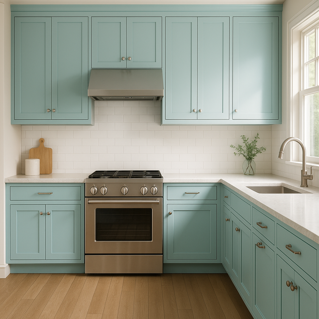
Kitchens: Use Seabrook on cabinets or as an accent wall to bring a pop of color to your kitchen. Pair it with marble countertops and brass hardware for a sophisticated, coastal-inspired design.
Exterior Applications: Seabrook is equally stunning on the exterior of a home. It can be used for siding or shutters to evoke seaside charm, especially when paired with white trim and natural elements like stone or shingled roofing.
Benjamin Moore Seabrook (750) is more than just a color—it’s an experience. Its ability to adapt to various design styles, lighting conditions, and spaces makes it a reliable choice for homeowners and designers alike. Whether you’re aiming to create a serene retreat or a lively, coastal-inspired living area, Seabrook’s versatile hue will help you achieve your vision.
By thoughtfully pairing it with complementary colors and using it in the right spaces, you can maximize its impact and create a timeless design that feels both fresh and inviting.
View Colors Only by Brand (No Imagery):
Sherwin-Williams
|
Benjamin-Moore
|
Behr
|
Valspar
Live on the Eastern Slope of Colorado and looking for a local painting professional, check out all our painting services and reach out for a free estimate.
Copyright © 2026 : Wild Fox Painting Inc. : 12435 Mead Way, Littleton, CO 80125


