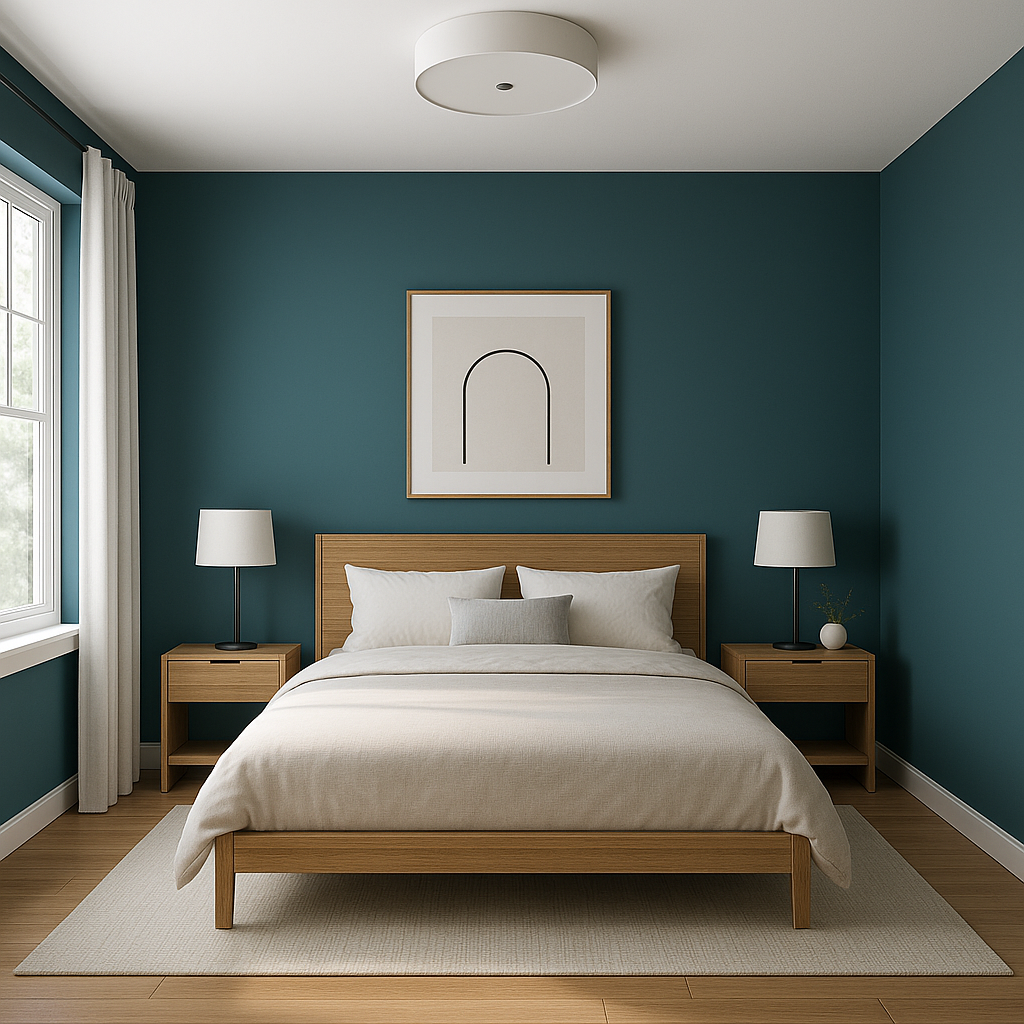
Benjamin Moore Varsity (756) is a sophisticated and timeless paint color that brings depth and charm to any space. This rich hue falls within the family of warm reds, offering a refined balance between boldness and subtlety. Its distinctive character makes it a favorite among designers who wish to create dramatic yet welcoming interiors.
Varsity (756) carries warm, earthy undertones that lean toward a deep, terracotta-inspired red. These undertones give the color a grounded, organic feel, making it a perfect choice for spaces that evoke comfort and intimacy. While undeniably bold, Varsity avoids overpowering the room with its nuanced warmth, striking a perfect balance for homeowners seeking depth without overwhelming vibrancy.
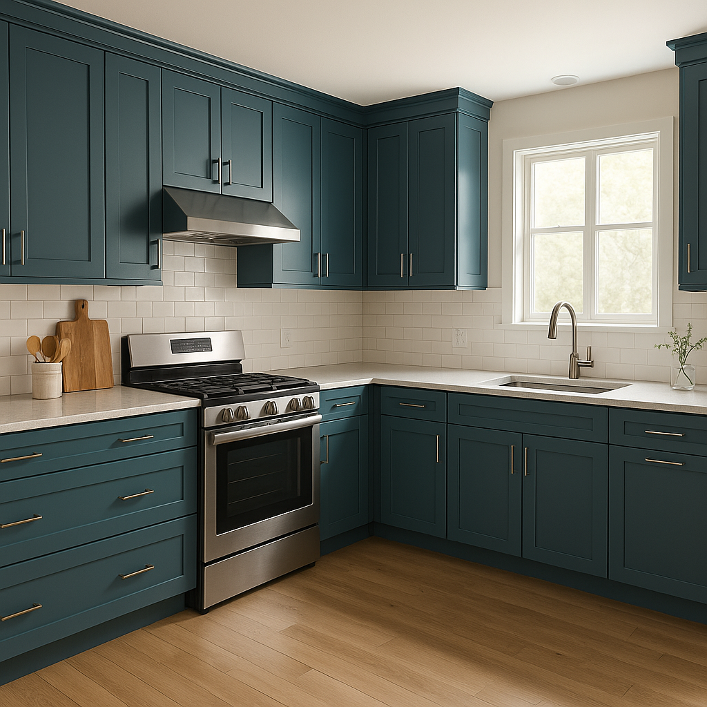
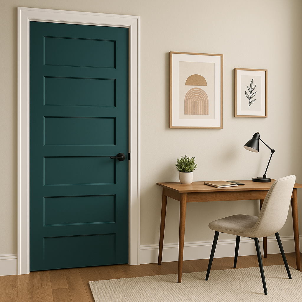
Benjamin Moore Varsity pairs beautifully with various complementary and contrasting hues, allowing for a wide range of design possibilities.
Varsity (756) is a versatile choice for a wide range of design applications. Its warm and inviting nature makes it suitable for both residential and commercial spaces.
Because of its deep and saturated nature, Varsity (756) can shift slightly depending on the lighting in your space. Under warm lighting, the earthy undertones become more pronounced, giving the color a comforting glow. In cooler lighting, the richness of Varsity takes on a more subdued and dramatic appearance.
Benjamin Moore Varsity is more than just a paint color—it's a statement. Its warm, sophisticated hue transforms interiors into spaces of elegance and character. Whether you're designing a cozy living room, a stylish dining area, or a polished commercial environment, Varsity offers unparalleled versatility and charm.
View Colors Only by Brand (No Imagery):
Sherwin-Williams
|
Benjamin-Moore
|
Behr
|
Valspar
Live on the Eastern Slope of Colorado and looking for a local painting professional, check out all our painting services and reach out for a free estimate.
Copyright © 2026 : Wild Fox Painting Inc. : 12435 Mead Way, Littleton, CO 80125


