Benjamin Moore Pacific (762) is a captivating mid-tone blue that strikes a perfect balance between richness and serenity. Its deep yet approachable character makes it an ideal choice for those seeking to infuse their spaces with a sense of calm sophistication. Whether used as an accent or a main wall color, Pacific (762) offers an inviting aesthetic that feels both modern and timeless.
One of the defining features of Pacific (762) is its nuanced undertones. This shade leans slightly toward gray, giving it a grounded, muted quality that prevents it from feeling overly vibrant or saturated. The subtle gray undertone ensures that Pacific (762) adapts beautifully to various lighting conditions, making it versatile for both natural and artificial light. At times, you may also notice soft hints of green undertones emerge, especially in spaces with warm lighting, adding an extra layer of depth to this already complex hue.
Benjamin Moore Pacific (762) pairs effortlessly with a variety of complementary colors, making it a dream for interior designers and homeowners alike. Here are some suggestions for coordinating shades:
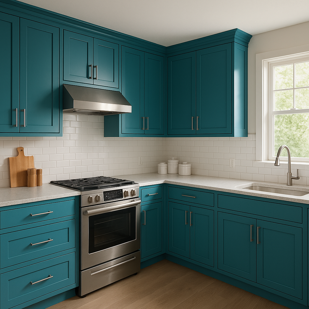
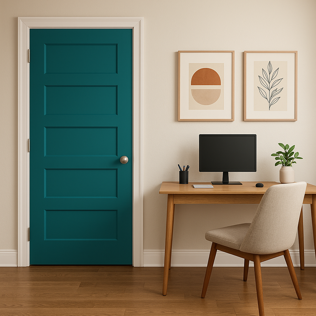
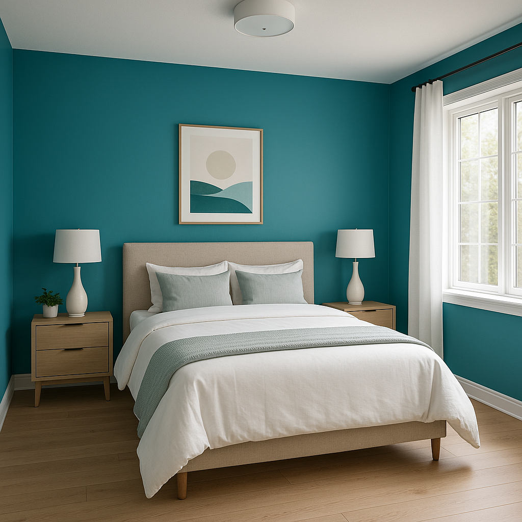
Pacific (762)’s adaptable nature makes it suitable for a wide range of applications, from residential to commercial spaces. Here are some ideas to inspire your next project:
Benjamin Moore Pacific (762) is a versatile and timeless shade that adapts effortlessly to various design styles, from coastal chic to modern elegance. Its muted undertones and ability to complement a wide range of colors make it a favorite among interior designers and homeowners. Whether you’re looking to create a calming oasis or add a touch of sophistication to your space, Pacific (762) is a reliable choice that will elevate your interiors for years to come.
View Colors Only by Brand (No Imagery):
Sherwin-Williams
|
Benjamin-Moore
|
Behr
|
Valspar
Live on the Eastern Slope of Colorado and looking for a local painting professional, check out all our painting services and reach out for a free estimate.
Copyright © 2026 : Wild Fox Painting Inc. : 12435 Mead Way, Littleton, CO 80125


