Benjamin Moore Graceful (767) is a sophisticated and versatile shade that effortlessly balances warmth and coolness, making it an ideal choice for a wide range of interior design applications. This soft gray exudes serenity and refinement, bringing a subtle yet impactful sense of elegance to any space. Whether you're designing a modern retreat, a traditional haven, or a transitional home, Graceful can serve as a perfect foundation or complement for your design vision.
One of the most compelling aspects of Benjamin Moore Graceful is its ability to adapt to different lighting conditions and surrounding hues. This shade features gentle greige undertones—a harmonious mix of gray and beige—that lend warmth and depth to its otherwise neutral base. These undertones make Graceful an incredibly dynamic color; in spaces with cooler light, it leans toward a soft gray, while under warmer lighting, its beige notes add a welcoming and cozy quality.
Graceful’s undertones ensure that it doesn’t feel stark or cold, making it an excellent choice for homeowners seeking a neutral that feels inviting and approachable. Its chameleon-like nature makes it compatible with various design styles, from minimalistic to rustic, and everything in between.
Benjamin Moore Graceful pairs beautifully with a wide range of colors, thanks to its versatile neutrality. Here are some coordinating hues to inspire your palette:
Whites:
Darker Grays & Charcoals:
Muted Blues and Greens:
Warm Neutrals and Beiges:
Graceful’s adaptability makes it a favorite among interior designers for its ability to work across different rooms and design elements. Here are several ways to incorporate this refined shade:
Living Rooms:
Graceful creates a calming backdrop for cozy living spaces. Pair it with soft textures like linen curtains or plush throw pillows to amplify its serene vibe. Add pops of color through artwork or accent furniture for visual interest.
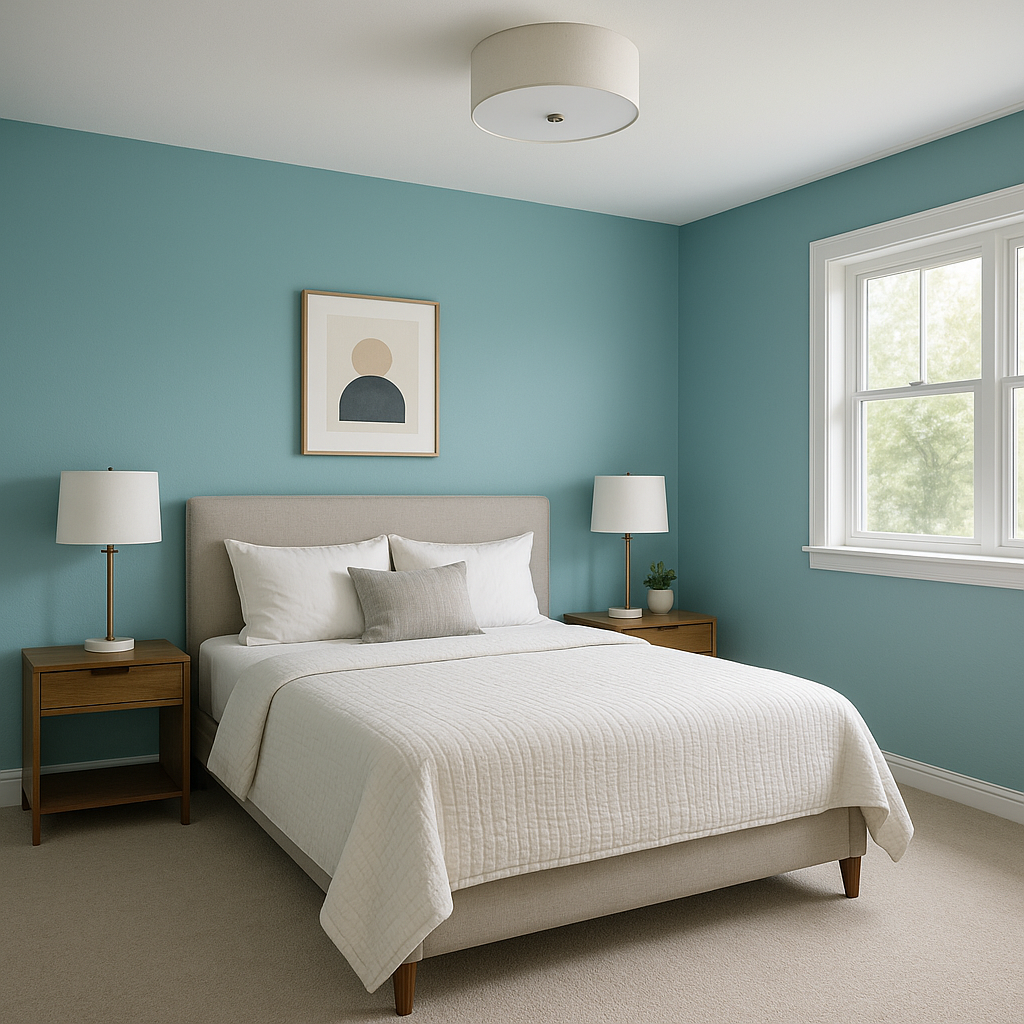
Bedrooms:
In bedrooms, Graceful fosters a tranquil and restful atmosphere. Combine it with crisp white bedding and natural wood tones for a serene retreat that feels fresh yet timeless.
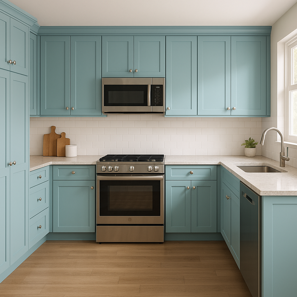
Kitchens:
Graceful works beautifully on kitchen cabinetry, especially when paired with marble countertops or brushed nickel hardware. It can also be used as a wall color for open-concept kitchens, providing a neutral canvas for bold accents like navy or emerald green island bases.
Bathrooms:
This shade is perfect for spa-like bathrooms where relaxation is key. Pair it with white subway tiles, polished chrome fixtures, and soft pastel accents for a clean, cohesive aesthetic.
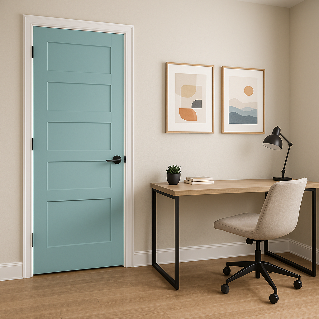
Home Offices:
Graceful’s understated elegance makes it an excellent choice for home offices. Its neutral tone fosters focus and creativity while blending seamlessly with natural wood desks or modern metallic shelving.
Entryways and Hallways:
As a transitional color, Graceful can help unify spaces. Use it in entryways or hallways to create a welcoming ambiance that flows effortlessly into adjoining rooms.
Benjamin Moore Graceful (767) is more than just a paint color—it’s a design tool that brings sophistication, versatility, and timeless appeal into your home. Its balanced undertones, compatibility with coordinating colors, and adaptability to various uses make it a standout choice for both small updates and complete renovations. Whether you’re looking to create a calming sanctuary or a polished contemporary space, Graceful is a reliable neutral that delivers understated charm with every brushstroke.
Elevate your interiors with Graceful, and watch as its serene presence transforms your home into a masterpiece of subtle elegance.
View Colors Only by Brand (No Imagery):
Sherwin-Williams
|
Benjamin-Moore
|
Behr
|
Valspar
Live on the Eastern Slope of Colorado and looking for a local painting professional, check out all our painting services and reach out for a free estimate.
Copyright © 2026 : Wild Fox Painting Inc. : 12435 Mead Way, Littleton, CO 80125


