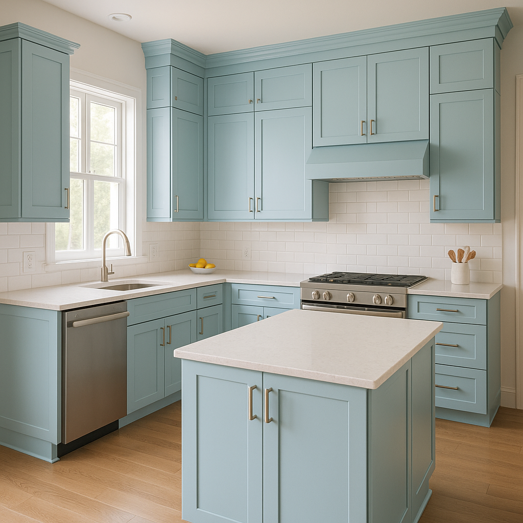
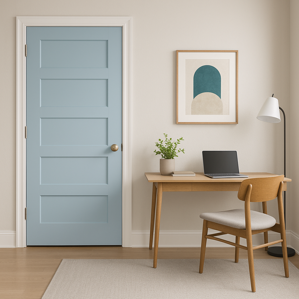
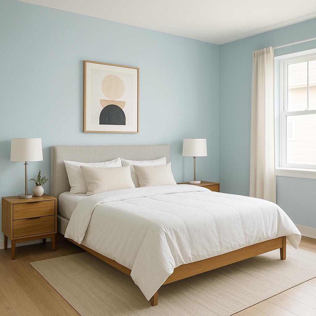
Benjamin Moore Blue (771) is a classic, mid-tone blue that evokes a sense of calm sophistication and effortless style. This charming shade combines the tranquility of nature with the timeless appeal of traditional design. Whether you're designing a coastal-inspired retreat, a modern living space, or an elegant dining room, Benjamin Moore Blue (771) strikes the perfect balance between boldness and subtlety.
This deep, saturated blue features slight gray undertones that soften its vibrancy and lend it a refined, versatile quality. The gray undertones make Benjamin Moore Blue (771) adaptable to both warm and cool color palettes, ensuring it complements a wide range of interior design styles. Additionally, the subtle undertones help this shade maintain a grounded feel, avoiding the overly bright or overpowering look that some blues can have.
Benjamin Moore Blue (771) pairs beautifully with a variety of coordinating colors, allowing for endless design possibilities:
Benjamin Moore Blue (771) is a versatile color that works in a variety of settings and applications. Its timeless appeal makes it suitable for both traditional and contemporary designs.
The appearance of Benjamin Moore Blue (771) can vary depending on lighting conditions. In natural light, its gray undertones become more pronounced, giving it a softer and more muted look. In artificial light, the richness of the blue takes center stage, appearing deeper and more vibrant. Choose your light fixtures and bulbs carefully to achieve the desired effect in your space.
Benjamin Moore Blue (771) is a timeless choice that offers both versatility and personality. Its ability to adapt to different design styles and coordinate with an array of colors makes it a favorite among interior designers and homeowners alike. Whether used as a bold statement or a subtle backdrop, this enchanting blue is sure to elevate any space.
View Colors Only by Brand (No Imagery):
Sherwin-Williams
|
Benjamin-Moore
|
Behr
|
Valspar
Live on the Eastern Slope of Colorado and looking for a local painting professional, check out all our painting services and reach out for a free estimate.
Copyright © 2026 : Wild Fox Painting Inc. : 12435 Mead Way, Littleton, CO 80125


