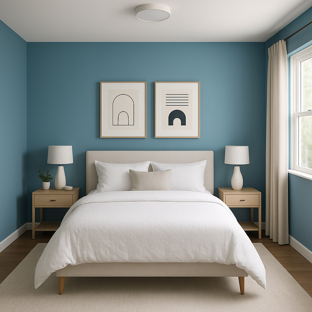
Benjamin Moore Poolside (775) is a versatile and refreshing paint color that evokes the tranquil charm of serene summer afternoons spent by the water. This captivating hue is a soft, cool blue-green that effortlessly balances between blue and green tones, creating a calming yet energizing ambiance. Whether you're looking to design a coastal-inspired retreat or simply infuse your space with a touch of nature, Poolside is an exceptional choice that complements a wide variety of styles.
The undertones of Benjamin Moore Poolside lean toward soothing blue with a gentle green influence, making it a perfect balance of coastal charm and natural serenity. Its cool nature ensures it remains refreshing and crisp without feeling overly stark. This subtle blend of blue and green undertones allows Poolside to harmonize beautifully with spaces intended to feel airy, open, and relaxed.
Poolside’s undertones also make it adaptable to different lighting conditions. In rooms with abundant natural light, the blue tones will shine brighter, while in dimmer spaces, the green undertones may become more prominent, creating a dynamic and ever-changing experience throughout the day.
Benjamin Moore Poolside (775) pairs seamlessly with a variety of complementary shades, allowing you to create a cohesive and visually appealing color scheme. Here are some suggestions for coordinating colors:
Poolside’s versatility makes it an excellent choice for a wide array of interior design applications. Here are some ideas to inspire your next project:
Poolside’s breezy blue-green hue is quintessential for coastal-themed spaces. Use it as a wall color in living rooms, bedrooms, or bathrooms to evoke the calmness of the ocean. Pair it with white shiplap, natural wood furniture, and beach-inspired décor for a charming seaside retreat.
Its lively yet calming nature makes Poolside an ideal choice for children’s rooms or playrooms. The soft, cheerful color provides a playful backdrop while remaining sophisticated enough to adapt as the child grows.
Transform your bathroom into a spa-like haven by using Poolside as the main wall color. Pair it with crisp white tiles, chrome fixtures, and soft gray accents to create a refreshing and rejuvenating space.
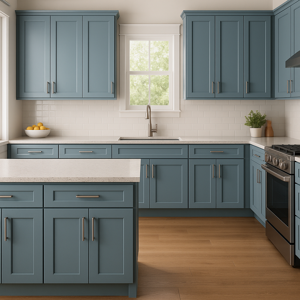
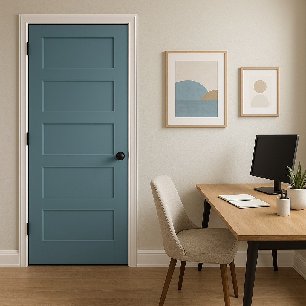
If you're not ready to commit to painting an entire room, Poolside works beautifully as an accent color. Use it on a single feature wall, cabinets, or furniture pieces to add a pop of color that energizes the space.
Benjamin Moore Poolside (775) is a color that brings tranquility and vibrancy into your home. Its delicate balance of blue and green undertones ensures it remains versatile while creating a relaxing atmosphere. Whether you’re designing a coastal-inspired living room, a spa-like bathroom, or a cheerful kid’s bedroom, Poolside is the perfect choice to infuse your interiors with a splash of refreshing charm. Pair it with neutrals, contrasting dark tones, or earthy hues to create a well-rounded palette that suits your unique style.
View Colors Only by Brand (No Imagery):
Sherwin-Williams
|
Benjamin-Moore
|
Behr
|
Valspar
Live on the Eastern Slope of Colorado and looking for a local painting professional, check out all our painting services and reach out for a free estimate.
Copyright © 2026 : Wild Fox Painting Inc. : 12435 Mead Way, Littleton, CO 80125


