Benjamin Moore Blue (782) is a captivating mid-tone blue that effortlessly balances sophistication and serenity. Known for its versatility and timeless appeal, this shade offers a refreshing take on classic blue hues. Whether you're aiming to create a calm retreat or add a pop of color to a modern aesthetic, Benjamin Moore Blue (782) delivers a harmonious blend of depth and vibrancy.
What sets Benjamin Moore Blue (782) apart is its nuanced undertones. This color carries soft gray undertones that temper its vibrancy, lending a slightly muted quality to the blue. These undertones make it adaptable to various lighting conditions, ensuring that the shade never feels overly bright or overwhelming. The gray influence also gives it a sophisticated, almost smoky quality, making it ideal for both traditional and contemporary spaces.
In cooler lighting conditions, the gray undertones become more pronounced, creating a soothing and tranquil blue-gray effect. In warmer lighting, the blue takes center stage, radiating a clean and crisp vibe. This chameleon-like quality ensures Benjamin Moore Blue (782) can work in a variety of settings without clashing with your design vision.
Benjamin Moore Blue (782) pairs beautifully with a wide range of colors, making it a dream for designers seeking cohesive palettes. Its versatility allows you to create stunning contrasts or subtle harmonies depending on your style preferences. Here are some coordinating colors to consider:
Neutral Pairings:
Pair it with soft neutrals like White Dove (OC-17) or Simply White (OC-117) to achieve a fresh and airy aesthetic. These whites enhance the crispness of Benjamin Moore Blue (782), creating a clean and modern look.
Earthy Complements:
For a grounded and natural palette, consider pairing it with warm tones like Hale Navy (HC-154) or Edgecomb Gray (HC-173). These colors provide balance and depth, creating a soothing atmosphere.
Bold Accents:
Add drama and personality by introducing bold accents like Caliente (AF-290), a rich red, or Golden Straw (2152-50), a warm yellow. These hues provide a striking contrast, making Benjamin Moore Blue (782) pop.
Metallics:
Incorporate metallic tones like brushed gold or silver to highlight the understated elegance of this blue. Metallic finishes work particularly well in modern or transitional spaces.
Benjamin Moore Blue (782) is incredibly versatile, making it a favorite for both residential and commercial interiors. Its adaptability allows it to be used in a variety of spaces, from entire walls to accent pieces. Here are a few ways this stunning shade can enhance your home or project:
Create a relaxing yet refined living space by painting your walls in Benjamin Moore Blue (782). Pair it with light-colored furniture and natural textures like linen or wood for a cozy yet sophisticated vibe. This color works beautifully as a backdrop for galleries of framed artwork or mirrors.
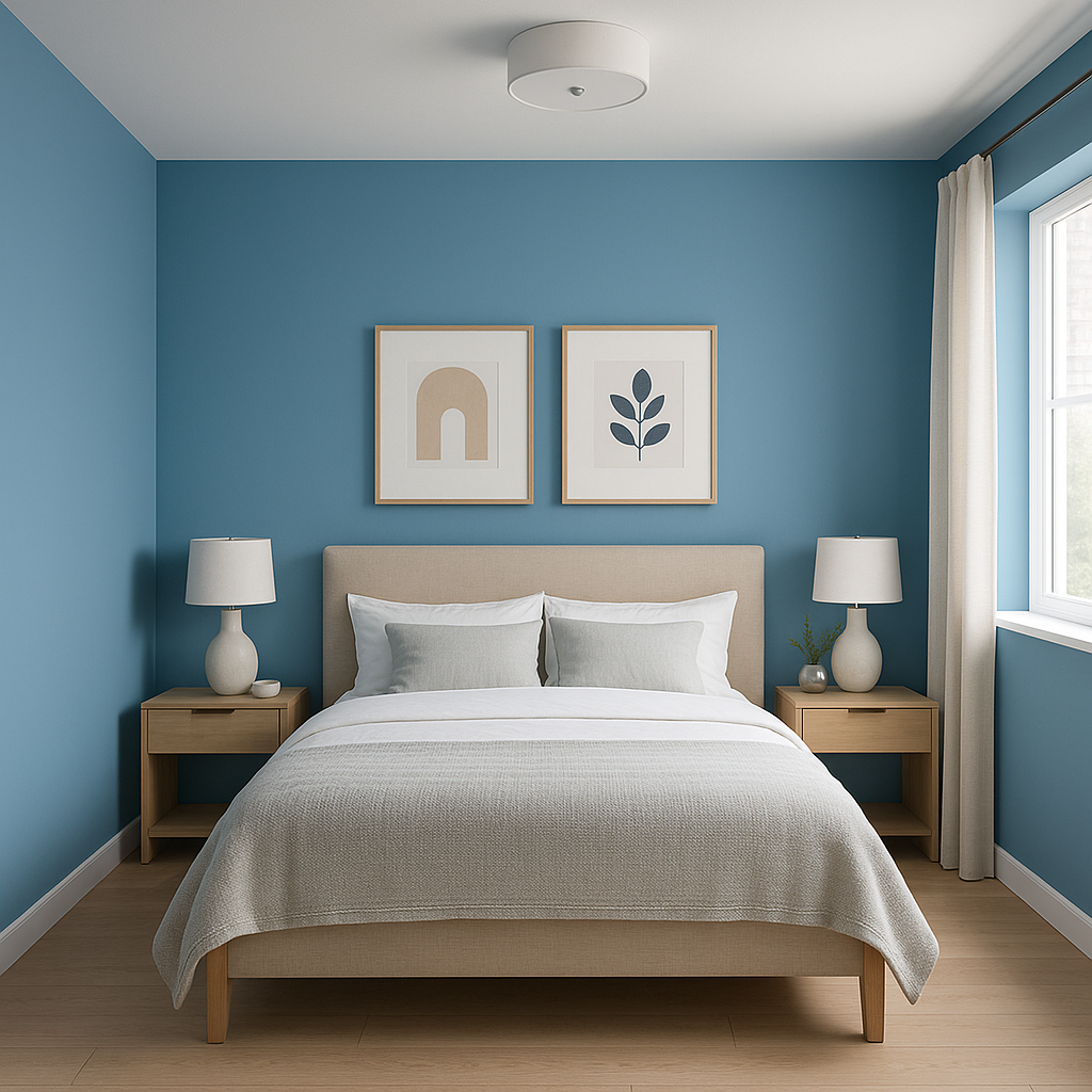
Transform your bedroom into a tranquil retreat by using Benjamin Moore Blue (782) as the primary wall color. Its calming undertones make it ideal for fostering relaxation and sleep. Complement it with crisp white bedding and warm wood furniture for a serene atmosphere.
Achieve a spa-like feel in your bathroom by incorporating this shade. Benjamin Moore Blue (782) pairs well with white subway tiles, chrome fixtures, and marble countertops, creating a clean and refreshing space.
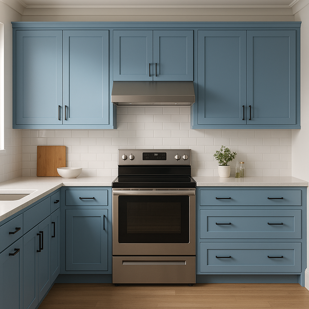
Use Benjamin Moore Blue (782) on kitchen cabinetry for a bold yet classic statement. Pair it with brass hardware and white countertops for a timeless look that feels both fresh and inviting.
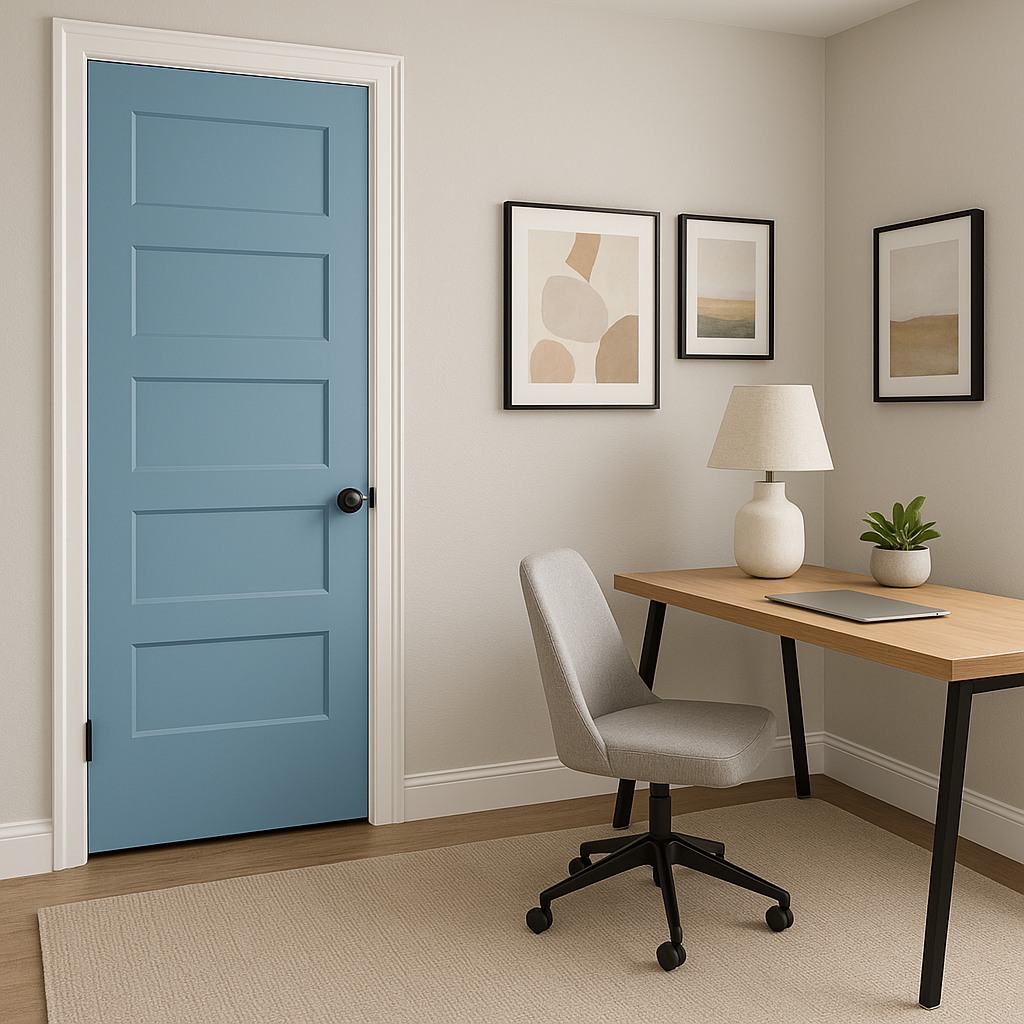
Make a statement in transitional spaces like hallways or entryways. Benjamin Moore Blue (782) sets the tone for the rest of your home, offering a welcoming and polished introduction.
If you're not ready to commit to an entire room in blue, use Benjamin Moore Blue (782) for an accent wall or on furniture pieces like a bookshelf or dresser. The subtle gray undertones ensure it blends seamlessly with surrounding colors.
Because of its gray undertones, Benjamin Moore Blue (782) interacts beautifully with different types of lighting. In natural daylight, it feels crisp and fresh. Under warm artificial light, it takes on a slightly cozier and more subdued tone. To ensure the perfect look, test it in your space during various times of the day to see how the light affects its character.
Benjamin Moore Blue (782) is the perfect blend of classic and contemporary, making it a versatile choice for any interior design project. Its ability to adapt to various lighting conditions and pair effortlessly with complementary shades ensures it remains a trusted favorite among homeowners and designers alike.
View Colors Only by Brand (No Imagery):
Sherwin-Williams
|
Benjamin-Moore
|
Behr
|
Valspar
Live on the Eastern Slope of Colorado and looking for a local painting professional, check out all our painting services and reach out for a free estimate.
Copyright © 2026 : Wild Fox Painting Inc. : 12435 Mead Way, Littleton, CO 80125


