Benjamin Moore Aquarius (788) is a captivating shade of blue that exudes tranquility and elegance. With its soft and soothing presence, this color is ideal for creating spaces that feel calm, refreshing, and effortlessly sophisticated. Its balanced tone makes it a versatile choice for a variety of interior design styles, from modern coastal to timeless traditional.
Aquarius (788) is a light-to-medium blue with subtle green undertones. These green undertones give the color a slightly aquatic feel, making it reminiscent of serene ocean waters or a clear summer sky. The undertones also help Aquarius adapt beautifully to different lighting conditions, shifting from a crisp, airy blue in bright natural light to a more muted and serene hue in dim lighting. This versatility ensures that Aquarius remains dynamic yet consistently soothing.
When designing with Benjamin Moore Aquarius, pairing it with complementary or contrasting colors can enhance its beauty and create a cohesive look. Here are some excellent coordinating options:
Aquarius (788) is a versatile blue that can be used across a wide range of spaces and styles. Its calm and refreshing presence makes it an excellent choice for:
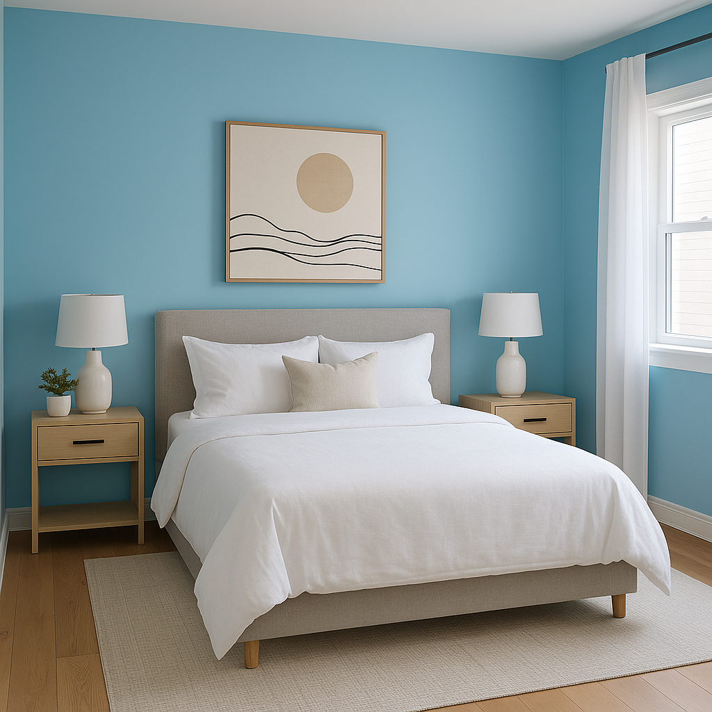
The soothing nature of Aquarius makes it ideal for bedrooms, where a sense of relaxation and tranquility is key. Pair it with crisp white linens and soft textures to create a peaceful retreat.
Aquarius's aquatic undertones make it a natural fit for bathrooms. Combine it with polished chrome fixtures, white subway tiles, and sandy beige accents to evoke a spa-like atmosphere.
Create a light and airy living room by using Aquarius on the walls. It pairs beautifully with neutral furnishings and natural textures like wood and rattan, perfect for coastal or casual aesthetics.
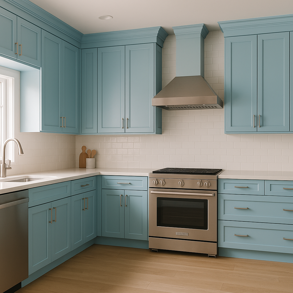
For a fresh and inviting kitchen, use Aquarius on cabinetry or as an accent wall. Pair it with white countertops and brushed nickel hardware for a clean, modern look.
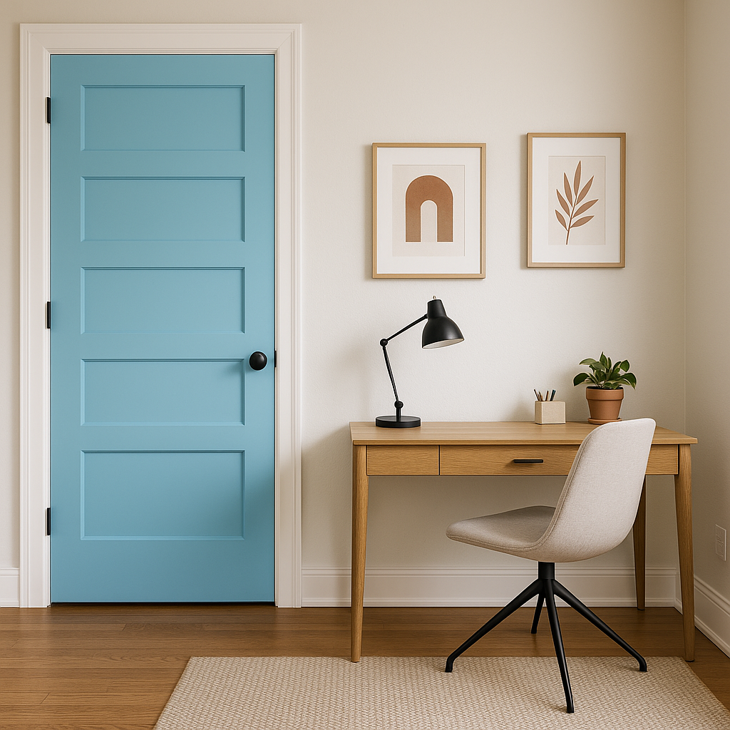
Aquarius works wonderfully as an accent wall color, especially in spaces that need a pop of sophistication without overwhelming the design. Pair it with complementary shades from its coordinating palette to tie the room together.
The soft, playful nature of Aquarius makes it a lovely choice for children’s bedrooms or playrooms. Its light and cheerful quality can inspire creativity and comfort.
Aquarius is the perfect blend of subtlety and charm. It brings a touch of color without overpowering a space, allowing it to serve as both a main wall color and an accent. Whether you’re aiming for a coastal-inspired home or simply want a serene, versatile blue, Aquarius is a shade that adapts beautifully to your design vision. Its ability to coordinate with a wide range of colors makes it a dream for any interior project.
With Benjamin Moore Aquarius (788), you can bring the calming beauty of the sea and sky into your home, creating spaces that feel both timeless and refreshing.
View Colors Only by Brand (No Imagery):
Sherwin-Williams
|
Benjamin-Moore
|
Behr
|
Valspar
Live on the Eastern Slope of Colorado and looking for a local painting professional, check out all our painting services and reach out for a free estimate.
Copyright © 2026 : Wild Fox Painting Inc. : 12435 Mead Way, Littleton, CO 80125


