Benjamin Moore Paddington 791 is a sophisticated and versatile deep blue-green shade that exudes a sense of elegance and tranquility. This bold yet refined color offers a striking balance of richness and depth, making it a standout choice for both modern and traditional spaces. Its timeless appeal ensures that it can adapt seamlessly to a variety of design aesthetics, from coastal-inspired interiors to dramatic, moody atmospheres.
One of the defining characteristics of Paddington 791 is its unique undertones. This color features a harmonious blend of blue and green, with subtle gray undertones that soften its intensity and give it a grounded, muted quality. The gray undertones prevent the color from feeling too vibrant or overwhelming, allowing it to work beautifully in a wide range of lighting conditions. In natural light, the blue-green tones take center stage, creating a calming and serene atmosphere. Under artificial lighting, the gray undertones may become more pronounced, adding a touch of sophistication and depth to the space.
To create a cohesive and balanced design, consider pairing Benjamin Moore Paddington 791 with complementary and coordinating colors. Here are some suggestions for perfect pairings:
Neutral Accents: Soft whites, such as Benjamin Moore White Dove OC-17 or Simply White OC-117, provide a clean and crisp contrast to Paddington 791. These neutral tones help highlight the richness of the color while maintaining a light and airy ambiance.
Warm Earthy Tones: Warm beige or taupe shades, like Revere Pewter HC-172 or Edgecomb Gray HC-173, create a cozy and inviting atmosphere when paired with Paddington 791. These earthy hues balance the coolness of the blue-green tones.
Metallics: Incorporate metallic accents in gold, brass, or bronze to enhance the luxurious feel of Paddington 791. Metallic elements can add warmth and sophistication to the overall design.
Darker Companions: For a dramatic effect, pair Paddington 791 with deep, moody hues like Kendall Charcoal HC-166 or Hale Navy HC-154. This combination works particularly well in spaces like dining rooms, libraries, or home offices.
Pops of Color: Add energy and vibrancy to your space by incorporating pops of contrasting colors, such as coral, mustard yellow, or soft blush pink. These accents can bring a playful and dynamic touch to the overall design.
Benjamin Moore Paddington 791 is a versatile color that can be used in a variety of applications to create a stunning visual impact. Here are some ideas for incorporating this hue into your home:
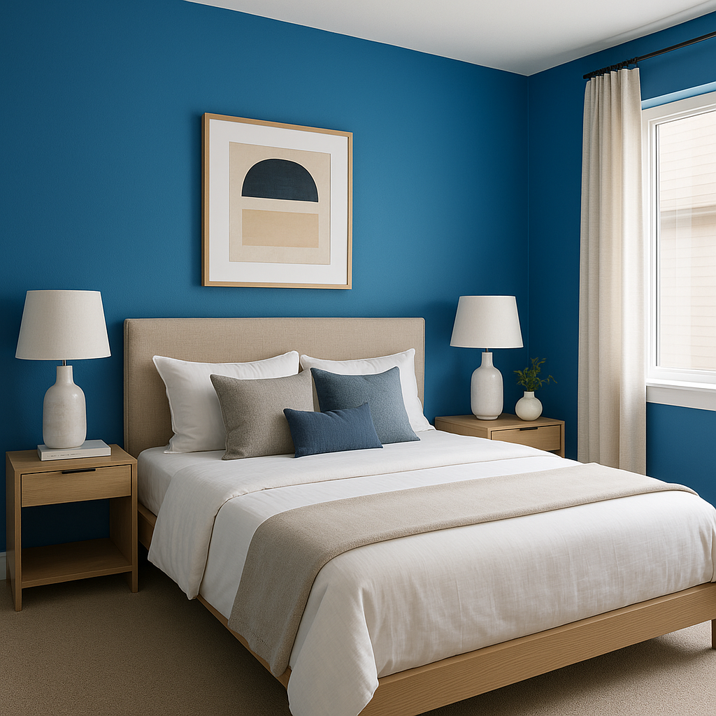
Paddington 791 makes for a striking accent wall in living rooms, bedrooms, or dining areas. Its rich color draws the eye and adds depth to the space without overwhelming the room.
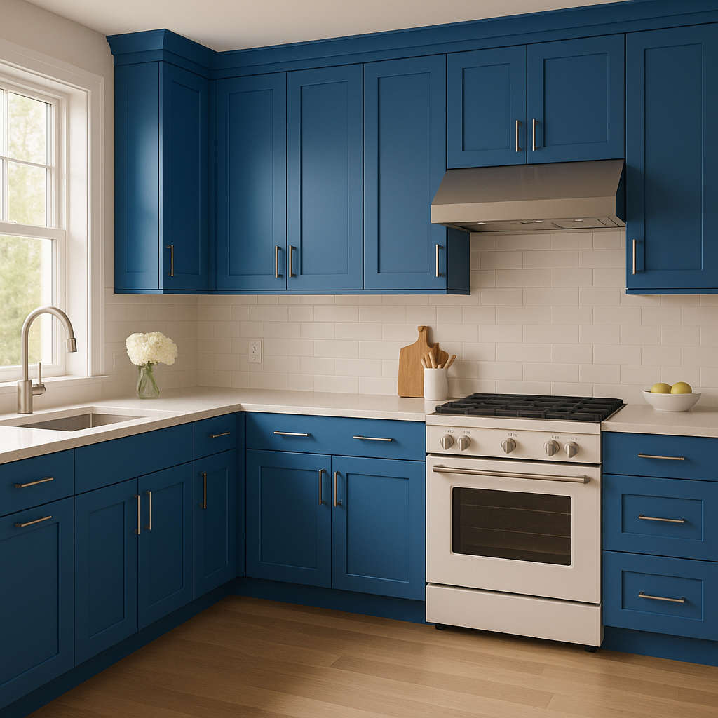
Use this sophisticated blue-green shade to refresh your kitchen cabinets. It pairs beautifully with white countertops, subway tile backsplashes, and warm wood tones for a modern yet timeless look.
For a spa-like retreat, consider using Paddington 791 on bathroom walls or vanity cabinets. Complement it with marble finishes, chrome fixtures, and soft white accents for a serene and luxurious feel.
Create a bold statement by painting built-ins, bookcases, or shelving units in Paddington 791. This color adds depth and dimension to these architectural features, making them a centerpiece in the room.
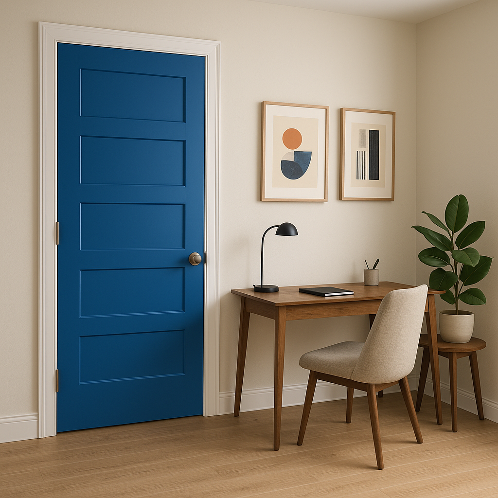
Make a memorable first impression by painting your front door in Paddington 791.
View Colors Only by Brand (No Imagery):
Sherwin-Williams
|
Benjamin-Moore
|
Behr
|
Valspar
Live on the Eastern Slope of Colorado and looking for a local painting professional, check out all our painting services and reach out for a free estimate.
Copyright © 2026 : Wild Fox Painting Inc. : 12435 Mead Way, Littleton, CO 80125


