Benjamin Moore Faded (795) is a soft and sophisticated neutral that encapsulates the gentle charm of muted tones. This versatile color, a delicate blend of gray with subtle beige undertones, offers a timeless appeal that can elevate any space with its understated elegance. Perfectly balanced, Faded (795) is neither too cool nor too warm, making it a highly adaptable choice for a wide range of interior styles, from contemporary minimalism to classic traditional design.
Faded (795) leans slightly into the greige family, with both gray and beige undertones that harmonize beautifully. This unique blend creates a soft, earthy foundation that feels grounded and serene. Its neutral base allows it to complement a variety of color palettes, while the subtle warmth ensures it doesn’t feel overly cold or stark. Depending on the lighting, the gray undertones may appear more prominent in cooler light, while the beige undertones shine in warmer settings, adding depth and dimension to your space.
The versatility of Faded (795) makes it easy to pair with other shades for a cohesive and stylish look. Here are some recommended coordinating colors:
These combinations allow you to explore various design styles, from relaxed coastal vibes to elegant modern interiors.
Faded (795) is exceptionally versatile, making it a great choice for a wide range of applications throughout your home. Here are some ideas for where and how to use this timeless neutral:
Create a cozy, welcoming atmosphere by using Faded (795) as the main wall color. Pair it with plush textures like velvet or linen in coordinating neutrals, or add pops of color with throw pillows in jewel tones or muted pastels.
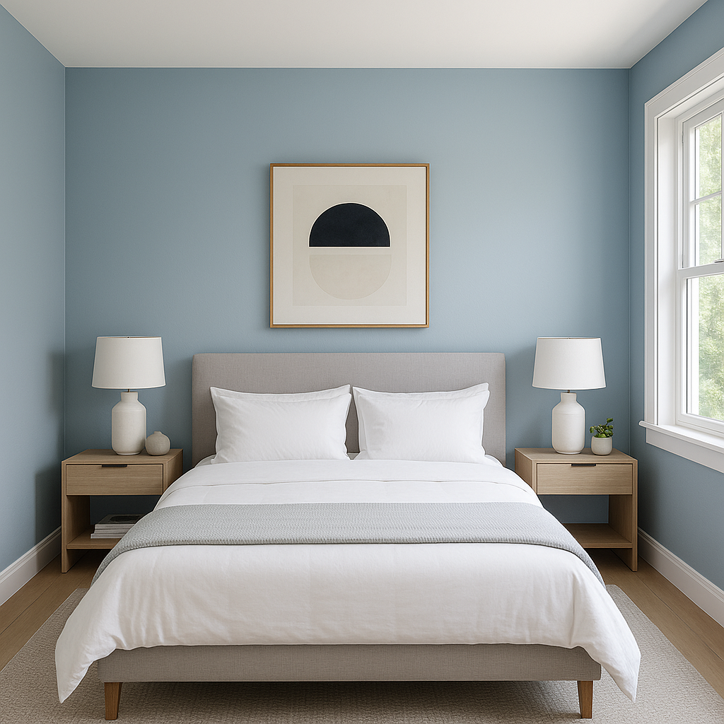
Faded (795) sets the stage for a serene retreat. Use it on walls to create a soothing backdrop, and pair it with crisp white bedding and natural wood tones for a tranquil and airy feel.
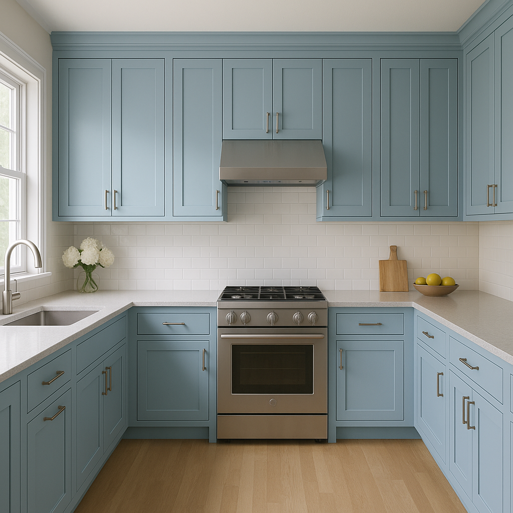
For a modern yet timeless look, use Faded (795) on cabinetry or walls. Pair it with polished brass hardware and a white subway tile backsplash to achieve a clean and sophisticated space.
This soft neutral works wonderfully in bathrooms, especially when combined with marble or quartz countertops. Add depth with deep navy or charcoal accents in towels or rugs.
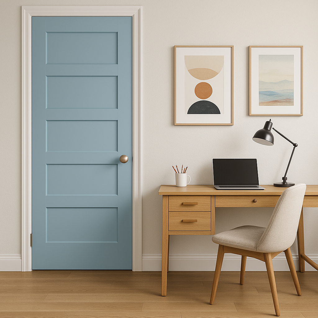
Faded (795) creates a focused yet calming environment, making it an excellent choice for home offices. Pair it with natural wood furniture and black accents for a sleek and productive workspace.
Like many neutral tones, Faded (795) can shift slightly depending on the lighting in your space. In rooms with abundant natural light, it will appear brighter and more airy, while in dimmer settings or artificial light, its warmer beige undertones may become more prominent. Always test a sample in your space to observe how it interacts with your specific lighting conditions.
Benjamin Moore Faded (795) offers the perfect blend of warmth and coolness, making it adaptable to a variety of design styles and color palettes. Whether you're looking to create a relaxing sanctuary or a sophisticated gathering space, this soft neutral provides a timeless foundation that will effortlessly enhance your interiors.
View Colors Only by Brand (No Imagery):
Sherwin-Williams
|
Benjamin-Moore
|
Behr
|
Valspar
Live on the Eastern Slope of Colorado and looking for a local painting professional, check out all our painting services and reach out for a free estimate.
Copyright © 2026 : Wild Fox Painting Inc. : 12435 Mead Way, Littleton, CO 80125


