
Benjamin Moore Blue (810) is a versatile and captivating medium blue that brings a sense of calm and sophistication to any space. This shade combines the richness of traditional blue tones with a modern charm, making it the perfect choice for both classic and contemporary interiors. Whether you're looking to create a serene retreat or add a pop of color to your home, Benjamin Moore Blue (810) offers the versatility and depth needed to transform your space.
Benjamin Moore Blue (810) is a true blue with subtle cool undertones that lean toward gray. These undertones create a balanced, muted quality that prevents the color from feeling overly bold or vibrant. The gray influence gives it a refined and understated elegance, making it ideal for spaces where you want to evoke tranquility and sophistication. The cool undertones also pair beautifully with both warm and cool color palettes, making it a flexible choice for a wide range of design styles.
Benjamin Moore Blue (810 can be paired with a variety of complementary and contrasting shades to create a harmonious and visually appealing palette. Here are some coordinating colors to consider:
Neutral Pairings: To enhance the calming qualities of Benjamin Moore Blue (810), pair it with soft neutrals like White Dove (OC-17) or Chantilly Lace (OC-65). These crisp whites provide a clean backdrop and allow the blue to take center stage while maintaining an airy and fresh feel.
Warm Accents: For a warmer, cozier palette, consider pairing it with earthy tones like Chelsea Gray (HC-168) or Edgecomb Gray (HC-173). These colors balance the coolness of Benjamin Moore Blue (810) and create a grounded, welcoming atmosphere.
Bold Contrast: To add drama and depth, pair Benjamin Moore Blue (810) with darker, more saturated tones like Hale Navy (HC-154) or Black Ink (2127-20). These rich colors create a striking contrast and elevate the mood of any space.
Playful Pop: For a more playful and energetic look, pair this blue with vibrant yellows or greens such as Lemon Grass (2029-20) or Spring Meadow (2030-50). These hues add a lively touch to the serene foundation of Benjamin Moore Blue (810).
Benjamin Moore Blue (810) is an excellent choice for a variety of uses throughout the home. Its adaptability and timeless appeal make it a favorite among homeowners and designers alike. Here are some ways to incorporate this stunning hue into your space:
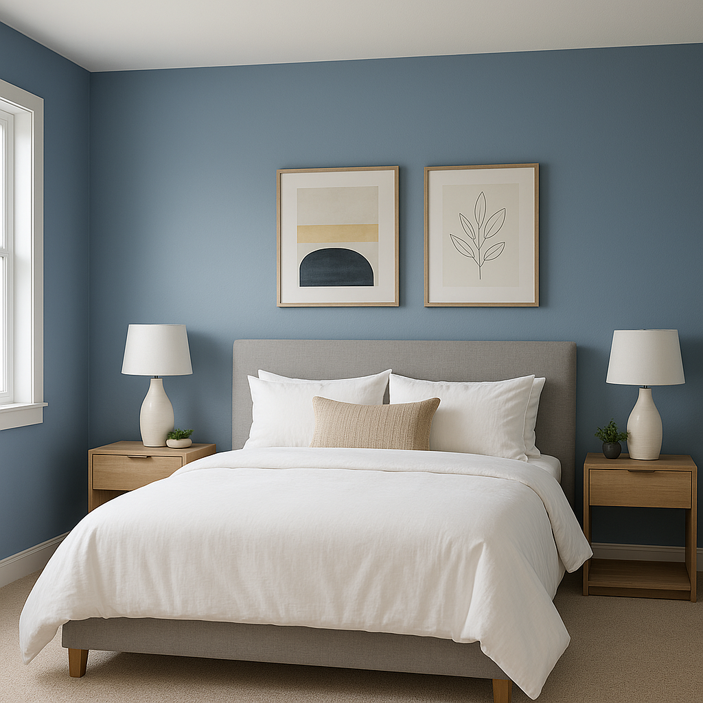
Create a peaceful atmosphere in living rooms or bedrooms by using Benjamin Moore Blue (810) on walls. Its soothing qualities make it perfect for spaces dedicated to relaxation and unwinding. Pair it with neutral furniture and soft textiles for a cozy and inviting ambiance.
The cool undertones of Benjamin Moore Blue (810) are ideal for bathrooms, lending a spa-like feel to the space. Pair it with white or marble finishes to enhance the clean and refreshing vibe.
Make a statement by using Benjamin Moore Blue (810) as an accent wall. Whether in a dining room, home office, or entryway, this shade adds depth and character while maintaining a sophisticated aesthetic.
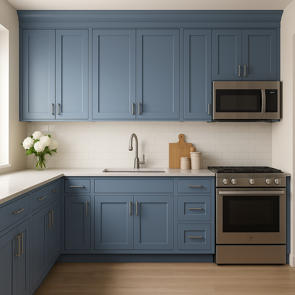
For a modern yet timeless look, consider painting kitchen cabinets or built-ins in Benjamin Moore Blue (810). When paired with brass or gold hardware, this shade adds a luxurious touch to your kitchen or living area.
Benjamin Moore Blue (810) is also an excellent choice for exterior applications. Use it for front doors, shutters, or siding to create a welcoming and stylish curb appeal that stands out while remaining classic.
Its ability to adapt to different lighting conditions and design styles makes Benjamin Moore Blue (810) a reliable choice for any project. In spaces with abundant natural light, its cooler undertones shine, creating a bright and airy feel. In dimly lit rooms, it takes on a richer, moodier tone that exudes coziness. Whether used as a primary wall color or as an accent, this hue effortlessly enhances the aesthetics of your home.
With its timeless appeal, balanced undertones, and versatility, Benjamin Moore Blue (810) is a color that truly stands the test of time. From serene bedrooms to bold accent walls, this shade is an interior designer's dream—and it’s ready to transform your home into a haven of style and comfort.
View Colors Only by Brand (No Imagery):
Sherwin-Williams
|
Benjamin-Moore
|
Behr
|
Valspar
Live on the Eastern Slope of Colorado and looking for a local painting professional, check out all our painting services and reach out for a free estimate.
Copyright © 2026 : Wild Fox Painting Inc. : 12435 Mead Way, Littleton, CO 80125


