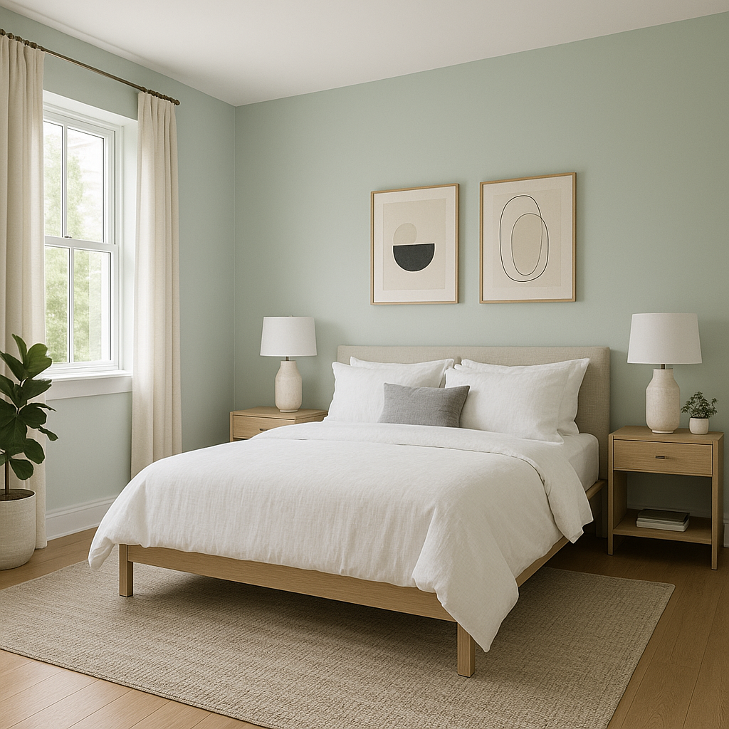
Benjamin Moore Come (846) is a sophisticated, warm neutral that exudes understated elegance and versatility. Perfectly suited for both modern and traditional interiors, this color creates a serene and inviting atmosphere that works beautifully in any space. Its gentle softness and balanced tone make it a timeless choice for walls, trim, or even cabinetry.
Benjamin Moore Come (846) features subtle beige undertones that lean slightly toward a creamy taupe. These warm undertones help the shade feel cozy without veering too yellow or overly brown, striking the perfect balance between warmth and neutrality. Its undertones ensure that it complements a wide variety of other shades, making it ideal for layering with different palettes.
Benjamin Moore Come (846) pairs effortlessly with other colors, whether you're looking to create a monochromatic scheme or add contrasting hues for visual interest. Here are a few recommendations:
For harmonious accents, consider metallic finishes like brushed gold or antique brass to further highlight the warm undertones of Come (846).
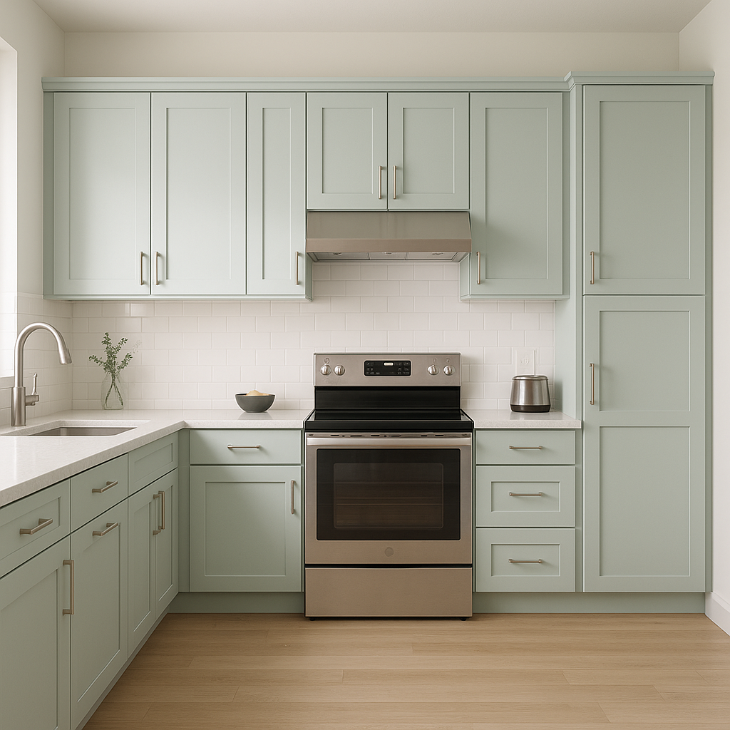
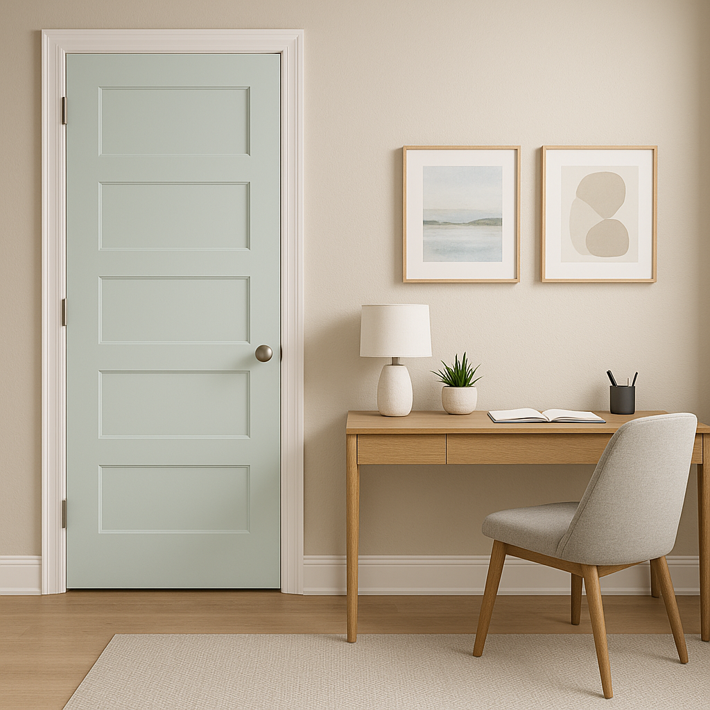
Benjamin Moore Come (846) is incredibly versatile, making it ideal for various applications throughout your home:
Benjamin Moore Come (846) adapts beautifully to different lighting conditions. In spaces with abundant natural light, its beige undertones become more prominent, lending a sunny warmth. In dimmer areas or under artificial light, it takes on a slightly deeper taupe-like quality, maintaining its elegant character. Pair it with layered lighting fixtures to bring out the best in this shade.
Benjamin Moore Come (846) is the epitome of versatility and timelessness, making it a go-to choice for homeowners and designers alike. Whether you’re aiming for a neutral sanctuary or a layered, textured look, this color effortlessly adapts to your vision while adding warmth and sophistication to any room.
View Colors Only by Brand (No Imagery):
Sherwin-Williams
|
Benjamin-Moore
|
Behr
|
Valspar
Live on the Eastern Slope of Colorado and looking for a local painting professional, check out all our painting services and reach out for a free estimate.
Copyright © 2026 : Wild Fox Painting Inc. : 12435 Mead Way, Littleton, CO 80125


