Benjamin Moore Carried (849) is a soft, understated neutral that exudes sophistication and versatility. Perfect for a variety of spaces, this gentle shade is a favorite among interior designers for its ability to create a serene and timeless atmosphere. Whether you’re revamping a modern space or enhancing a traditional room, Carried offers a subtle yet impactful touch.
Carried (849) is a light taupe with warm beige undertones that lean slightly toward gray. These undertones give it a balanced softness, making it an adaptable color that works well in different lighting conditions. In spaces with natural light, the warm beige undertones shine through, giving the room a cozy and inviting feel. In rooms with cooler artificial lighting, the slight gray influence emerges, creating a more subdued and tranquil aesthetic.
This muted neutrality allows Carried to harmonize effortlessly with other colors, making it a go-to choice for layering tones or pairing with bolder accents. Its versatility enables it to serve as either a primary wall color or a complementary backdrop.
Benjamin Moore Carried (849) pairs beautifully with a wide range of shades, thanks to its neutral base. Here are some top coordinating colors to consider:
By mixing these coordinating shades, you can tailor the mood of your space to suit your personal style, whether it's minimalist, classic, or eclectic.
Carried (849) is highly versatile and can be used in various rooms and design styles. Its understated elegance makes it a popular choice for spaces where a tranquil atmosphere is desired. Below are some suggestions for where and how to use this color:
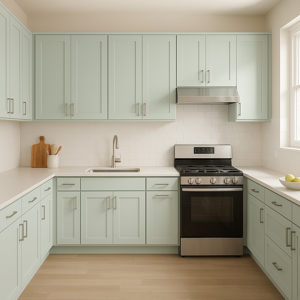
Carried’s subtle tones create an inviting and calming foundation for living rooms. Pair it with plush furniture in neutral shades and pops of color through accent pillows or artwork. Metallic finishes, such as brushed gold or silver, add a touch of sophistication.
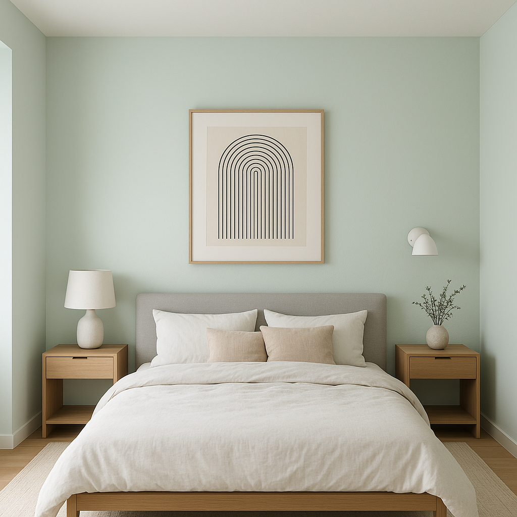
For bedrooms, Carried is ideal for cultivating a restful retreat. Combine it with soft whites and pastel tones, such as blush pink or sage green, for a serene and soothing ambiance. Layering textures like linen bedding and velvet throw blankets enhances the cozy vibe.
If you’re looking to design a dining area with a refined yet approachable feel, Carried works wonderfully. Pair it with darker wood furniture and coordinating accents in deep greens or navy blues for a polished look. Add a statement lighting fixture to complete the space.
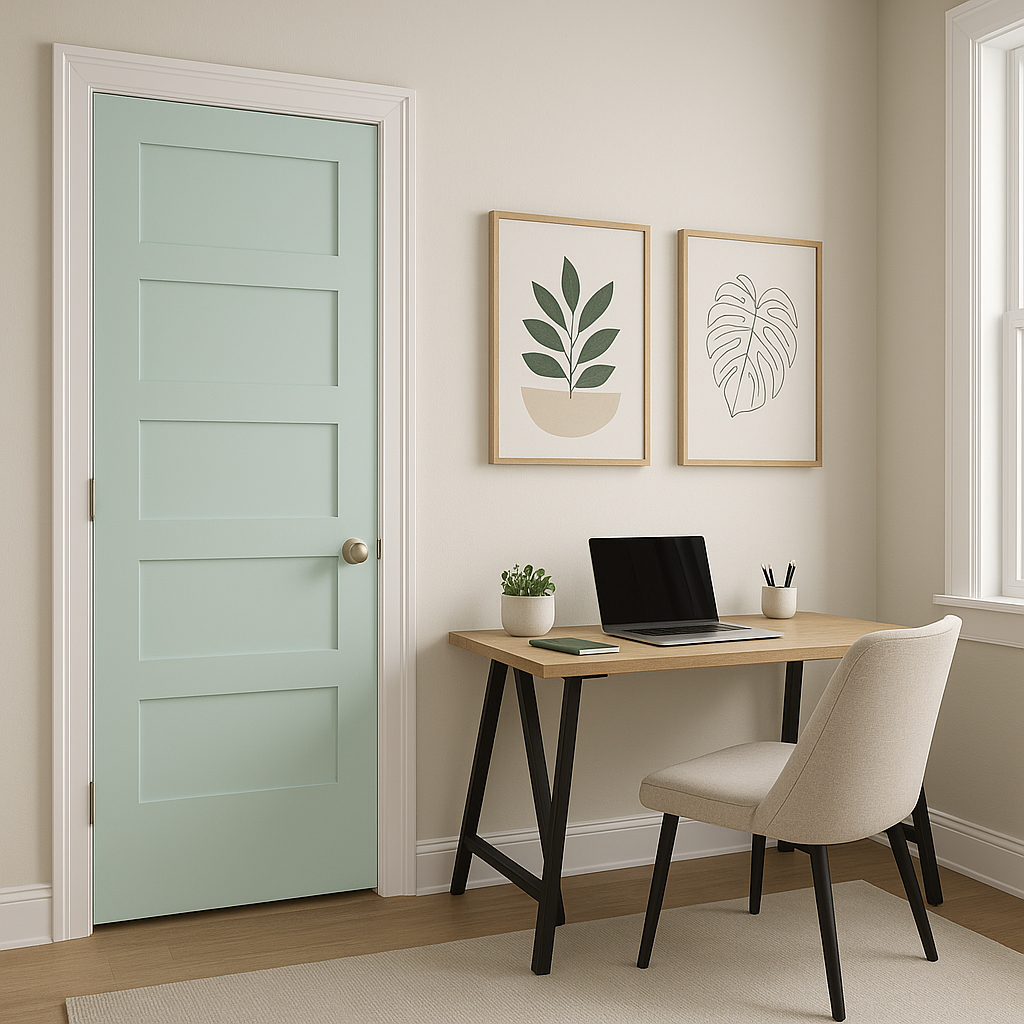
Carried’s neutral tone makes it a perfect backdrop for home offices. It encourages focus and balance without being overly stark. Pair it with natural wood desks and shelves, along with accents in muted blues or greens for a productive environment.
Transform your bathroom into a spa-like oasis with Carried on the walls. Pair it with white or marble tiles and chrome or matte black fixtures for a clean and modern look. Adding greenery through potted plants can further enhance the calming atmosphere.
Benjamin Moore Carried (849) is a timeless choice for those seeking a neutral color that balances warmth and coolness. Its subtle beige-gray undertones make it adaptable across various design styles and lighting conditions, ensuring a harmonious aesthetic in any space. Whether used as a primary color or as part of a layered palette, Carried has the ability to elevate interiors with its understated charm.
When you choose Carried, you’re opting for a versatile shade that suits modern sensibilities while remaining classic enough to stand the test of time.
View Colors Only by Brand (No Imagery):
Sherwin-Williams
|
Benjamin-Moore
|
Behr
|
Valspar
Live on the Eastern Slope of Colorado and looking for a local painting professional, check out all our painting services and reach out for a free estimate.
Copyright © 2026 : Wild Fox Painting Inc. : 12435 Mead Way, Littleton, CO 80125


