Benjamin Moore Collingwood (859) is a soft, sophisticated greige (a blend of gray and beige) that strikes the perfect balance between warm and cool tones. This versatile neutral color is a favorite among designers and homeowners alike, thanks to its ability to create a calming, welcoming atmosphere while complementing a wide range of interior styles. Whether you're looking to refresh a living room, bedroom, or hallway, Collingwood is an exceptional choice that lends understated elegance to any space.
One of Collingwood's standout features is its subtle undertones. It leans slightly toward the warm side of greige, with faint lavender and purple undertones that give it depth and a touch of sophistication. These undertones are soft and unobtrusive, making Collingwood an adaptable and non-demanding color that works beautifully in different lighting conditions.
It's important to test Collingwood in your space before committing, as its subtle undertones can shift depending on surrounding colors and lighting.
Collingwood's easygoing personality makes it an ideal partner for a variety of coordinating colors. Whether you're crafting a monochromatic palette or introducing bold accents, this neutral hue offers endless possibilities:
Collingwood also pairs beautifully with natural wood tones and metallic finishes such as brushed gold, bronze, or matte black.
Collingwood's versatility makes it a go-to option for virtually any room in your home. Its understated elegance ensures that it enhances, rather than overwhelms, your decor.
Collingwood creates a cozy yet refined backdrop for living spaces. Pair it with plush furniture, layered textures, and metallic accents for a modern look that's both stylish and inviting.
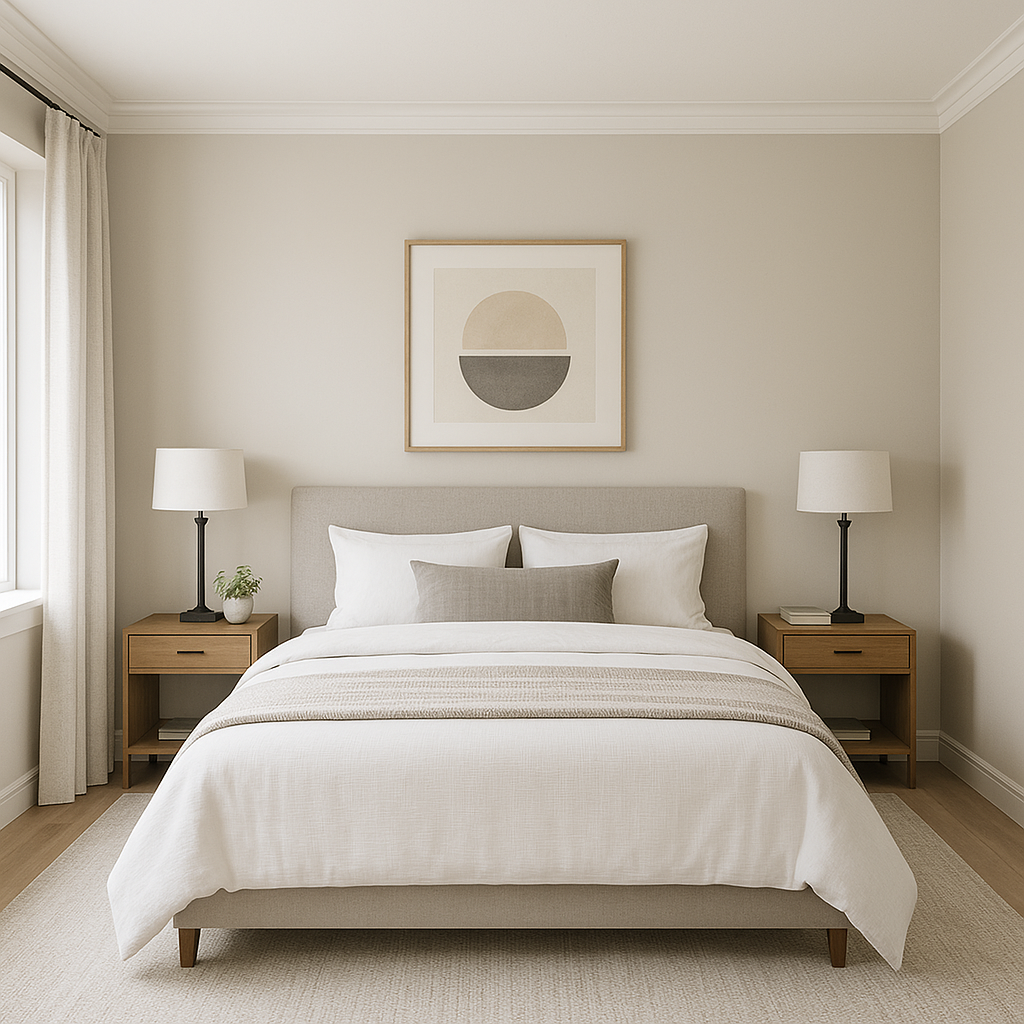
The soothing undertones of Collingwood make it an ideal choice for bedrooms. Combine it with soft whites, warm woods, and tactile fabrics like linen or velvet for a serene retreat.
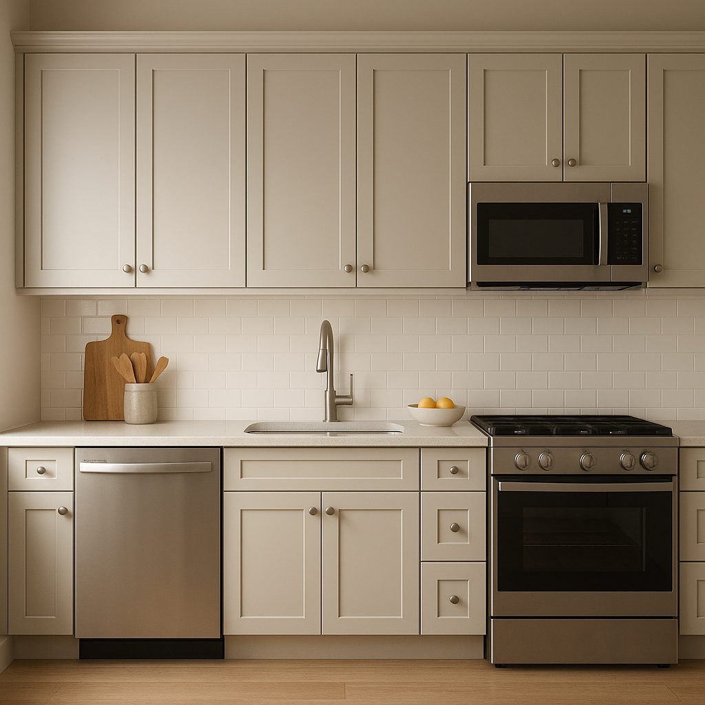
Collingwood brings a fresh and contemporary feel to kitchens, especially when paired with white cabinetry and matte black hardware. Add pops of color through accessories or backsplash tiles for a touch of personality.
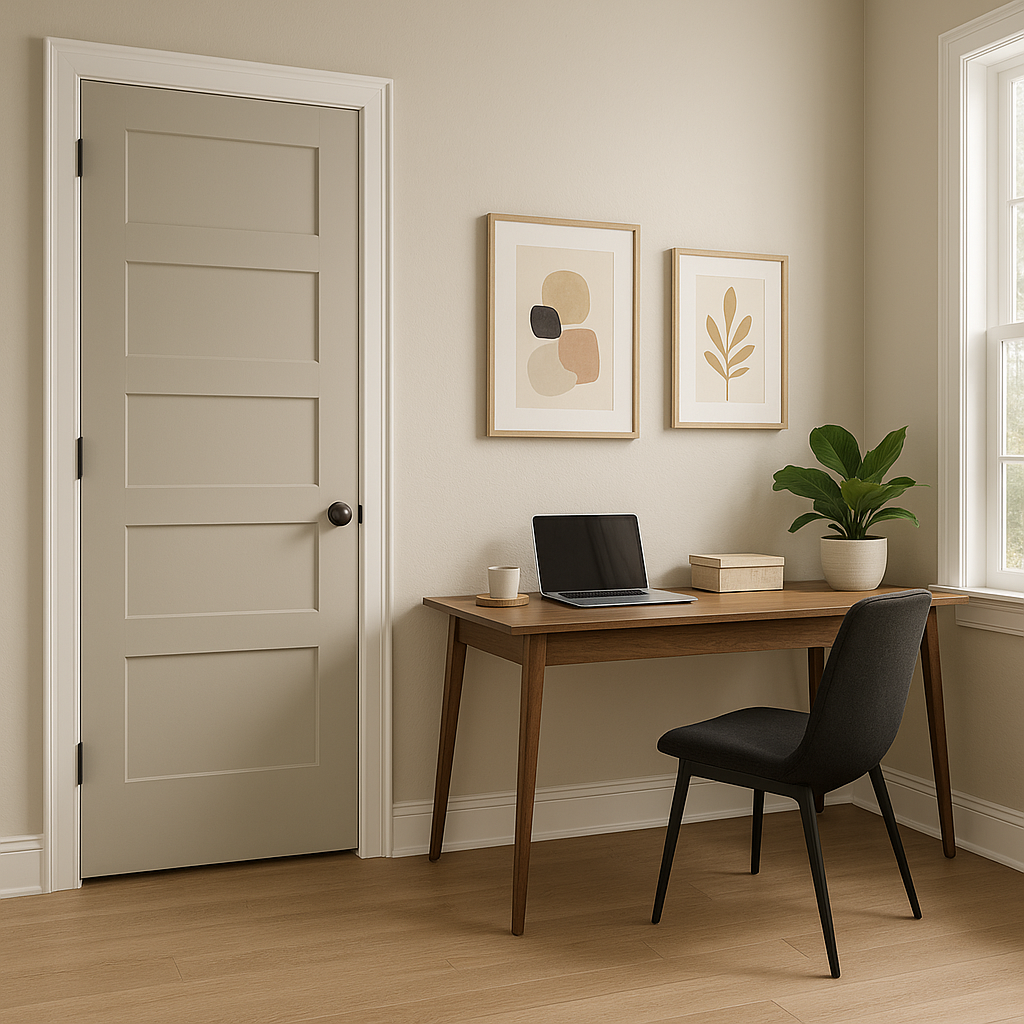
A neutral like Collingwood is perfect for transitional spaces like hallways and entryways. Its ability to coordinate with virtually any color ensures a smooth flow between rooms.
For bathrooms, Collingwood delivers a spa-like ambiance. Pair it with crisp whites, marble finishes, and chrome accents for a timeless and luxurious feel.
Benjamin Moore Collingwood (859) is more than just a paint color; it's a design tool that transforms interiors with grace and subtlety. Its refined undertones, versatility, and ability to coordinate with a wide range of colors make it an indispensable choice for anyone looking to elevate their home. Whether you're aiming for a cozy farmhouse aesthetic or sleek modern elegance, Collingwood lays the foundation for a space that feels harmonious and effortlessly stylish.
View Colors Only by Brand (No Imagery):
Sherwin-Williams
|
Benjamin-Moore
|
Behr
|
Valspar
Live on the Eastern Slope of Colorado and looking for a local painting professional, check out all our painting services and reach out for a free estimate.
Copyright © 2026 : Wild Fox Painting Inc. : 12435 Mead Way, Littleton, CO 80125


